Last weekend, I was on the road and starving after a morning of errands. I pulled out my phone and after rooting through a mess of confusing navigation, out-of-date PDF menus, and questionable hours of operation, I ended up heading home to settle for a sad bowl of cereal. I blame all-too-common terrible restaurant website design, and I’m not the only one who has been deterred from patronage by bad website design.
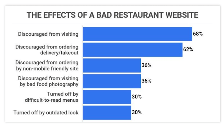
In fact, 68% of diners are discouraged from visiting a restaurant due to a bad website.
That’s why I’m cataloging some of the best restaurant website design examples you can use for inspiration, whether you’re overhauling your site, updating your brand, or launching your own place.
Before we get to the examples, though, let’s take a closer look at why you need to care about your restaurant website design—not just to avoid ruining my weekend morning, but to grow your business.
Why do you need to care about restaurant website design?
You’ve already read the stat in the intro, but here are some more:
- 77% of consumers will visit a restaurant’s website before dining in or taking out food.
- When placing an online order, a patron is more likely to use a restaurant’s website than a third-party site like Grubhub.
- Even if you have a functional website, 30% of diners are turned off by an outdated look.
So while your menu, social media profiles, and listings are important for restaurant marketing, an appealing, effective website is essential for sales and revenue.
And the importance of a solid digital presence is only going to become more important. It’s no surprise that younger generations have stronger preferences for online interactions, including website FAQs over phone calls, ordering through a website or app instead of over the phone, and more.
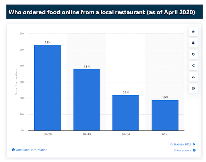
In fact, Statista found that more than 50% of people 18-29 years old ordered food online during April 2020 and almost 40% of people 30-49 years old.
13 delicious restaurant website design examples
The most effective website design will depend on the style of your restaurant. Is it formal or casual? An intimate dinner spot or a must-see brewery? A food truck or a local chain? You want to communicate your spot’s personality to your customers so that they know exactly what to expect, so all of these factors will impact your website design. But there are some standard elements. that you’ll want to include regardless.
So we’ve rounded up 13 restaurant website design examples of these essentials, including great branding, intuitive navigation, and so much more. Take a look.
1. Mida
Mida is an Italian restaurant in Boston’s South End with amazing pasta dishes, a great wine list, and an ambiance that is, quite simply, cool. The website design matches this perfectly.
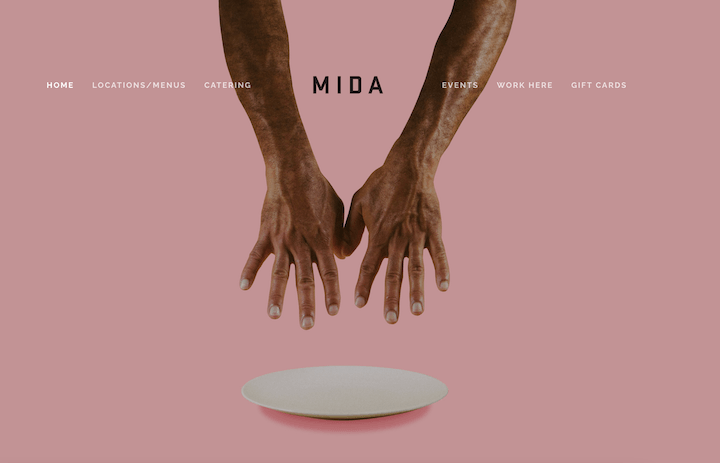
The shadowy Millennial pink background, the sleek sans serif font, the intriguing photograph. The effect is cool and clickable, which is ideal for a restaurant looking to get reservations and online orders.
2. Bennett’s
In case you’re thinking appealing brand design is just for cool or upscale restaurants, let’s look at Bennett’s. This sandwich shop is located in Kennebunk, Maine, with additional locations in New Hampshire, Maine, and Boston.
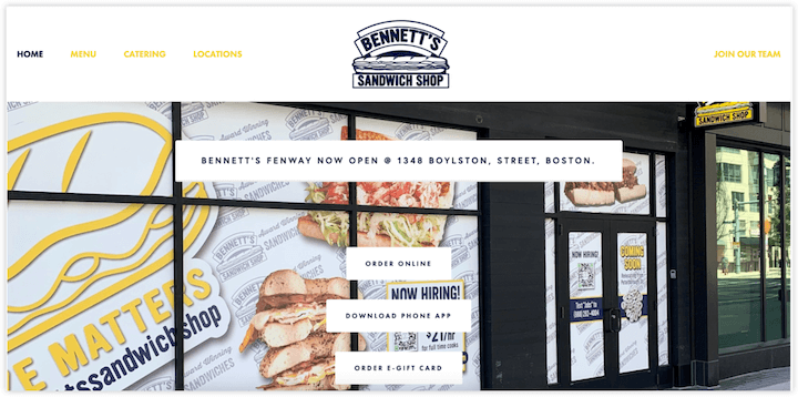
The line-drawn sandwich feels nostalgic, but the logo font is nice and modern. The black-and-white is also a sharp backdrop for the sandwich photos, and the fun, bright yellow accent. Plus, this works well for a sandwich place with a beach-town origin.
3. Shake Shack
Shake Shack is a large fast-food chain with a young, modern feel. Its website color scheme is similar to Bennett’s: black and white with a bright, featured green.
Shake Shack’s website also features its menu—which most searchers are looking for—right on its home page.
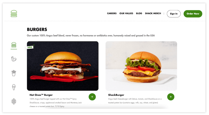
The photos are detailed and show everything on the burgers and sandwiches, and right underneath each item has a full description, including all allergen information. This is great, but it isn’t just for large chains or franchises. Including this info is key for serving a ton of people effectively and safely, so make it easy for everyone with food restrictions to figure out which items on your menu work for them.
4. Union Square Donuts
One non-negotiable design element for your restaurant website (real estate websites too!): photos. 45% of restaurant patrons say they specifically look for food photos on restaurant websites, and 36% say disappointing food photography discourages them from visiting a restaurant.
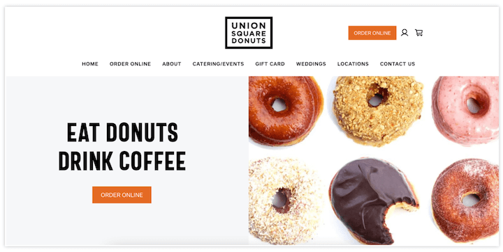
These don’t need to be super fancy or staged, but the food needs to look amazing. Here’s how Union Square Donuts does it.
Delicious, donut-y perfection.
5. Founding Farmers
Founding Farmers is a Mid-Atlantic chain of farm-to-table restaurants that originated in D.C., hence the adorably punny name. The restaurants feature fresh food with locally sourced ingredients and a focus on brunch. Even more, Founding Farmers is majority farmer-owned, sustainably operated, and intent on giving back to its communities.
This human-first focus is front-and-center in the hero section video.
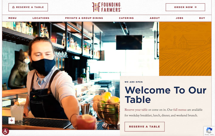
The video frames the experience from start to finish with people—a diner walking in the door, prep chefs cooking and plating, and a server going above and beyond with a takeout order. An excellent way to communicate to potential patrons the feel-good center of this local chain.
6. The Lost Kitchen
The Lost Kitchen is a small, boutique restaurant opened by Erin French that exploded in the last few years. It’s way more than just the restaurant now—it’s a BnB, a small goods store, cookbooks, and even a TV show. The website communicates this well, without losing sight of the brand.
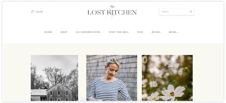
The soft off-white backgrounds and deep gray fonts. The simple design. And notice the muted bucolic photos flanking the brighter, more colorful shot of Erin French. This keeps the heart of the restaurant, now the brand, at the center.
7. Giusto
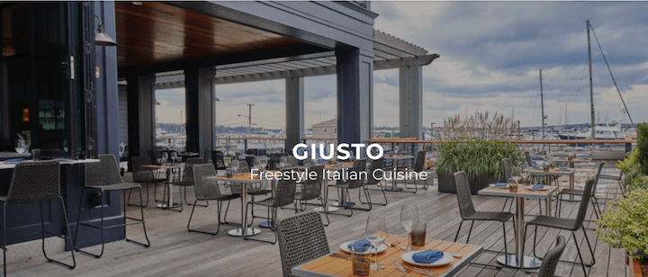
Your restaurant doesn’t need to have a celebrity chef or a TV show to be able to feature your unique selling points. Maybe it’s a specific one-of-a-kind dish, maybe it’s the location, maybe it’s the family tradition. Whatever makes your place special needs to be highlighted on your website.
Giusto does this really well. The restaurant has a small indoor section and a large, open-air bar and bar seating on a deck overlooking Newport, Rhode Island’s harbor. This photo is, of course, on its homepage.
8. Pizzeria Beddia
Having a completely unique history, location, or focus is great (especially for your about us page). But sometimes what makes your restaurant special can be more common: farm-fresh food, a local connection, a slow, handmade specialty.
This still deserves top billing in any restaurant website design.
Here’s an example. Pizzeria Beddia, located in Philadelphia, showcases its handmade pizza and the process right on the homepage.
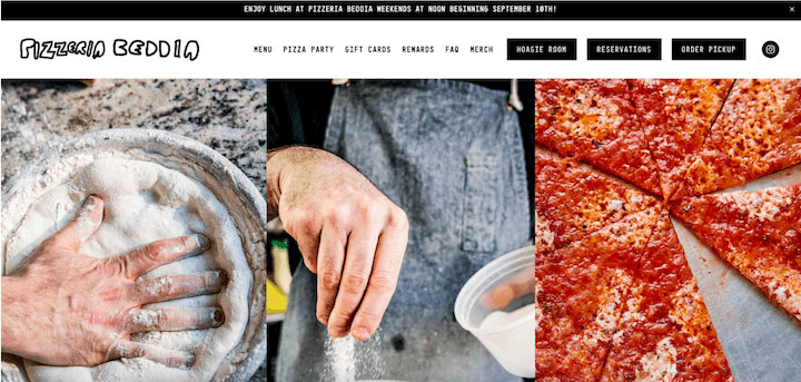
It looks delicious. Bonus points for the banner advertising the schedule change, too.
9. Rebel Rebel
If your restaurant has been featured in the press or received any awards, this should go on your website. Depending on your brand, this could be a photo, a link, or a badge on your homepage.
Rebel Rebel is a natural wine bar in Somerville, Massachusetts that manages to share its achievements prominently without breaking out of its hipster-y personality.
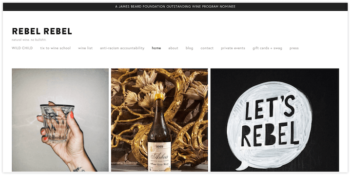
Rebel Rebel celebrates its James Beard award with a simple banner—letting everyone know, but not gushing or getting uncool.
10. Condesa
Whenever I’m visiting a restaurant website (or any website, for that matter), I’m looking for something. A menu, hours, social links, a reservation. That’s why you need to prioritize easy navigation on your own site.
I love how Condesa, a Mexican restaurant in Philadelphia, accomplishes this without the design looking utilitarian or boring.
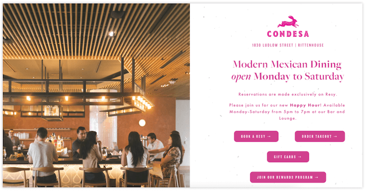
The left revolves through a gallery of restaurant photos, and the bold pink on the right has all of the information you need, including a CTA to book a reservation and another to order takeout. Nice and easy.
11. Rose Foods
Rose Foods also uses bright colors to show off its brand personality. Located in Portland, Maine, this restaurant described itself across the internet as a house-made bagel shop featuring sandwiches and classic Jewish deli fare.
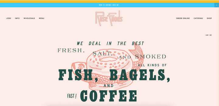
Because the focus is on classics, Rose Foods leans into retro fonts and kitschy line drawings and includes just a few photos. The effect? Based on the small shop’s weekend waits and 20k Instagram followers, it works.
12. Uni
One of the reasons why a restaurant website is so important to get right is because it’s often your potential customer’s first interaction with your band. You want to include all of the basic information, as well as let them know what to expect when they visit you IRL.
Here’s a great example from Uni, an izakaya in Boston.
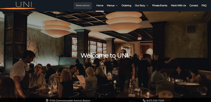
The feel of the website is sleek, dark, intimate, and crowded (in a cozy way). This is exactly what Uni feels like inside.
13. Girl & the Goat
Some restaurants have multiple locations that are nearly identical. But others have a few locations with distinct personalities. If that’s your restaurant, make sure to convey this on your website. Girl & the Goat does this well.
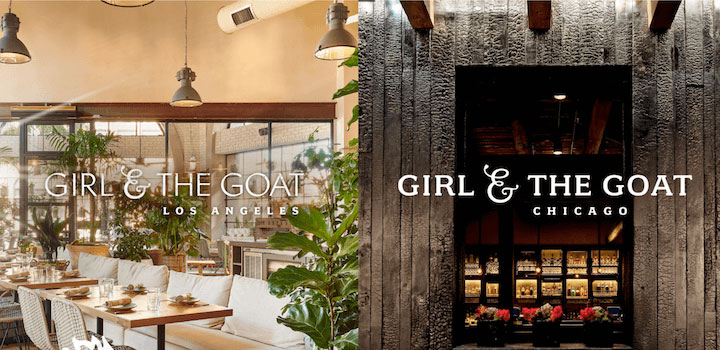
The interior of the Los Angeles location is light and airy with lots of natural sunlight and greenery. The Chicago location is darker and moodier with deep wood tones, black accents, and an ornate bar. The website features photos highlighting the appeal of each location’s ambiance, as well as the same delicious food.
Make sure your restaurant website design delivers
Your restaurant’s website is another element of your customer experience, so take advantage of that opportunity. You want to offer the same high-quality service, share the same information, invite the same ideal customers, and start forming that relationship right away.
The restaurant website design examples above offer tons of great ideas for inspiration, and a few repeat essentials. Here’s a quick run-down of the elements you should focus on to make sure your restaurant website as effective as possible:
- Clear location or locations
- Easy-to-access menu
- Appealing branding
- Contact information
- High-quality photos
- Reservation CTA
- Order online CTA
- Awards and press
The post 13 Brilliant Restaurant Website Designs to Copy in 2023 appeared first on WordStream.


Recent Comments