
It’s no question that Australia is one of the most visually stunning places on Earth.
And, for generations, Australian artists have embraced the continent’s colorful culture in their work.
When walking through a museum or historical location in Australia, you might find canvases covered with vibrant colors and energetic images that feel like they’re transporting you into an intense or action-packed scene.
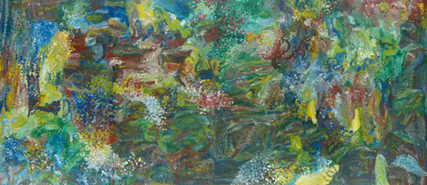
Take, for example, this 1994 painting by Emily Kame Kngwarreye, an Australian high-colorist artis. Here, the painter uses explosions of different colors to simulate the action-packed beginning of Earth.
But Australia’s colorful, energetic art aesthetic doesn’t stop at art museums. Today, it can be seen in architecture, graphic design, and online. In fact, many Australian brands exemplify the region’s immersive or eye-popping artistic techniques in web design and user experience.
Whether you’re an international marketer learning how to design a unique web experience for visitors around the world, or an Australian designer hoping to get a leg up on the local competition, we’ve compiled a list of nine stunning Australian company websites you can learn from.
Examples of Australian Websites
Vbreathe
Vbreathe, which sells a high-tech, compact air detoxification system for homes,leverages a full video experience on the homepage of its website.

When you enter Vbreathe’s site, you instantly see a silent video that uses animations and special effects to demonstrate how the detoxifier works. Then, when you click on the video’s overlaid play button, you enter a full-screen product demo video that explains how the product works and why consumers should consider it.
After viewing the silent or full-screen video, visitors can scroll down to find more text-based product details and links to content air detoxification.
All in all, Vbreathe’s site does a great job of combining stunning images, videos, and text-based content that educate visitors about in-home air quality and give them the information they need to justify making a purchase.
Kua Coffee
Kua Coffee pulls visitors into its website with an interactive homepage scale that simply asks, “How many coffees do you have a day?”
When you click an amount of coffee you drink on the scale and press “GO,” you’re sent through a slide show that calculates interesting measurements related to the amount of coffee you drink and explains where that coffee would be sustainably sourced from if you purchase brews from Kua.

Once you complete Kua’s slideshow, you can scroll through a page that informs you more about the impact of environmentally-friendly coffee brewing and where Kua’s ingredients are sourced from.
Kua Coffee’s site is a great example of how a brand can create an interactive experience that allows a visitor to think about how they use or consume a product, learn more about how that type of product is made, and find out why a particular brand’s product is better than its competition.
Slaven Torline
While some designers might find it difficult to create a memorable site around something as logistical as financial planning, Slaven Torline — an Australian firm that advises struggling companies — embraces whitespace and simple animations to create an intriguing, effective, and professional website.
On Slaven Torline’s homepage, all you’ll find a brief mission statement, an image with a sphere and a cube, and a headline asking “How can we help?”

When you hover over the sphere, you’ll see the word “Insolvency” appear with a few list items to the side explaining how the business can help. When you hover over the square, you’ll see something similar around the word “Restructuring.
When you click “Learn more” for either Insolvency or Restructuring, the page expands with the associated shape moving down to a lower corner. From there, the shape’s shadow will change based on where your mouse is moving, adding light interactivity to the page.
Overall, Slaven Torline’s a great example of how a corporate or B2B company with less visual offerings can still leverage a clever — yet professional — aesthetic to create a memorable, interesting, and smooth user experience for its visitors.
SeeMakePlay
SeeMakePlay is a company that coordinates and teaches arts and crafts to children in schools or at parties. When you visit the site, you’ll see a colorful SeeMakePlay logo surrounded by colorful animated characters. And, on the lower-right, you can click a color and a pencil icon which enables you to scribble all over the page and characters.

As you scroll down, you continue to see playful animations, testimonials, and images of happy children, as well as an explanation of how the business works. You can also find an inquiry form allowing you to learn more about the brand.
With SeeMakePlay’s website, visitors can experience the fun and excitement of arts and crafts at the top of the homepage, scroll to learn more about the business, and ultimately find out where and how to schedule a class when they reach the bottom. This is an excellent way to pull a visitor through the flywheel as the design attracts, engages, and delights them.
PacVac
PacVac, an Australian vacuum company, offers its homepage visitors a highly visual and somewhat interactive experience that highlights the major value points of its Velo vacuum cleaner.
When you enter the site, you see a simple image of a woman vacuuming her home. Then as you scroll, you begin to see product shots of the Velo, which pop in front of a white background.
Just when you think this is a standard product site, you might notice that the product shots are animated. For some of them, you can twist and move the Velo in different directions with a simple swipe of your mouse, allowing you to get an interactive 360-degree view of the product.

From there, the animations continue to get more advanced with each scroll. At one point you can scroll to see how each piece of Velo’s inner machinery works.

Essentially the home-page of this site feels like a self-paced, interactive video demonstration that shows a visitor everything they need to know about a vacuum without completely overwhelming them. The more you scroll, the more complex the details and animations get.
The progression of VacPac’s homepage content lines up well with the average buyer’s journey. When a prospect is doing initial research, they might just skim a site for light product information. But, as they get more serious about purchasing a product, they’ll look for a longer list of details and specifications before making an informed decision.
The Rocks Markets
The Rocks Markets is a retail and dining space in Sydney, Australia. While this business could easily place static food shots and basic information on its site and still get great foot traffic as a notable tourist destination, the web designers used the site to embrace color, video, and a sense of movement with each scroll.

When you land on the homepage, you can see that the background is a video of delicious foods from different vendors at The Rocks Market. As you scroll, you’ll continue to see photos and notice that the page navigation shrinks to give space to the beautiful food photography.
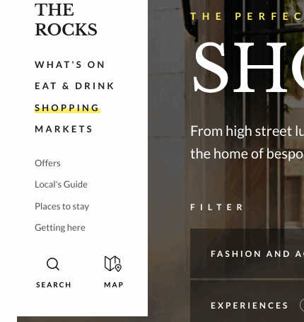
The Rocks Markets’ site is a great example of how a brand can highlight product videos and imagery, text-based content, a detailed navigation bar, and other information without making a homepage look too busy or overwhelming to understand. When visiting this site, you feel like you’ve learned almost everything you need to know about the Rocks Market, but still know exactly where to click if you have remaining questions before your visit.
Australian Shopping Sites
Boyd Blue
Boyd Blue is a women-fun ecommerce site and store chain that sells a wide range of Australian-made home products — from furniture to decor.
While many other sites on this list have amped up interactivity, Boyd Blue’s designers aired on the side of simplicity by focusing each web page’s format around large, high-resolution images of products in natural home settings.

Aside from its beautiful homepage, Boyd Blue’s website also features an ecommerce store with a design and UX that’s also simple and easy to navigate for quick, frictionless purchases:
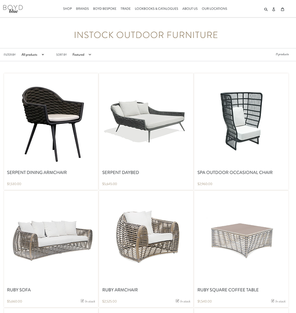
Rather than burying basic product shots in a page design with tons of descriptive text, the image-centered, light-text design allows users to get an accurate idea of what products will look like in real life, while also enjoying a smooth, aesthetically pleasing web experience.
Queen Garnet is an Australian brand that sells plum-based health and wellness products such as supplements, powders, and beverages.
Like a Queen Garnet plum, which has been dubbed a “queen of antioxidants,” the QueenGarnet.com’s homepage is purple, decorative, and uses regal-looking imager and fonts. When you enter the homepage, you’ll see a short, but memorable automatic video that presents one of Queen Garnets products in a castle with a moat surrounding it.

As you scroll down the homepage, you’ll see light animations that show each recent Queen Garnet product and basic information about it. With each product listing, visitors can click to buy it or learn more about it.
Visitors can also click to the Queen Garnet’s ecommerce shop, which has a similar purple aesthetic, and lists all of its products:
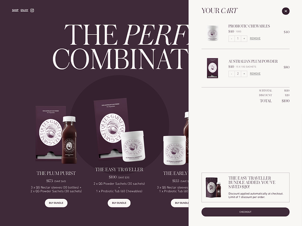
Queen Garnet’s site is a great example of how brands can benefit from light video, basic animations, and a consistent color and style aesthetic. The site’s royal-purple theme is not only fun and vibrant, but it could also be very memorable to visitors sifting through a handful of health and wellness sites for the perfect product.
Birdsnest
Birdsnest is an ecommerce clothing site that allows you to skim through product listings or get automated product recommendations based on your interests.
The ecommerce brand’s website design balances whitespace with colorful product shots to give off a simplistic, friendly, care-free aesthetic.

What’s most memorable about Birdsnest’s site is its user experience.
If you’re a first time visitor, you can browse products using search filters, or shop by categories including body type, occasion, and even personality. You can also answer a few questions about yourself and your clothing interests to generate a Style Profile that will help the website send you suggestions.
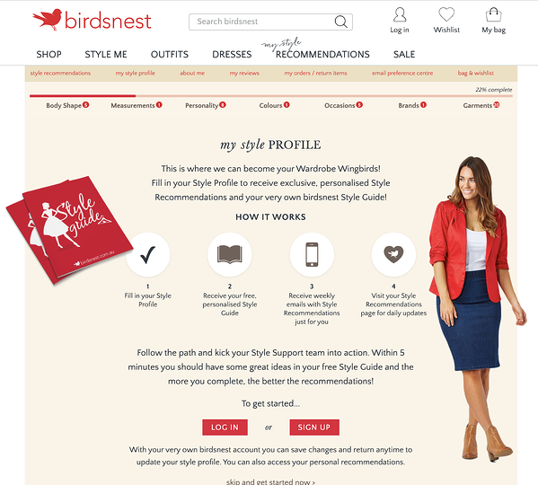
As you fill out your Style Profile, look at different products, or buy different outfits, the site will learn more about you and give you product suggestions in its Style Me section or through via an email subscription.
This is a great example of how designers and marketing teams can work together to create a highly-personalized shopping experience that can lead multiple groups of people with different interests to product purchases.
If you’re interested in building a website and design that does something similar, there are plenty of affordable ecommerce tools that can help businesses in any region with personalization and ecommerce recommendations. Check out this guide to learn more about them.
What Marketers Can Learn From Australian Web Design
Whether you’re in Australia or designing a website globally, the examples on this list have highlighted how brands can use color, video, and other elements to make their websites (and brands) seem memorable and unique to all visitors.
Here are a few techniques you can try leveraging:
- Immersive or Interactive Experiences: Many of the sites above drop the visitor into a video or interactive experience that makes navigating the homepage feel like an entertaining journey. These experiences not only engage the visitor, but they’re also memorable and allow prospects to easily digest lots of information about a brand in a short time.
- High-Resolution Imagery: All of these websites played up imagery, whether the graphics related to products or stirring up emotion. Regardless of the photo strategy, solid photos with great quality will be very memorable to your visitors.
- Vivid Color Schemes: While some websites on this list masterfully played with white space, all of the examples above had a design scheme that allowed colors related to their images or brands to stand out.
To learn more about designing the best website for achieving your brand’s awareness or sales goals, check out this guide. Already have a website? Click here for redesign tips. You can also download the free resource below for even more handy advice.
Recent Comments