At the beginning of 2021, I was tasked with an assignment: Create a pie chart showcasing which types of content performed best on the Marketing Blog in 2020.
The question was an undeniably important one, as it would influence what types of content we wrote in 2021, along with identifying new opportunities for growth.
But once I'd compiled all relevant data, I was stuck — How could I easily create a pie chart to showcase my results?
Fortunately, I've since figured it out. Here, let's dive into how you can create your own excel pie chart for impressive marketing reports and presentations. Plus, how to rotate a pie chart in excel, explode a pie chart, and even how to create a 3-dimensional version.
Let's dive in.
How to Make a Pie Chart in Excel
1. Create your columns and/or rows of data. Feel free to label each column of data — excel will use those labels as titles for your pie chart. Then, highlight the data you want to display in pie chart form.

2. Now, click “Insert” and then click on the “Pie” logo at the top of excel.
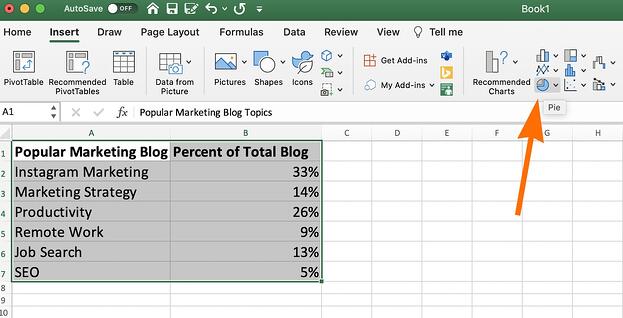
3. You'll see a few pie options here, including 2-dimensional and 3-dimensional. For our purposes, let's click on the first image of a 2-dimensional pie chart.
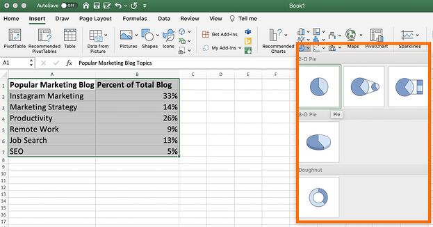
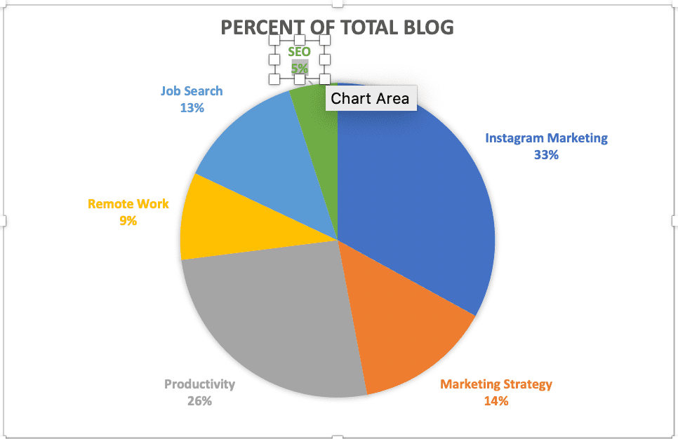
4. And there you have it! A pie chart will appear with the data and labels you've highlighted.
If you're not happy with the pie chart colors or design, however, you also have plenty of editing options.
How to Edit a Pie Chart in Excel
Background Color
1. You can change the background color by clicking on the paint bucket icon under the “Format Chart Area” sidebar.
Then, choose the fill type (whether you want a solid color as your pie chart background, or whether you want the fill to be gradient or patterned), and the background color.
Pie Chart Text
2. Next, click on the text within the pie chart itself if you want to rewrite anything, expand the text, or move the text to a new area of your pie chart.
Pie Chart Border
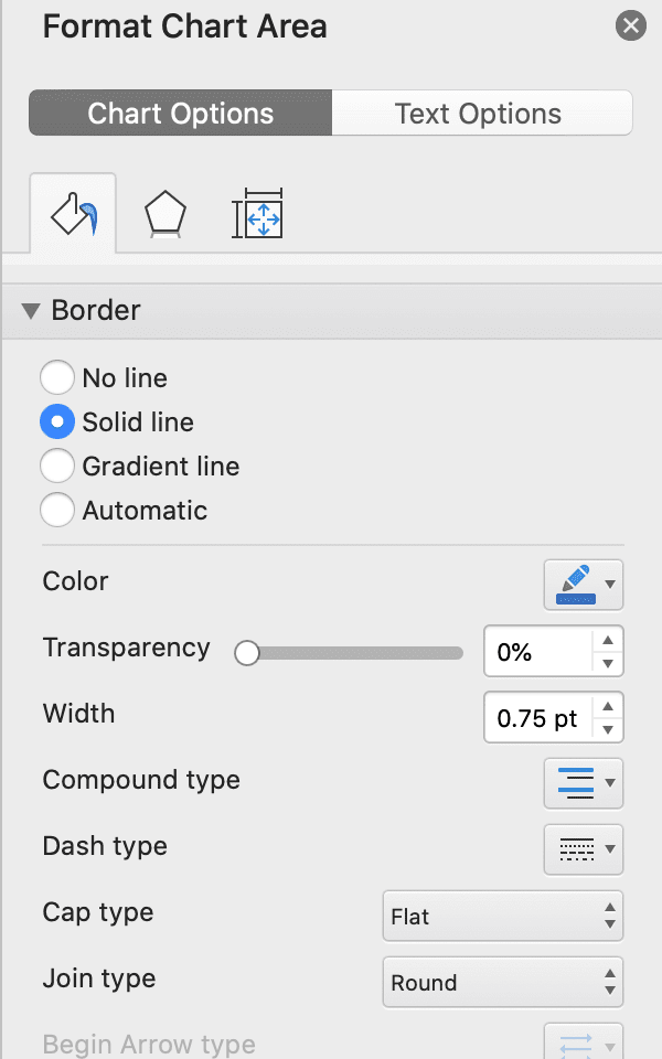
3. Within the Format Chart Area, you can edit the border of your pie chart as well — including the border transparency, width, and color.
Pie Chart Shadows
4. To change the pie chart box itself (including the box's shadow, edges, and glow), click on the pentagon shape in the Format Chart Area sidebar.
Then, toggle the bar across “Transparency”, “Size”, “Blur”, and “Angle” until you're happy with the shadow of your pie chart box.
Pie Chart Colors
5. Click the color paint palette, at the top left of excel, to change the colors of your pie chart.
Excel offers a range of complementary colors — including a few presets under “Colorful”, and a few presets under “Monochromatic”. You can click between the options until you find a color palette you're happy with.
(Alternatively, if you want to change the colors of your pie chart pieces individually, simply double click on the pie chart piece, toggle onto the paint section of the Format Chart Area, and choose a new color.)
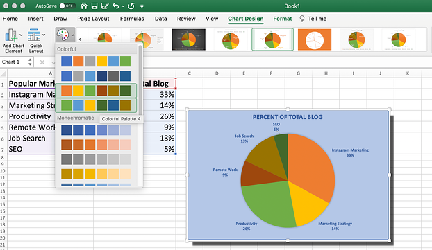
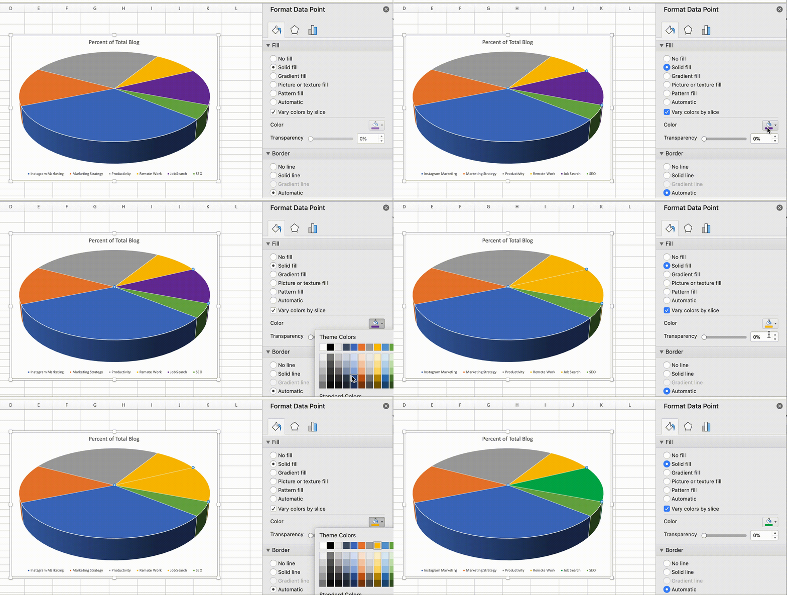
Chart Title
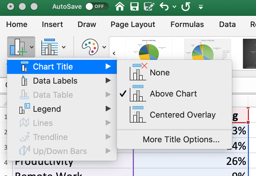
6. Change the chart title by clicking on the three bars graph icon in the top left of excel, and then toggling to “Chart Title > None”, “Chart Title > Above Chart”, or “Chart Title > Centered Overlay”.
Change Location of Data Labels
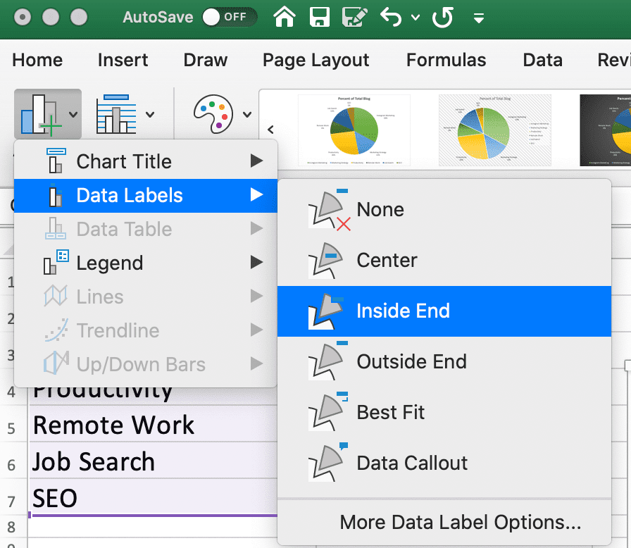
7. On the same three bar graph icon, click “Data Labels” to modify where your labels appear on the pie chart. (For instance, do you want the pie chart pieces labelled in the middle of each pie chart portion, or on the outside?)
Switch Row/Column
8. If you'd prefer to switch which data appears in the pie chart, click “Switch Row/Column” to see alternate information aligned from your original data set.

How to Explode a Pie Chart in Excel
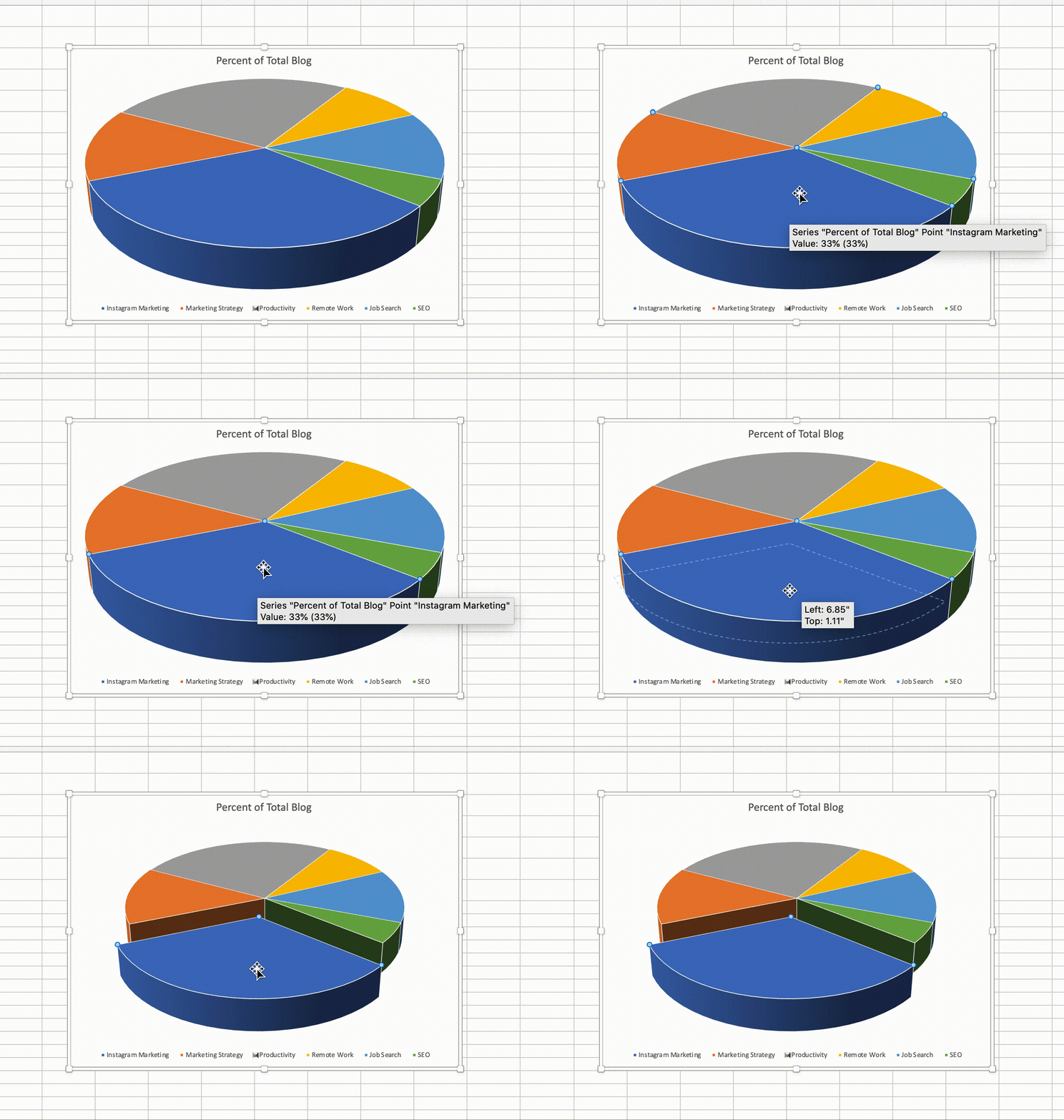
1. To explode a piece of your pie chart (which can help you emphasize or draw attention to a specific section of your pie chart), simply double-click on the piece you want to pull away.
Then, drag your cursor until it's the distance you want it, and you're all set!
How to Create a 3D Pie Chart in Excel
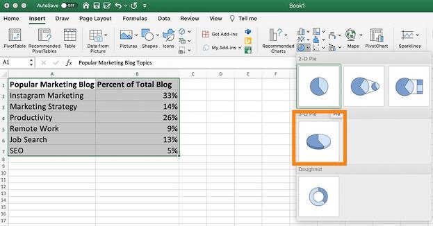
1. To create a 3-dimensional pie chart in excel, simply highlight your data and then click the “Pie” logo.

2. Then, choose the “3-D Pie” option.
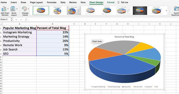
3. Finally, choose the design option you like at the top of your screen.
How to Rotate a Pie Chart in Excel
Finally, to rotate your pie chart, double-click on the chart and then click on the three-bar icon under “Format Data Point”.
Then, toggle the “Angle of first slice” until you've rotated the pie chart to the degree you want.
And there you have it! You're well on your way to creating clean, impressive pie charts for your marketing materials to highlight important data and move stakeholders to take action.
Ultimately, you'll want to experiment with all of excel's unique formatting features until you figure out the pie chart that works best for your needs. Good luck!

![Download 9 Excel Templates for Marketers [Free Kit]](https://localseoresources.com/wp-content/uploads/2021/04/9ff7a4fe-5293-496c-acca-566bc6e73f42.png)


Recent Comments