Product images can make or break your online shop’s success. You can hire the best designer in the world to create a killer design, but when images are bad, sales will be bad. It’s the first thing a customer will look at. In this post, we’ll go over a number of things you need to consider when adding product images to your e-commerce site.
Table of contents
The importance of good images
Over the years, there’ve been many studies that show the online consumer values high-quality product images. Customers trust credible online stores to have a way to view or experience the product online. They want to see product in all available colors and from all different angles. Online shoppers can’t touch the product so they have get everything they need from your description, images and videos. So, they better be good!
And in the year of the pandemic, the surge in online shopping has made it shoppers even more aware of good product information and images. With shops closed, they need to be able to see your products in the best light on your site.
Recent research from Periscope (a McKinsey brand), shows that many shoppers make the move to online for the first time. What they value most is good product descriptions and clear images.
“The need for informative product descriptions and clear product images at a time when consumers couldn’t see, feel or test products in a store ranked as one of the top three factors for a great online browsing experience in all the countries we surveyed, increasing in importance by 12 to 23% from pre- to post-shutdown.”
Not just for people, but for machines as well
Today, great images aren’t just consumed by people but machines as well. Increasingly, search engines and other platforms can ‘read’ images to make sense of what’s on them. As a result, they can provide you with a search result. So, you could take a photo of a cool pair of shoes your friend bought and have the search engine tell you where they came from and what they cost. Or, they can do a live translation of a road sign in a foreign language. This is called visual search — and it’s gaining speed!
The technology for this is getting better by the day and machines can read evermore complex images. But here, again, clear images of high-quality is increasing the chance of a machine understanding the image.
Product images set a mood
Product images are a big part of every type of online store. But sometime, you find e-commerce site with big images that just don’t do justice to the products the company sells. The images of the featured products simply don’t ‘pop’. If you want to stand out for the thousands of other stores, your photography needs to do that as well.
One of the things you could try is to use photos of people using the product. Or the product in use. It doesn’t matter if you sell coffee machines or dresses. If you add people, your product will look friendlier and people will see themselves using your products.

In the photo above, we’ve combined two images of the same bed to demonstrate what you can do with your photos. See the difference? That Ikea bed is much more appealing when it appears in a room — you can easily imagine how it will fit in your own room. Ikea does an awesome job in this, both in their magazines, on their website and in their stores. Product images like this are becoming more and more common, so be sure you’re not the last one to do this!
Using product images with the products in use works best, because people will be able to see themselves using that product. It’s as close as you can get to an in-store experience. People want to buy the product online, but an image will never replace picking a product up, looking at it from all angles or trying it on. We need to try to give our customers that same experience. You can even add small videos to present your products in another way, or to demonstrate certain features.
Quality of your product images
It seems so obvious to use high quality images. But we have been telling you to reduce the file size for years, right? First of all, that doesn’t mean you have to use a crappy, blurred image of just a few kBs. The tools mentioned in our image SEO article don’t reduce the quality of an image, for instance. They remove meta / Exif data and things like that, but your image will still look awesome. Plus, browsers can now work with a number of new image formats (like WebP) that provide drastically better quality images at a smaller size. And WordPress can now lazy load your images, so your site won’t load all the images at once — making it appear faster.
Also, internet connections are still getting faster. In many countries, broadband internet is everywhere. That also means people’ll have less difficulties downloading your larger product image files. You’ll need larger images anyway, as that leads us to another necessary feature of online shops: ability to zoom product images.
Ability to zoom
Have you ever picked up a backpack or daypack to inspect the lining? Is it waterproof, does it protect your stuff well? You want to be able to take a closer look at details. That’s what zooming product images is for. But, it’s so annoying when the zoomed image is exactly the same size (or even smaller) than the product image that was already shown. This still happens frequently! A lot of online shops simply import product images from manufacturers (or even download them from other shops that sell the same product) without testing the image first. This ruins user experience.
If there is no proper product image available, create one. Even your iPhone’s camera can provide you with a decent, large image that can serve as a zoomable product image. If you want to DIY your photography, Shopify has a great guide that’ll help create great photos for your online store.
If we look at image sizes, Shopify‘s guide on product images states:
Your product and collection images can be any size up to 4472 x 4472 px, or 20 megapixels. Product and collection images need to have a file size smaller than 20 MB to be added to Shopify. High resolution photos look more polished and professional to your customers. For square product images, a size of 2048 x 2048 px usually looks best
Woocommerce states that the minimum dimensions should be 800×800 pixels. That seems to make sense, as it will perfectly fit most tablets as well without any problem. Smaller will lead to distortion, and we have established you want quality images, right?
Any color you want as long as it is black
Henry Ford wrote in his autobiography “Any customer can have a car painted any color that he wants so long as it is black”. Times have changed. Today, you can get your products in many, many colors. Of course, you need people to show all the different color options in the same way as your ‘main’ color variant.
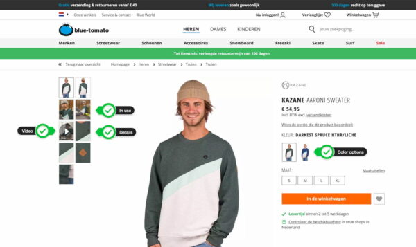
Bottom line: if you want to buy a blue sweater, you want to be able to see that sweater in that color. Clothing stores like Blue Tomato do this, by not just showing colored squares, but a thumbnail of the product in another color:

Especially for products that consist of one main and a few other colors, this works really well.
Alternate views or products
You want to be able to look at a product from all angles. Let’s look at that Blue Tomato example again. It shows that sweater being used, from the back and front, plus some details. You can really check the sweater from multiple angles.
If you are looking for furniture online, you want to check that chair from multiple angles as well. You want alternate views for the kitchen appliances, even though you’ll hide the dish washer behind a cabinet panel. And let’s take a closer look at the fabric of those drapes, or the back cover of that book. Again, it’s all about replacing the in-store experience.
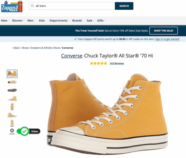
Zappos does all that and adds a video of (in this case) an employee telling you more about the product itself:

The way that shoe is bent and rotated makes that you really ‘feel’ what kind of shoe that All Star is, so to say.
To wrap things up
If you have an online business selling actual products, you need to make sure to optimize your product images. Your customer will most definitely appreciate that. Make sure to:
- use high quality images;
- add an option for zoom;
- make sure to show the product in all available colors;
- provide alternate views of the product.
These are the main things to take into account when optimizing your shop’s images. We trust this article will make you rethink your own product images, or make you realize you are actually doing a pretty nice job!
Read more: Optimizing images for SEO »
The post Optimize product images for your online store appeared first on Yoast.


Recent Comments