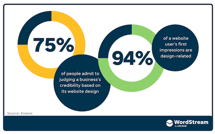
Did you know that 75% of people admit to judging a business’s credibility based on its website design? Or that 94% of a website visitor’s first impressions are design-related?
Needless to say, an attractive and modern website should be a top priority for your business in 2022. And lucky for you, we’ve got 10 ideas and examples to inspire you based on the trends of this year.
10 website & graphic design trends to follow in 2022
Use these 10 website and graphic design trends to get idea and inspiration for your website, business branding, and other marketing collateral this year and beyond.
1. Illustrations & doodles
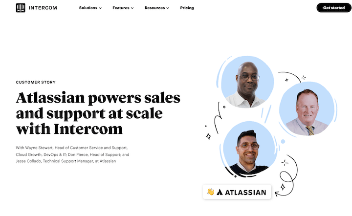
If you haven’t noticed, more brands are using hand-drawn illustrations like arrows and squiggly lines on their sites. These simple elements add a touch of movement and a friendly feel .
2. Big typography & contemporary Serifs
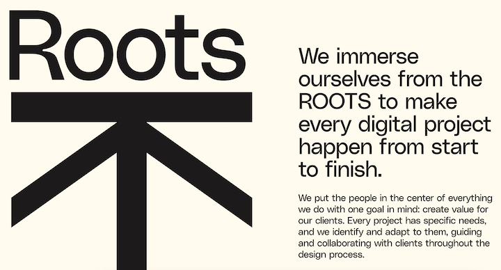
Big and bold typography is stealing the spotlight everywhere. These authoritative fonts create emphasis on key messaging and help set the page’s visual hierarchy. Sometimes the words become more of a graphic element themselves.
3. Vintage design
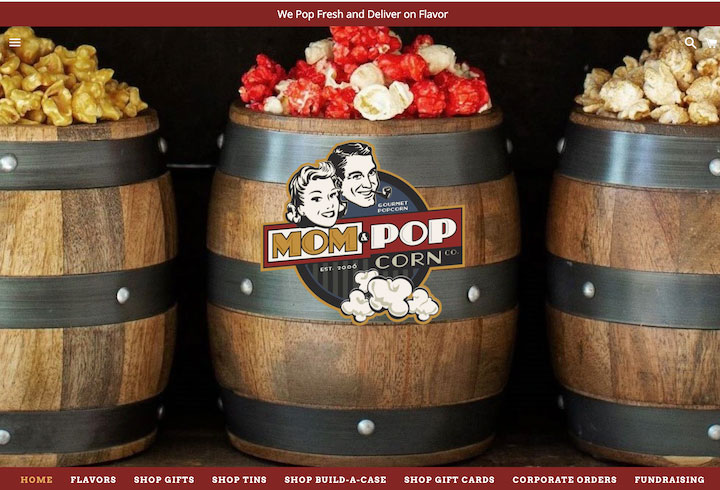
Vintage and retro styles have been trending for some time, and we’re seeing more and more of it in branding and websites. These styles evoke nostalgia and positive emotions, helping your brand connect on an emotional level with your audience.
4. Flat icons
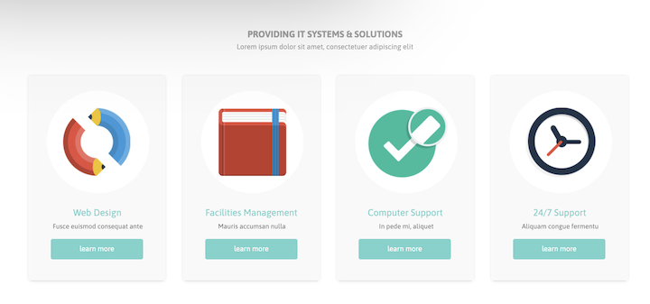
Many websites and apps are shifting over to flat design principles to simplify and modernize their user interfaces. Rather than using Flat design uses fewer colors and simple shapes to convey an image rather than complex shading.
Is your website doing the job? Get a fast, free audit with the LOCALiQ Website Grader and find out.
5. Complex gradients
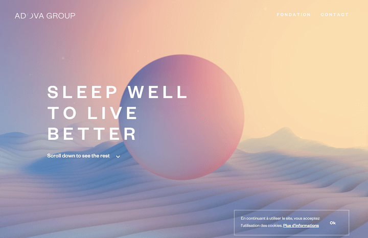
Interestingly enough, complex gradients are trending alongside flat design. They offer a nice complement to the simplicity of flat icons. Gradients are transitions from one color to another, whether it’s monochromatic (light to dark blue) or one color to another (yellow to green). They create visual interest, add depth, and shift focus across a screen, which makes them versatile for use anywhere on a website—whether as a background or CTA button. It’s also one of the landing page trends for 2022.
6. Subtle motion
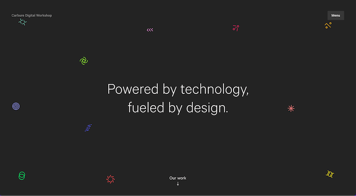
Subtle motion is popping up everywhere on websites. Rather than real or animated videos, elements appear like they are floating in space or show a slight shift or bounce when hovered over or reached. Subtle motion can be applied to backgrounds, buttons, icons, headings, and more to help keep visitors engaged.
You can also create interactive designs like Carbure’s website below, where users can drag & drop the objects on the page.
7. Early aughts
This is another form of retro and nostalgic website design, this time focusing on the early 2000’s. In fact, TikTok has more than 2 billion views for the #Y2K aesthetic—even Gen Z is tuned into this style.
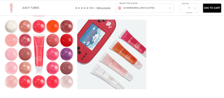
Lancôme relaunched their early 2000’s staple Juicy Tubes last year, with genius social media pics that featured a hot pink Game Boy console.
You don’t have to be revamping an old product to benefit from nostalgia, however. Any campaign can incorporate retro references whether it’s a 70s font, 80s icons, or 90s neon. Nostalgic aesthetics lend themselves to social media campaigns but can be used across other channels and touchpoints too.
8. Inclusivity & accessibility
This is a broader 2022 digital marketing trend where businesses are incorporating more accessibility and inclusivity into their marketing collateral—websites included.
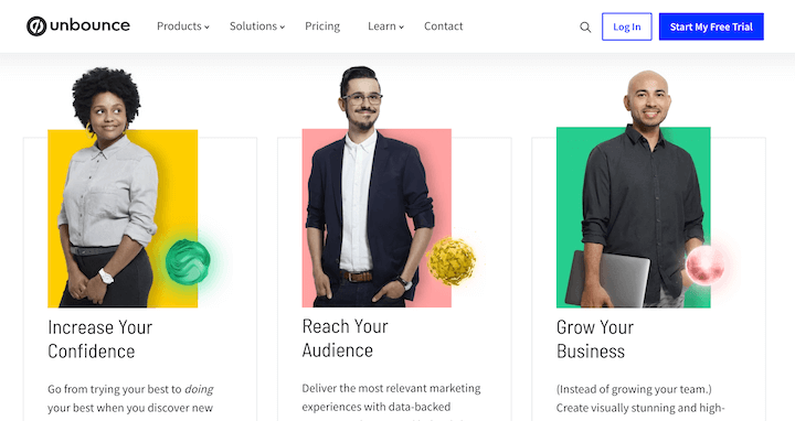
When we think of inclusivity in imagery, we usually think of people—but you can also represent different incomes and lifestyles with your backdrops and settings. And we’ll continue to see more alignment with accessibility best practices.
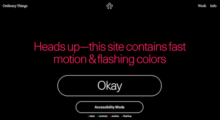
A seizure-friendly warning for the Office of Ordinary things website.
9. Real images combined with graphics & illustrations
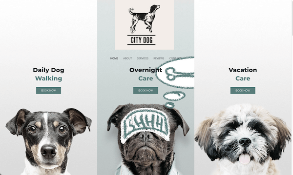
There are images all over the internet, so how can you make yours stand out? The current trend is to overlay and overlap illustrations and graphics to give them a playful and active feel.
10. Interactive content
Interactive content is nothing new, but what is relatively new is that it’s not just for cutting-edge websites or complex data visualization. In the website shown above, illustrations appear over each dog as you hover over them. As the mainstream gets more access to interactive content tools, we’ll be seeing more decorative interactive elements.
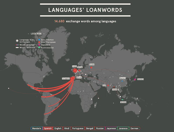
And data visualization will continue to evolve. In the example below, you can hover over a language to see where terms have been adopted and naturalized elsewhere.
Go to this data visualization.
Incorporate these website design trends into your content strategy
The creative designs in this post can be used for not only your website, but also your emails, social media posts, events, and other elements of your content marketing strategy. Whether that’s a nod to nostalgia, a friendly doodle, or a complex data visualization, you can stand out from your competitors and have fun while doing it!
To recap, here are the 10 website design trends to take advantage of this year:
- Illustrations & doodles
- Big typography & contemporary Serifs
- Vintage design
- Flat design
- Complex gradients
- Subtle motion
- Early aughts
- Inclusivity & accessibility
- Real images combined with graphics & illustrations
- Interactive content
The post 10 Website & Graphic Design Trends to Stand Out in 2022 appeared first on WordStream.



Recent Comments