Hosting a webinar is an excellent way to connect directly to your audience, raise awareness for your brand, and establish your organization as an expert in its field. According to Zippia, 73% of B2B webinar attendees become qualified leads while 20%-40% of B2C attendees become leads. With that said, one way to attract audiences to your webinar is to have a good webinar landing page.
A webinar landing page gives audiences a first impression of the quality of your webinar. Designing a webinar landing page can seem daunting. Fortunately, there are many outstanding webinar landing page examples online that can give you some inspiration.
Webinar Landing Page Examples
To help you craft the perfect landing page for your webinar, I've gathered 20 examples from various companies.
1. Slack
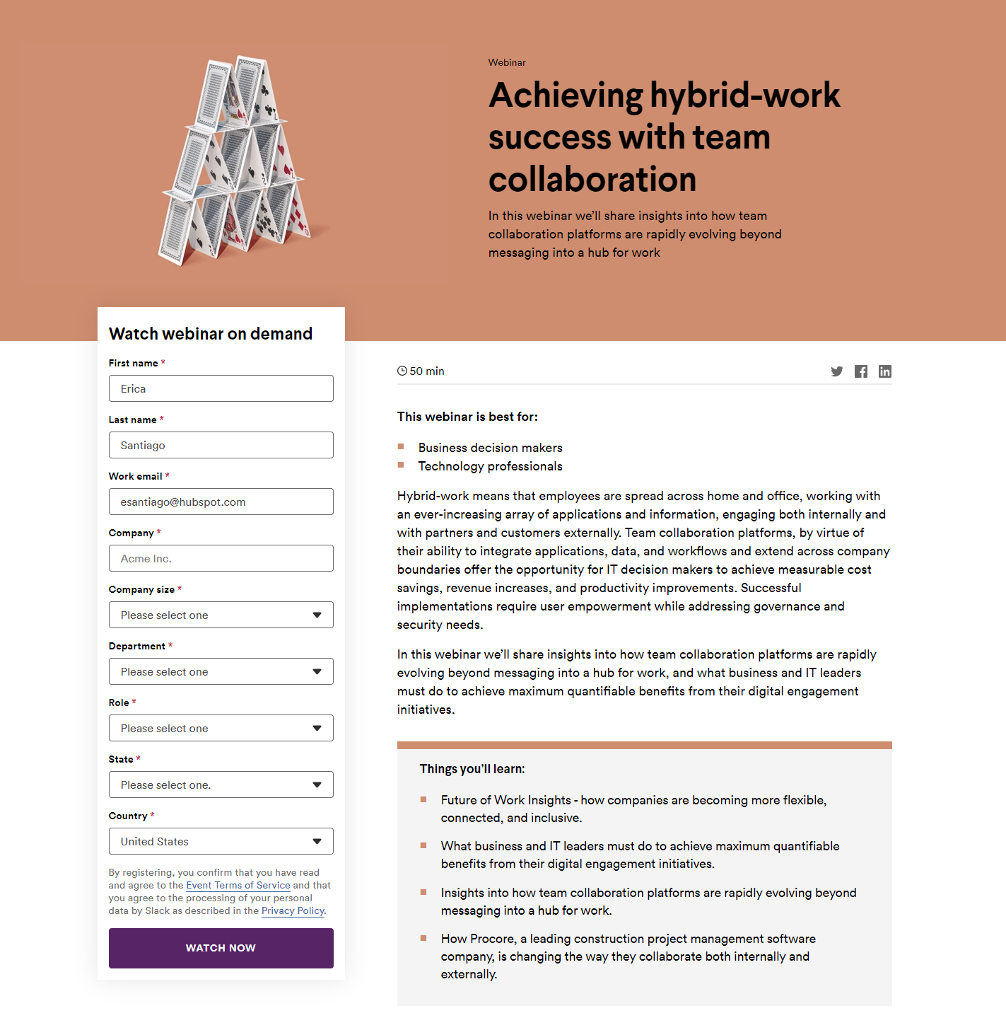
This webinar landing page is minimalist and straightforward while featuring an interesting image that corresponds with the topic. If you scroll down, you'll find a paragraph that clearly states the purpose of the webinar and who benefits from tuning in. To the left of the paragraph is an easy-to-fill-out registration form that further enforces the fact that the webinar is meant for business professionals.
The landing page is also easy to share with others thanks to the social media buttons featured above the paragraph.
2. CXL
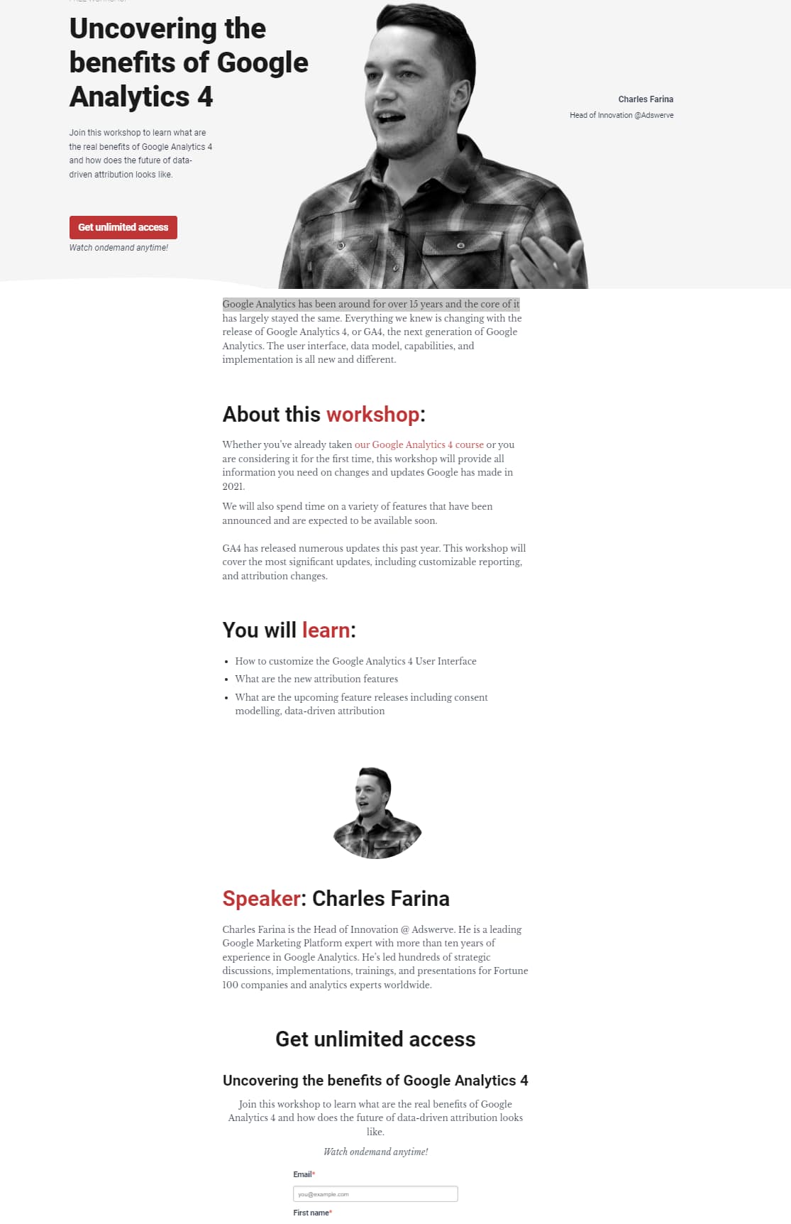
CXL's webinar landing page features multiple calls to action:
- “Join this workshop to learn what are the real benefits of Google Analytics 4 …”
- “Get unlimited access”
- “Watch on demand anytime”
These CTAs concisely explain the point of the webinar and persuade visitors to register and tune in. The “About This Workshop” and “What You'll Learn” sections give better context around the topic.
The registration form is also simple and doesn't require a lot of information — just the visitor's first name, last name, and email address.
3. Google
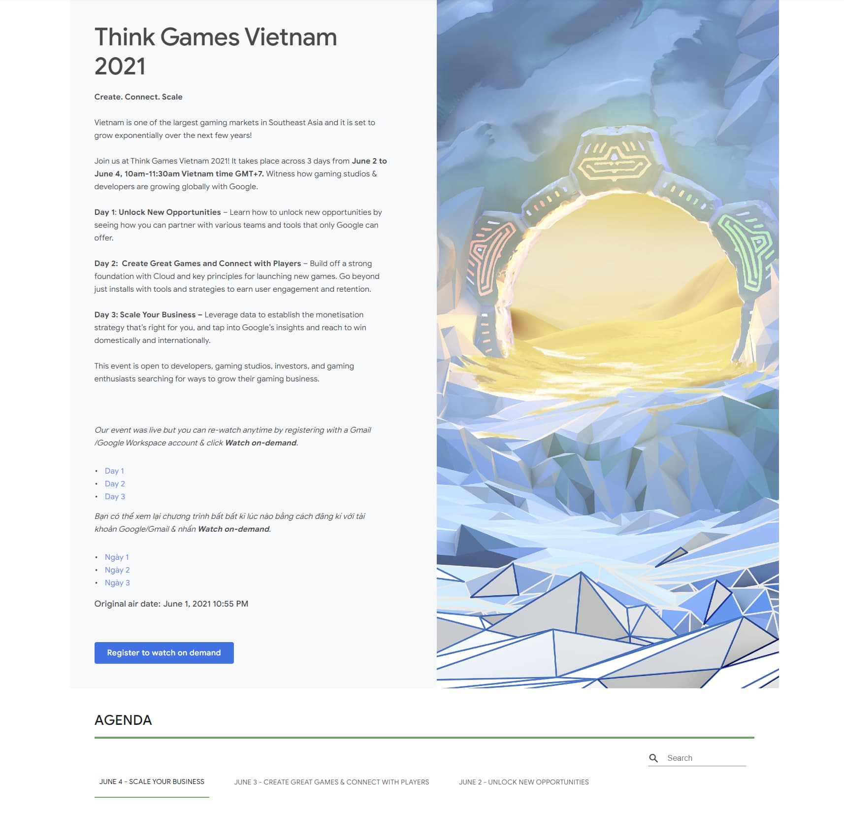
The colorful illustration captures the visitor's attention, and the copy is easy-to-read thanks to the bold headlines and detailed paragraphs. The CTA button also encourages visitors to view the recorded webinar.
4. HealthCheck360
This webinar landing page gets straight to the point by immediately having the registration scaled large against a dark background.

5. Salesforce
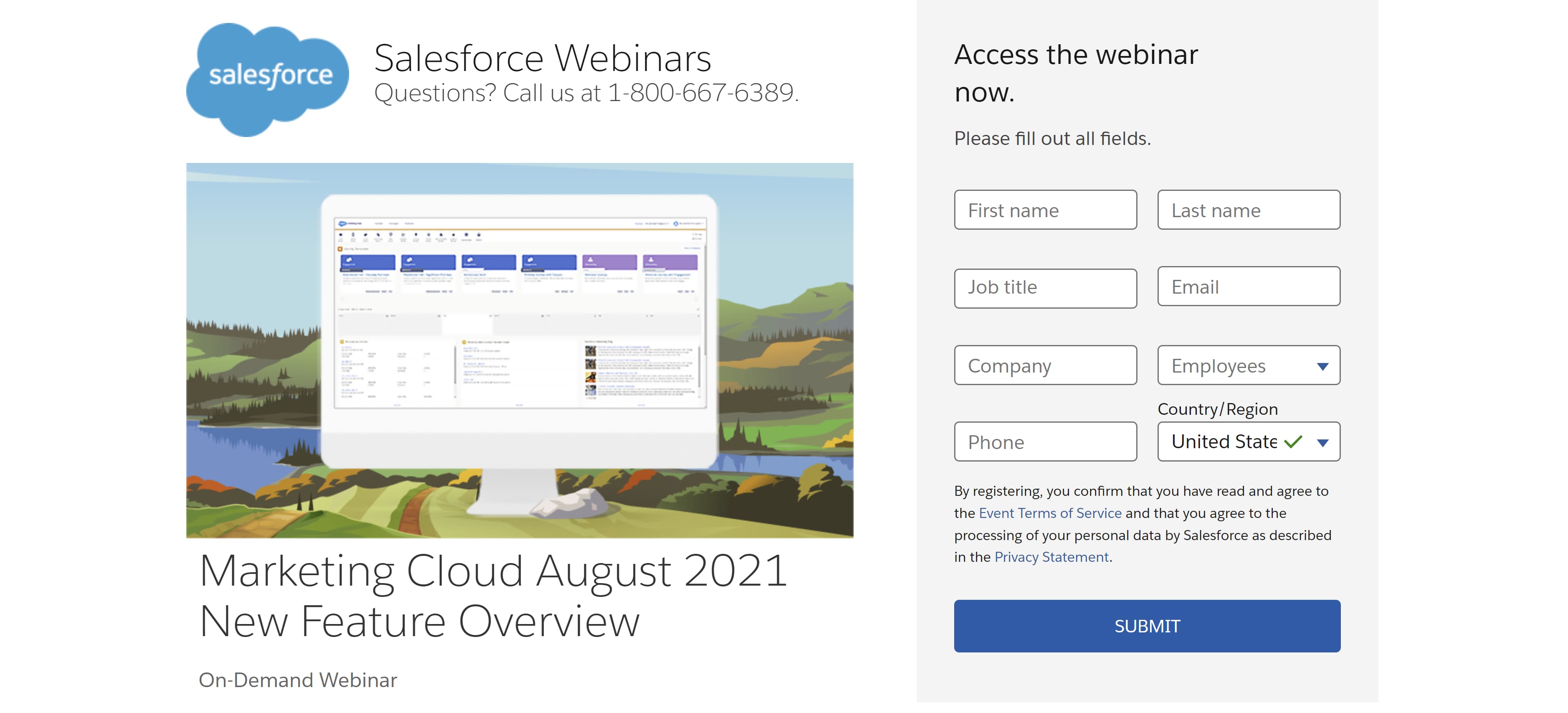
Salesforce uses big bold lettering for its headlines and hotline. Its registration form also features a call to action at the top. Combined with the unique image to the right of the form, this landing page is both visually appealing and easy to navigate.
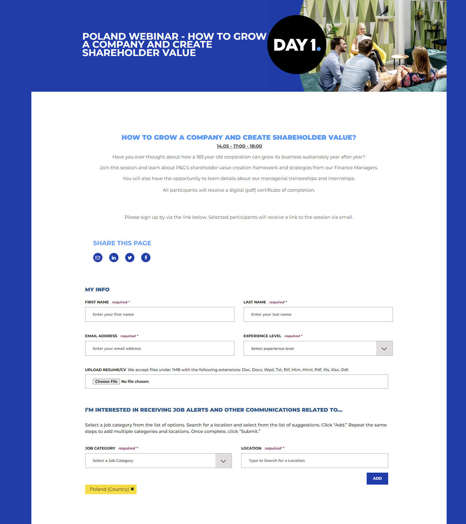
6. P&G
The topic of the webinar is emphasized by the bold white text against a blue background. The professional tone of the webinar is further made clear by the corresponding image of what appears to be a meeting. The web copy above the registration form explains the key takeaways of the webinar.
The landing page also features a section under the registration that encourages visitors to sign up for job alerts and forms of communication.
7. ThoughtSpot
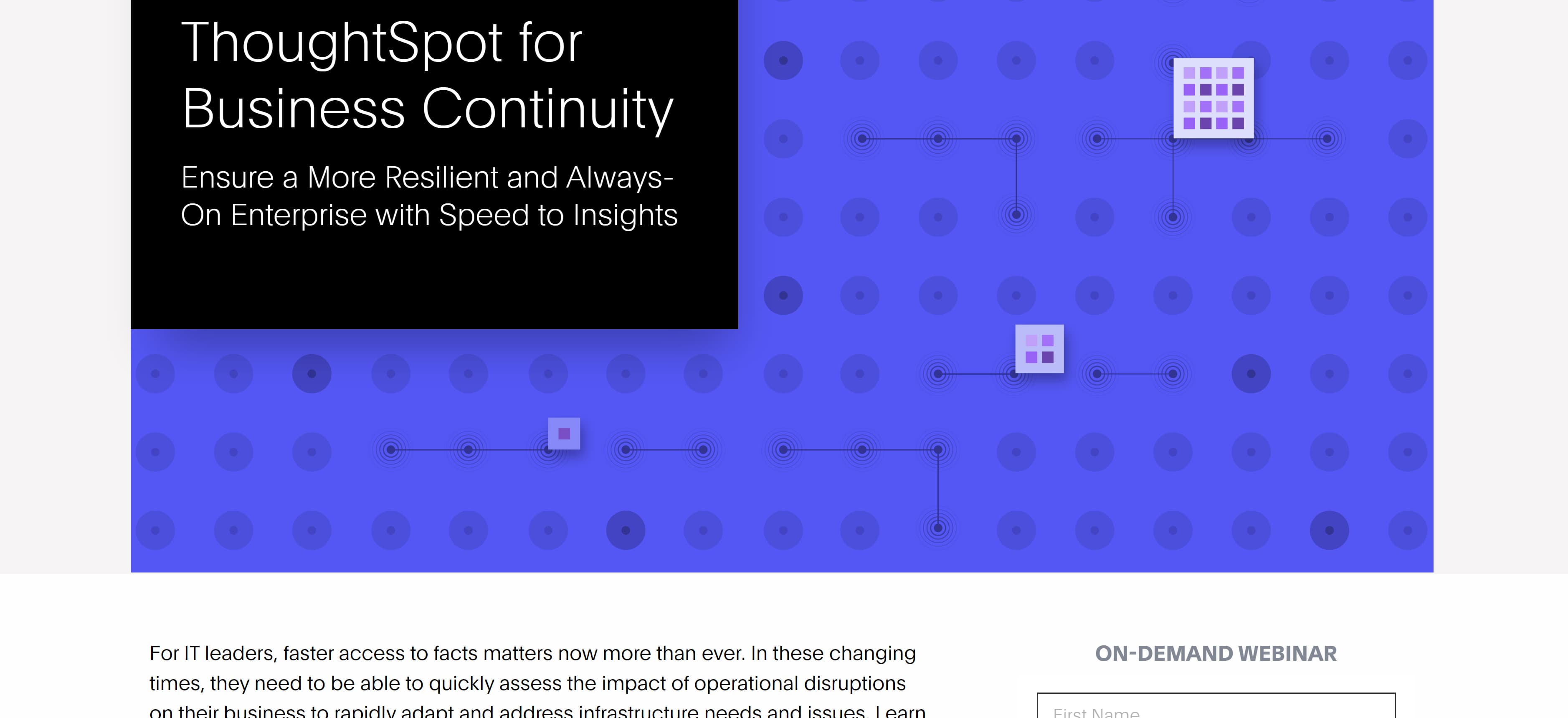
ThoughtSpot keeps the landing page for its webinar clean and organized with bold lettering over a geometric image.
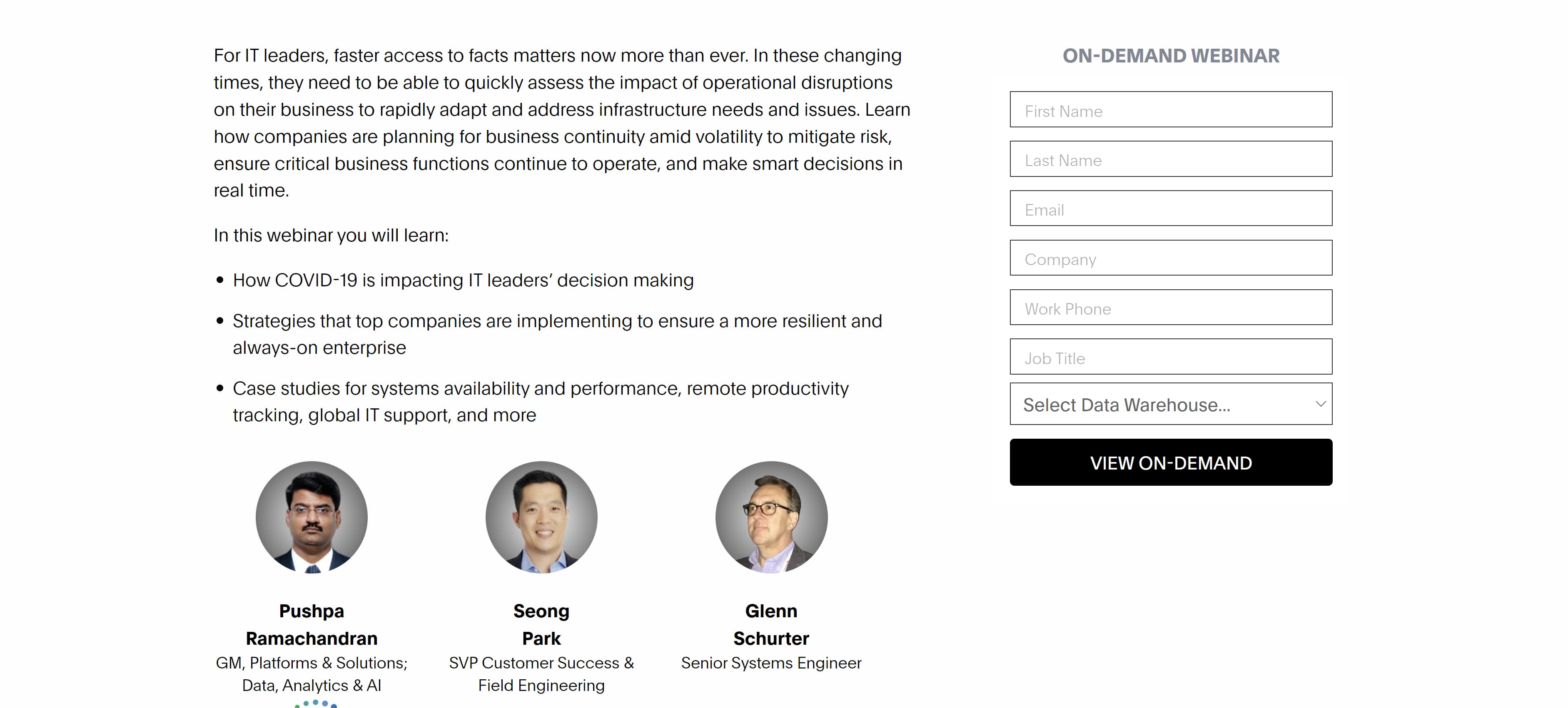
 The paragraph below includes everything visitors need to know about the webinar and its purpose. Even better, below the paragraph are images of the webinar speakers and their roles in the company to lend credibility.
8. Alibaba
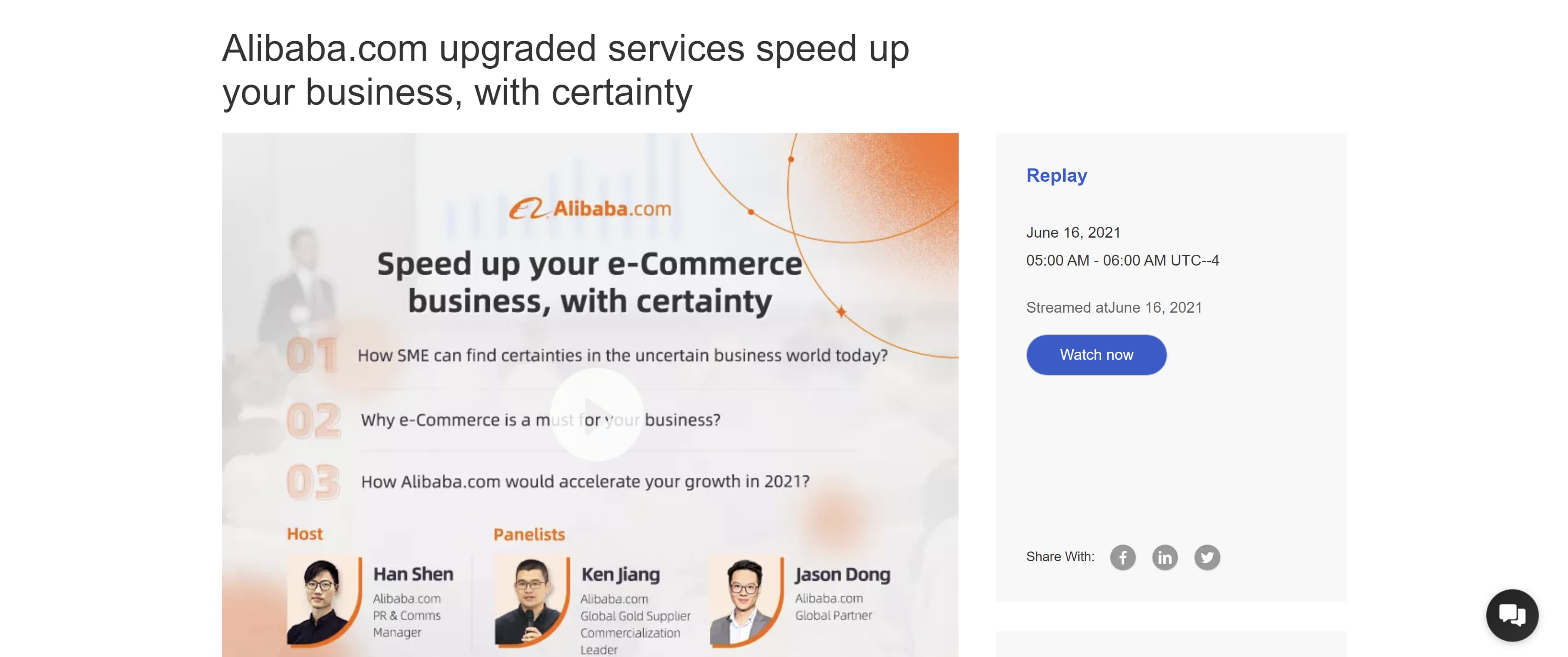
Alibaba's webinar landing page features a video and a CTA button encouraging visitors to watch the recorded webinar immediately.
9. LinkedIn
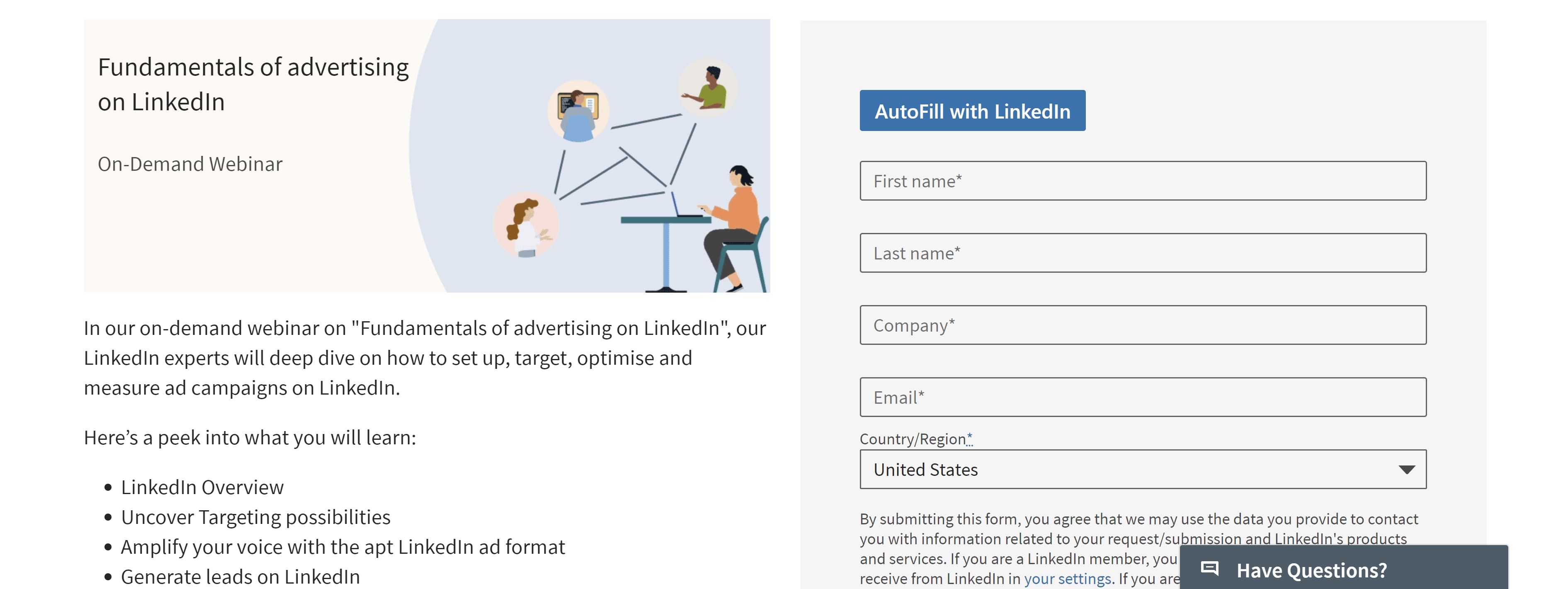
This landing page prioritizes simplicity and ease by featuring a bulleted list of key takeaways from the webinar and allowing LinkedIn members to easily autofill the registration form.
10. Zoom
This landing page shows Zoom hosts regular webinars five days a week at specific times, and there are several points on the page where those who are interested can register.

11. Schneider Electric
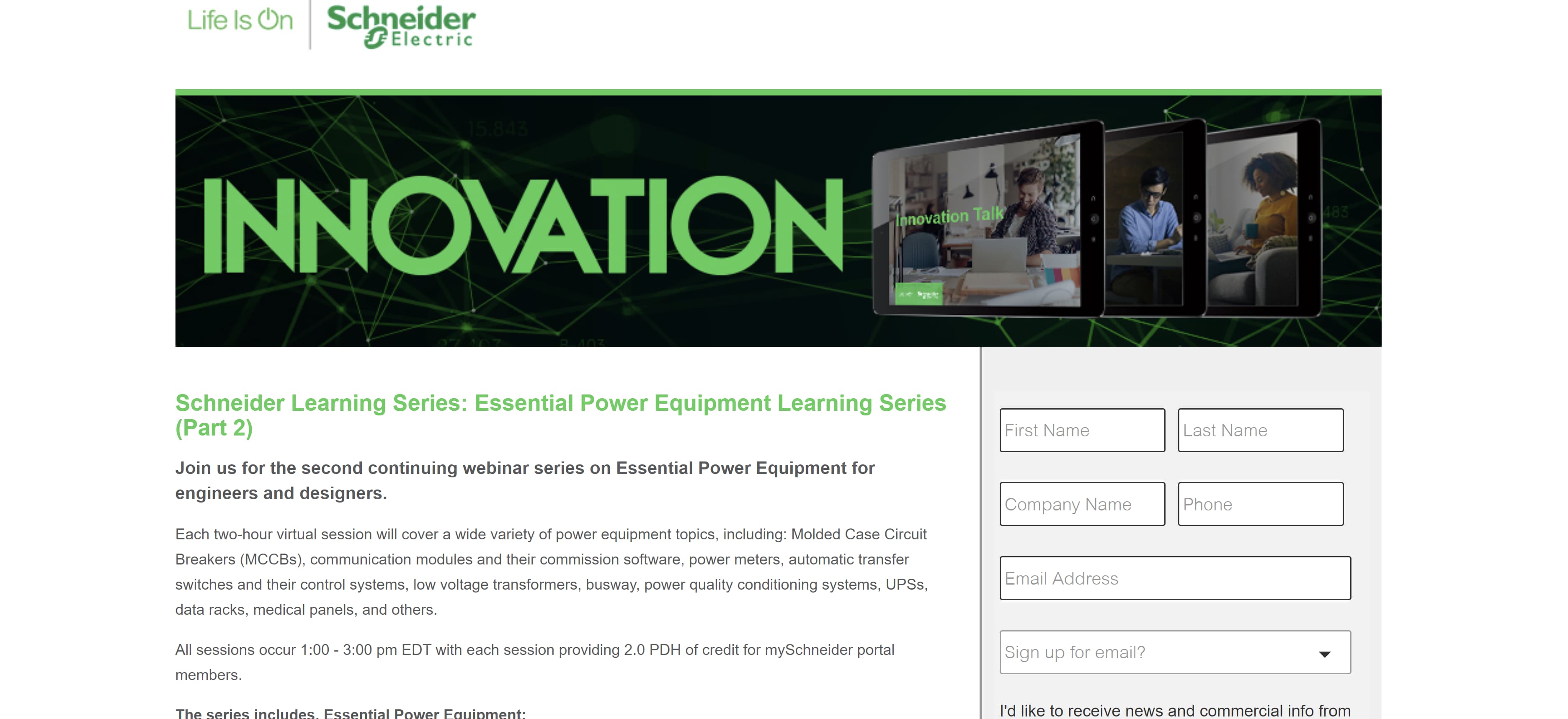
Schneider Electric uses a bold graphic with the word “Innovation” in big, bold green letters against a green background. Below the image is the headline, which stands out thanks to its bright green lettering. Registering is easy and even allows visitors to pick the specific sections of the webinar they are interested in viewing.
12. Airbnb
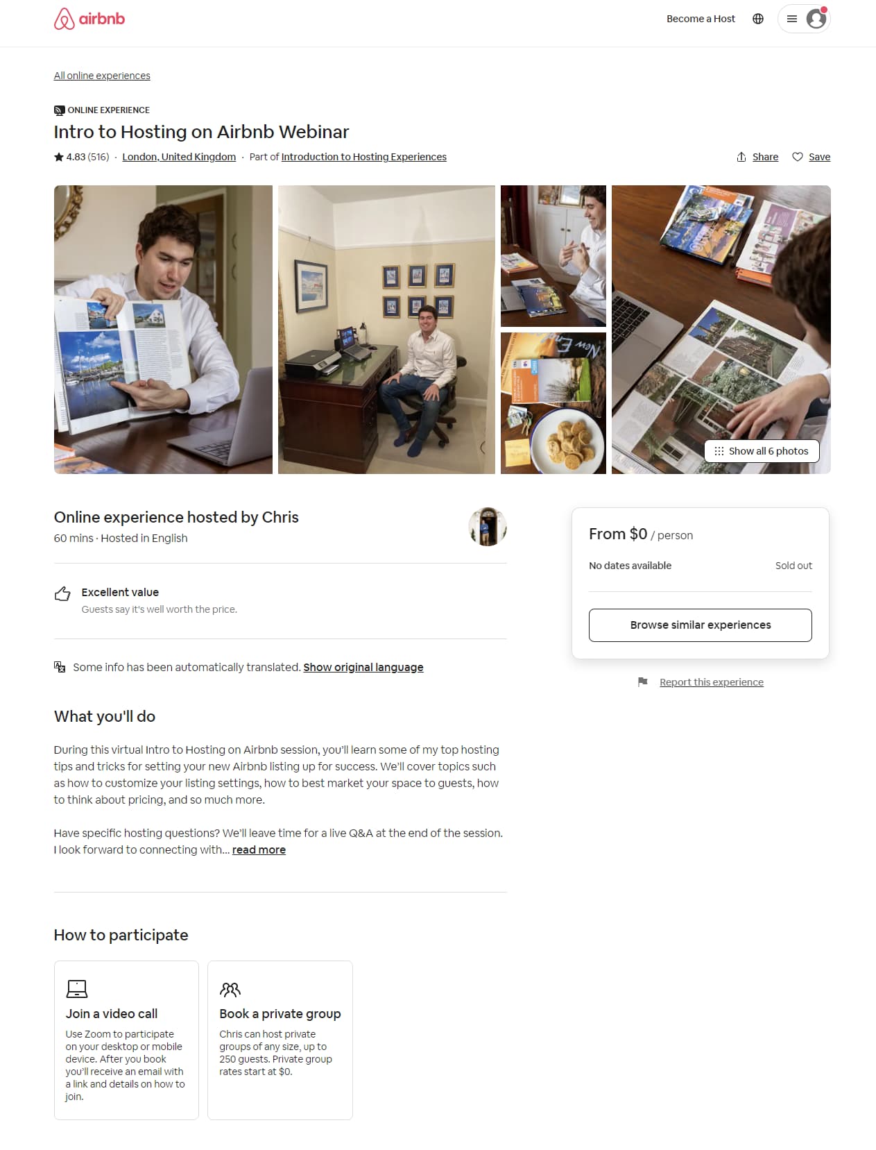
Airbnb uses multiple images to catch visitors' attention. It also tells visitors the webinar is about 60 minutes long, which will allow viewers to set aside the time needed to watch and take notes. Though this webinar is sold out, the page is still valuable to visitors because it features a CTA button that will take them to similar events being held on the website.
13. Bosch
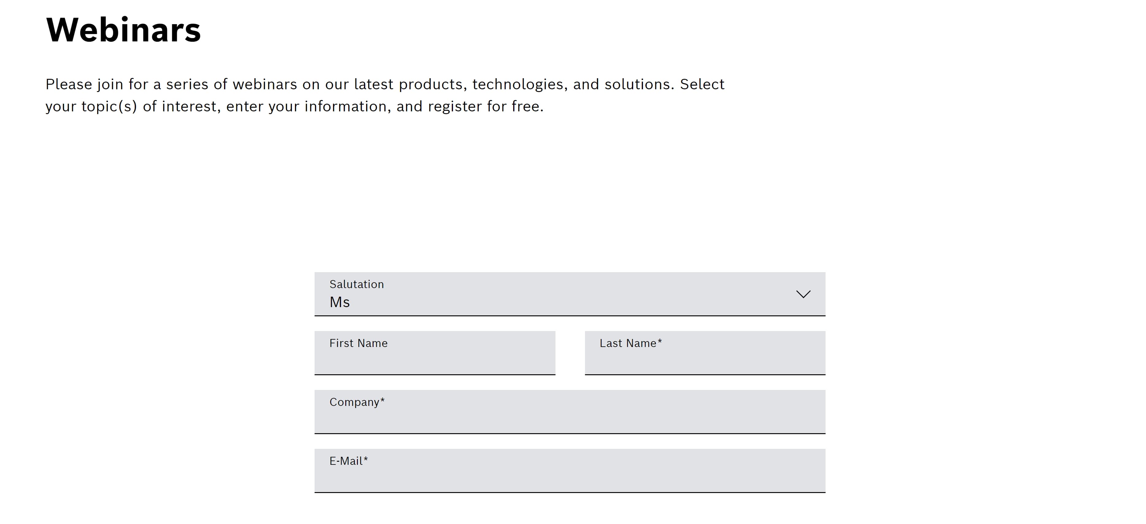
Though the page could be improved by including bolder texts and an interesting image for its webinar landing page, the registration form is front and center and easy to fill out. Those who prefer a straightforward, no-nonsense approach may appreciate this page.
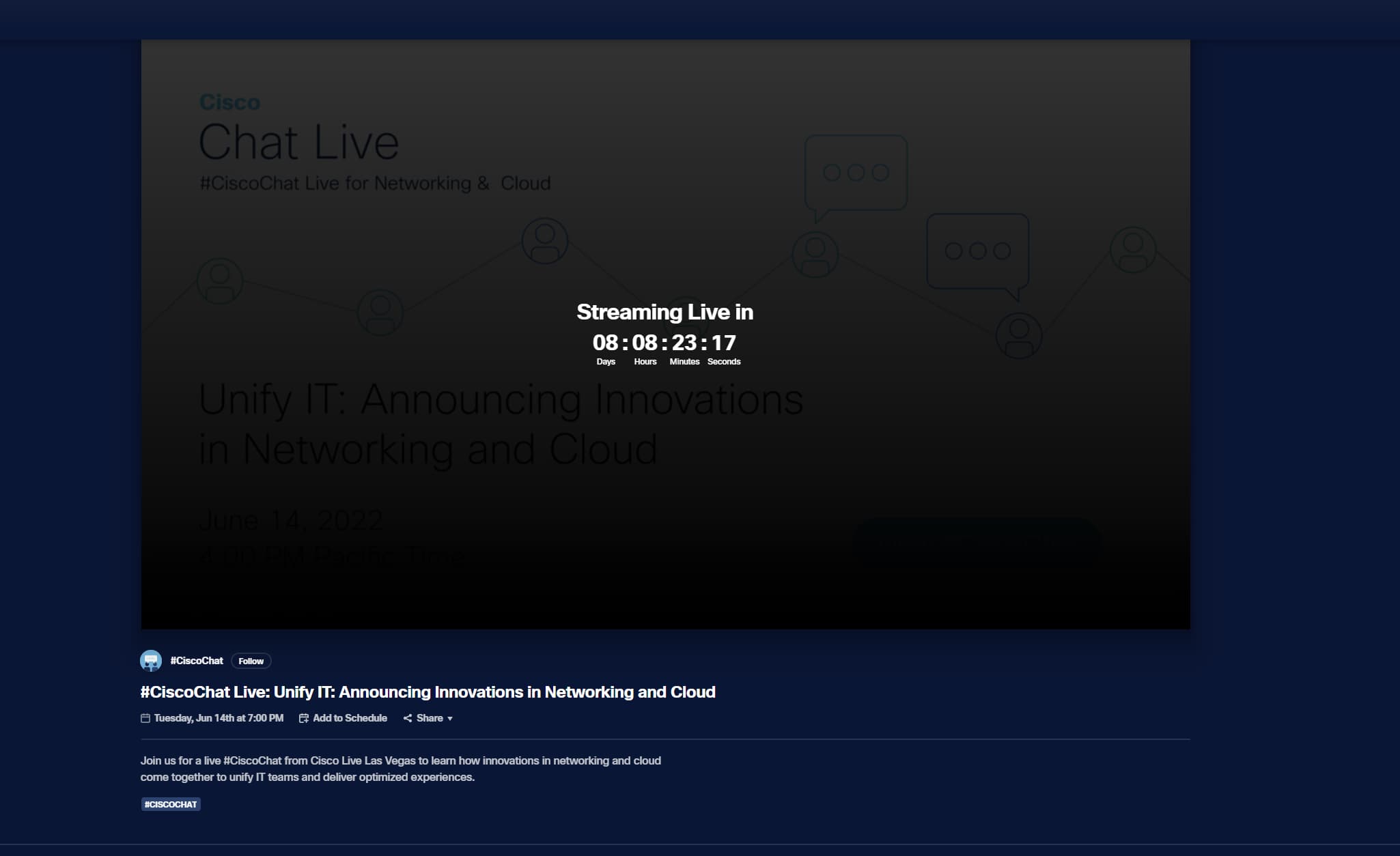
14. Cisco
Cisco uses a countdown to let viewers know when the next webinar will be hosted. To join ahead of time, viewers can click the “Add to Schedule” button and either sign in or create an account.
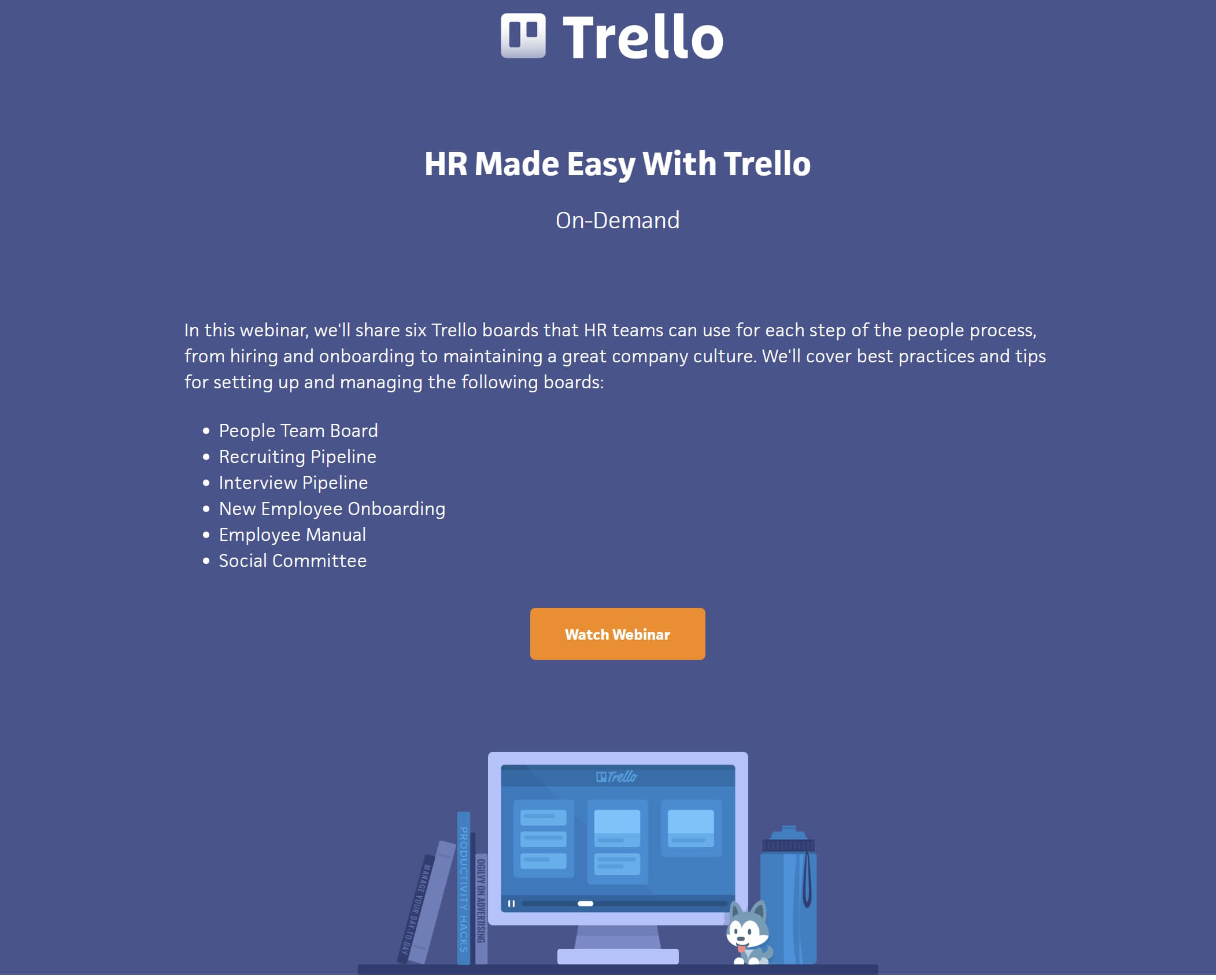
15. Trello
Trello sticks to the minimalist approach and forgoes any vivid imagery. Instead, the company uses bold lettering and the company logo, followed by a paragraph that explains the purpose of the webinar. The yellow CTA button at the bottom of the landing page encourages visitors to watch the webinar on demand.
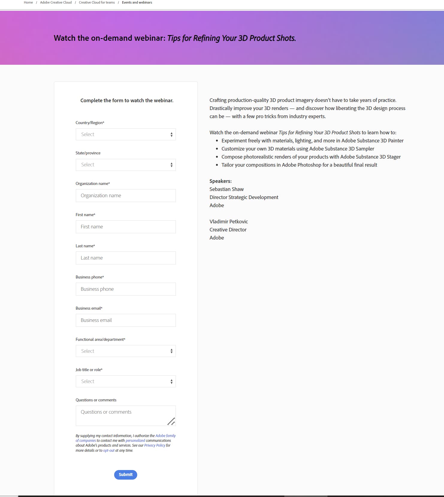
16. Adobe
Adobe uses gradient colors to draw the viewer's eye to the text highlighting the webinar's topic. Under the image is a paragraph that goes into greater detail about what viewers can expect and the registration form is neatly displayed to the left.
17. Grab
The webinar topic is made obvious thanks to large bold lettering on the landing page's banner. The banner includes the topic, the date of the webinar, and a CTA.

18. Prudential
Prudential is a great example of what to do after a webinar is over and visitors find your landing page. The name and parts of the webinar are displayed in bold and there is a brief sentence or two describing the topic. Below the copy is a CTA button that directs viewers to watch the recording and download the slides.

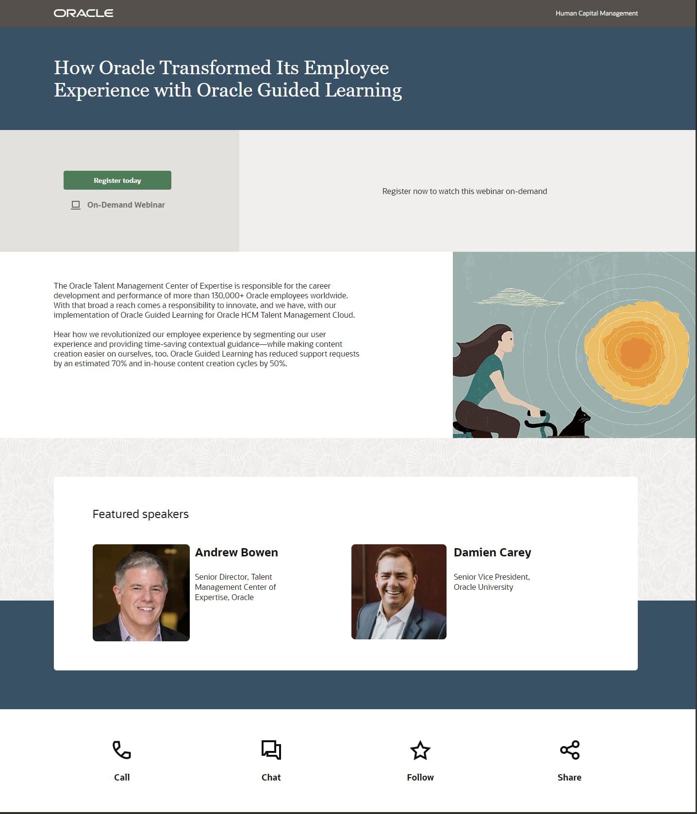
19. Oracle
The design for Oracle's webinar landing page is simple yet visually interesting. The large white headline shows the subject of the webinar. If you scroll down, you'll see a peaceful image of a woman on her bike and a paragraph giving greater insight on the left. The bottom of the page has images of the webinar's speakers and their roles to add legitimacy.
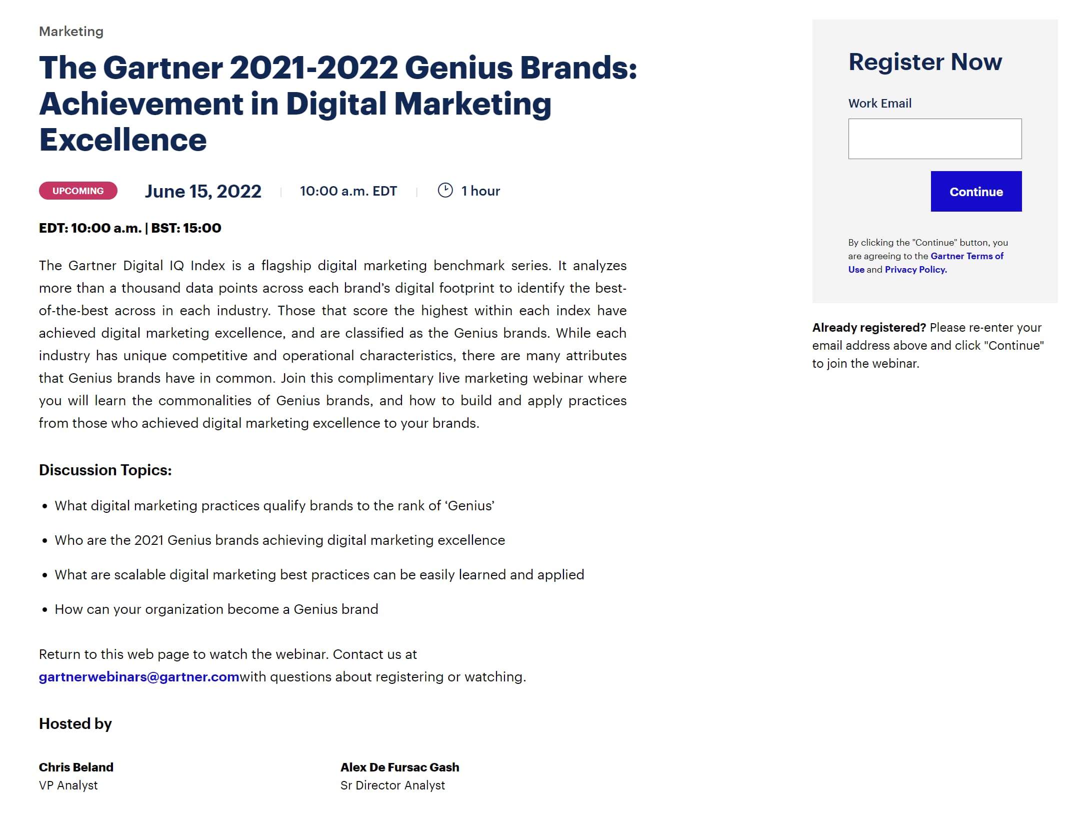
20. Gartner
Gartner doesn't rely on imagery at all. Its webinar landing page features a huge headline followed by the time, date, and length of the webinar, followed by a paragraph explaining the topic and key takeaways.
The registration form features a strong CTA and only requires a work email, making it incredibly simple to register.
Webinar Landing Page Best Practices
While it's good to have your own unique approach to creating the best webinar landing page for your company, it's important to adhere to the following best practices:
- Include a clear, catchy, and concise headline to grab the reader's attention.
- Write an engaging body paragraph that expresses why readers need to tune into the event.
- Include high-quality, eye-catching imagery.
- Include strong CTA buttons that urge visitors to register and tune in so they can be converted leads and paying customers.
If you're unsure of where you can find the proper tools to host a webinar, ON24 is a company that provides many kinds of products and services that can make virtual event hosting and webcasting simple.
Furthermore, eWebinar and Wistia are two more companies that have excellent tools for webinar and video hosting respectively.
Now that you have examples of webinar landing pages and best practices to keep in mind, you're ready to start designing your page!




Recent Comments