
The one page that often seems to be forgotten in the optimization of ecommerce sites is the product category page. We see this very often: category pages just don’t get the love they deserve. That’s a lot of missed opportunities, because many people arrive from the SERPs on these specific pages. In this article, we’d like to break down the elements of a great category page for your online store.
Table of contents
Don’t forget the basics on category pages
The category pages of your online store — whether you’ve built your store in WooCommerce or Shopify — should first be treated as any other important page you want to optimize for a particular keyword. In this case, that focus keyphrase is the category name itself. After doing keyword research for your online store, you probably have enough insights to know how your customer describe your products. Here, it’s important to name your categories in a way that makes sense to the customers.
If your online store has few categories, chances are these categories will be rather general. Try to optimize the page for that general keyword, but make sure you add value to the category page. You could also add more related pages, focused on, for instance, related long-tail keywords on your site and your blog.
Add relevant category text
On the category pages of your online store, write an inviting, optimized introduction for the chosen keyword. What people often forget is that this ‘introduction’ could be split up into an enticing paragraph that is located above your list of products and continued right below the list. This, of course, depends on the theme you’re using for your shop (or your development skills).
Google seems to prefer at least some kind of textual piece of content on your products list. But please feel free to elaborate (a lot) below that list. In the introduction, you could also include links to other sections of your website. That can be related shop categories pages or specific landing pages that explains more about your products. Anything to make your visitors and Google find the right products.
Fix your URLs, titles and meta descriptions
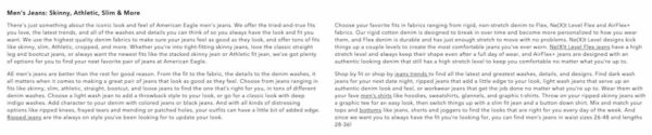
Treating the category pages of your online store as the important pages they are should also mean taking care of your regular SEO chores, like making proper SEO-friendly URLs and writing great titles and meta descriptions. We know it’s fashionable to have titles and meta descriptions auto-generated based on some variables, but it’s still better to come up with something unique for every category. Be sure to include your keywords and add an trigger for people to click.
Something like the one below is more enticing, right?
Make your categories available
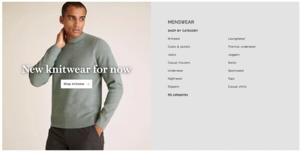
To maximise discoverability, your category page should also contain a list of all the categories, immediately visible or visible on demand, like Marks & Spencer’s menswear category list.
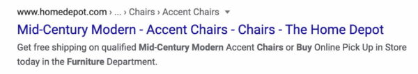
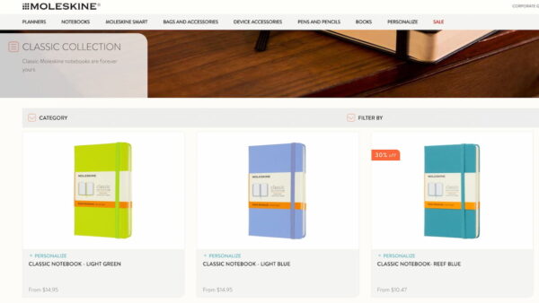
Clicking on the All categories link returns a huge list of subcategories if wanted. Your list might be shorter, like the one at Moleskine.com:
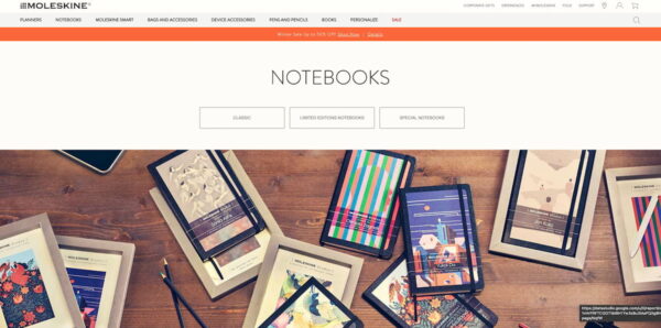
Moleskine incorporated the main categories in the main menu of their shop. On click, there is also a subcategory list, as you can see on the left in the image above.
Add filters to narrow down products
This is almost a given on most modern ecommerce sites, but make sure that your store offers some way to filter products. There are a lot of options for this and you need to pick the one that fits your site and products best. Of course, if you sell just a couple of products a filter doesn’t really add a lot.
Product listings
The main section of your category page is, of course, the entire list of products in that category. It’s like the excerpts on your blog but narrowed down to just a few product details. These details combined need to entice the visitor to click to that particular product page. Let’s go over these details.
Call-to-action
The Moleskine example mentioned earlier leads us to the central element on the category page, the products list. The product listing on the Moleskine miss a crucial one: a great trigger for customers to click. There’s no stand out button that says: buy this now!
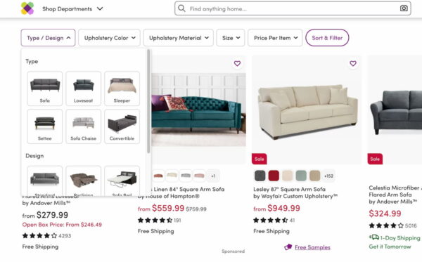
Of course, we know that all visitors understand these images and everything is clickable, but there is no triggers for me, like at Staples.com:
It will lead to a lot of calls-to-action on the category page, but that doesn’t have to be bad. You obviously want to place that call-to-action near (or containing) the price of the product.
Add a great product image
One might argue that by leaving the add-to-cart button out, there will be more focus on the product image. This is another critical element of the product listing. We like to judge a book by its cover. It largely depends on the product image what kind of sentiment a product brings (and what product one will buy). Make sure that you try to use your own, high-quality product images. And don’t forget to fill in that alt text for your products!
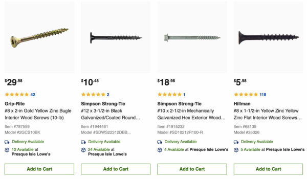
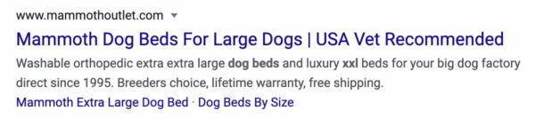
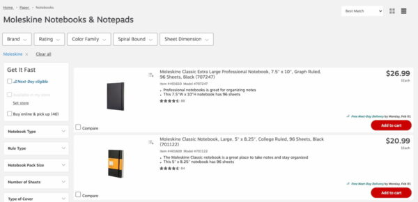
This screenshot clearly shows that you sometimes just can’t fix that image, or it’s just too much hassle to optimize thousands of images that come from manufacturer catalogs. In that case, it is vital to show differences between these images immediately. This is where the product title comes in.
Product title
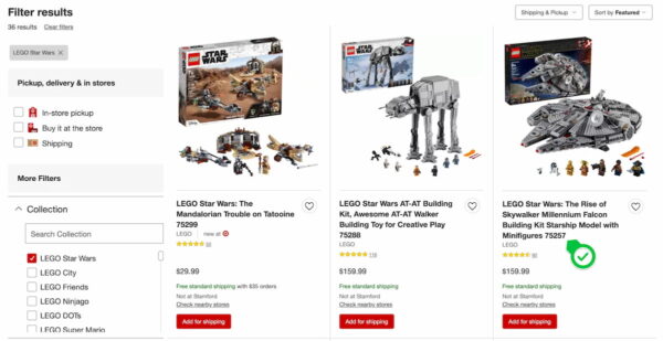
A product title should include brand, product name and in the case of the screws in the screenshot above, dimensions. For some other products, you might want to include SKU as well. For LEGO, that makes all the sense in the world. A lot of people search for that particular SKU, like here:
Including that SKU in the product title, will help people finding that precise product page in Google.
Availability
In the screenshot of Target.com above, there is another element we’d like to see on a shop category page: availability. Unfortunately, in the example, the products don’t appear to be available in the shop at the moment. But, we can order them online and Target will ship the Lego products for free to our location. Not sure about the product? Check the reviews to see what other customers thought about it.
List or grid?
On a more general note, another thing to decide is whether to use a list or grid view. There are things to say for both variations. A grid view allows for more products per page (which is easier to scan) and list views allow for more product details. You could also add a convenient switch so that the visitors can decide for themselves. If you have to choose, do test what works best. Please allow for proper whitespace (top-bottom and left-right) between products.
Anything to add?
In this article, we’ve highlighted the most important part of good category pages. But, there are probably a lot of other elements that you’d like to see on that online store category page. What are your favorite tactics for improving category pages for online stores? Please leave these in the comments. We’d love to hear your thoughts!
Read more: Product page SEO »
The post How to perfect the category page of your online store appeared first on Yoast.

Recent Comments