Website Design Tips for Plumbers: Convert Site Visitors Into Leads & Revenue
Plumbers run very different businesses than traditional companies. The bakery down the street may use their website to advertise their menu and specialty pastries while you need to generate leads from your plumbing company’s website.
Unlike the bakery, your measure of success is qualified leads (calls, web form submissions, and chats with customers), not foot traffic to a storefront.
In this blog, we’ll look at three bad website designs and cover XX plumbing website design tips proven to convert more site visitors into qualified leads and revenue. Including:
- Does this plumber provide the services I’m looking for?
- Does this plumber service my town/city/neighborhood?
- How can I contact this company?
- Why should I hire this company over the competition?
Answer this: when is the last time your site generated 50+ web forms in a month? How about phone calls? Do you frequently talk to customers who say, “I found you on Google?” Or worse… is your phone not ringing? If the answer is “yes,” then this blog is for you.
The #1 Rule for Plumbing Websites: Answer Visitors’ Questions
As a general rule of thumb, visitors should be able to answer four questions within three seconds of landing on your website:
- Does this plumber provide the services I’m looking for?
- Does this plumber service my town/city/neighborhood?
- How can I contact this company?
- Why should I hire this company over the competition?
In today’s digital age, consumers want the information they seek NOW, meaning your plumbing website needs to answer the questions above in a clear, concise manner. The best websites for plumbers do.
What Bad Plumbing Websites Look Like
Take a look at the three websites below while keeping these questions in mind:
- Does this plumber provide the services I’m looking for?
- Does this plumber service my town/city/neighborhood?
- How can I contact this company?
- Why should I hire this company over the competition?
Bad Plumbing Website #1
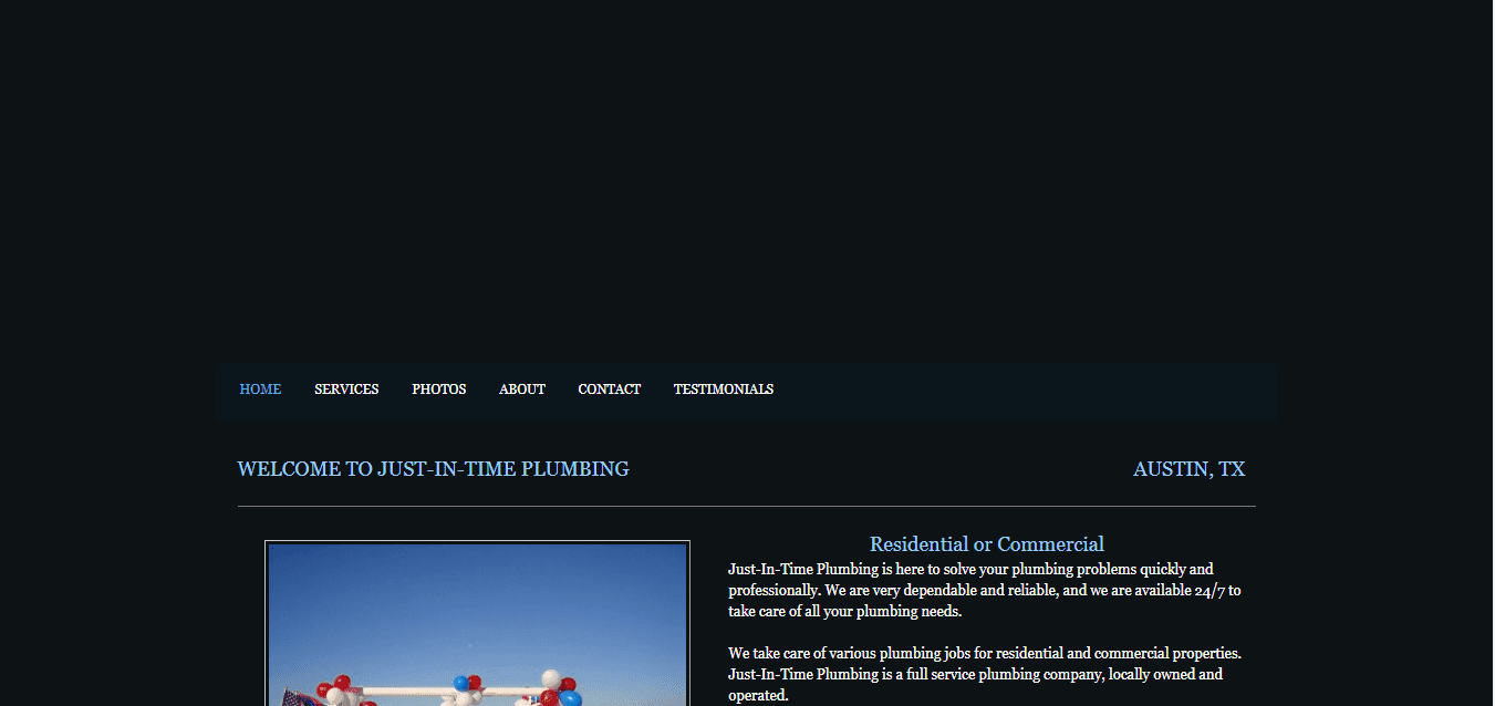
Why It’s Bad:
- User friendliness – With all of the empty space above this plumbing website’s navigation, this site is not very user friendly and pushes all of the important information too far down the page.
- Contact information – Although the Contact page is found in the navigation, it may be difficult to find as it is hidden between the company’s About and Testimonial pages. Plumbing website design tip: Your company’s phone number should be highly visible on the page. This company’s phone number is nowhere to be found.
- Services – To their credit, this company does advertise residential and commercial services above-the-fold (before you need to scroll), however it is missing a list of plumbing services, imagery to convey these services, service areas, etc.
Why It’s Good:
Nothing.
Bad Plumbing Website #2
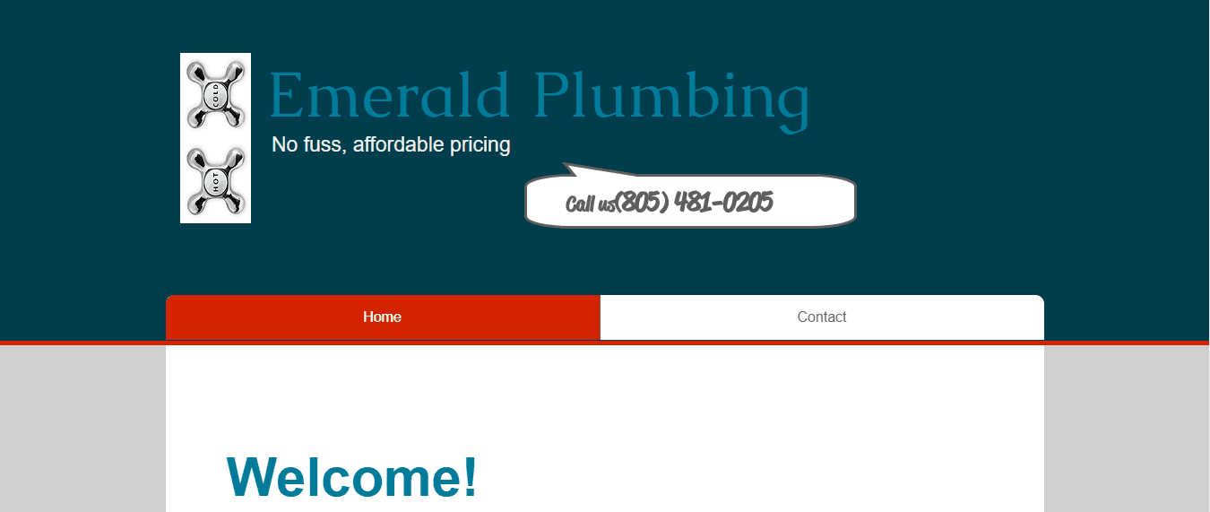
Why It’s Bad:
- Design – This plumbing website does a poor job of legitimizing the company. It does not have a logo, the company name (in blue) does not stand out from the blue background, and has zero imagery to breathe life into the site.
- Services – Beyond the name Emerald Plumbing, this plumber provides zero information to his or her plumbing services. Customers are left wondering if they are a residential or commercial contractor, if they offer the exact plumbing services they need, etc.
- User friendliness – Like the first site we looked at, this site is not very user friendly and provides virtually no helpful information above-the-fold. Additionally, the header (top part of the site) is so large it’s almost impossible to read the information below as you scroll.
Why It’s Good:
- Phone number – This company places their phone number above-the-fold and it is clearly visible, making it easier for potential customers to call for service.
Bad Plumbing Website #3
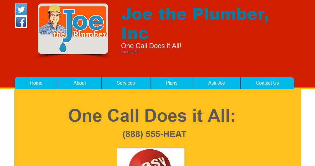
Why It’s Bad:
- Readability – The color scheme chosen by Joe the Plumber makes it difficult for customers to read. The blue text layered over the red background is not very user friendly and the text reading “Since 1968” is virtually unreadable.
- Service areas – Unlike the other two sites above, this plumbing company has an 888 phone number and zero mentions of their service areas, making it nearly impossible for customers to know their location or service areas.
Why It’s Good:
- Phone number – Like the second bad plumbing website, Joe the Plumber places their phone number above-the-fold and clearly visible, eliminating unnecessary steps for visitors to find their contact information.
- Logo – Unlike the first two sites, this company clearly has a logo located in the upper-left corner of its header—which is one plumbing website design tip we recommend—helping legitimize the company as a real plumber.
15 Web Design Tips Every Plumber’s Website Needs to Generate Leads
Plumbing Website Design Tip #1: Add a Professional Logo to Your Website
A professional plumbing logo serves multiple purposes. First, it legitimizes your company. Consumers comparing an ugly website with no logo compared to a professionally-designed website with a clear logo associate the nicer logo and site with a more high quality company, regardless if it’s true or not.
Consider investing in a professional brand design and a brand spanking new logo to kick off the website design process for your plumbing company.
Plumbing Website Design Tip #2: Clear Call to Actions
A call to action is language, graphics, or some sort of content that entices users on your site to take action (call you, fill out a form, chat with customer service, etc.). It directs them where to go next or what to do.
Plumbing Website Design Tip
On plumbing websites, provide multiple ways for users to contact your company and convert into a qualified lead:
- Phone number clearly visible
- Web forms located on every page (and found above-the-fold on your home page)
- Website chat
Consider putting a clear call to action in the header of your website, making it as simple as possible for visitors to contact you and your customer service representatives, like Len The Plumber, who encourages customers to “Schedule NOW,” creating a sense of urgency with website visitors.

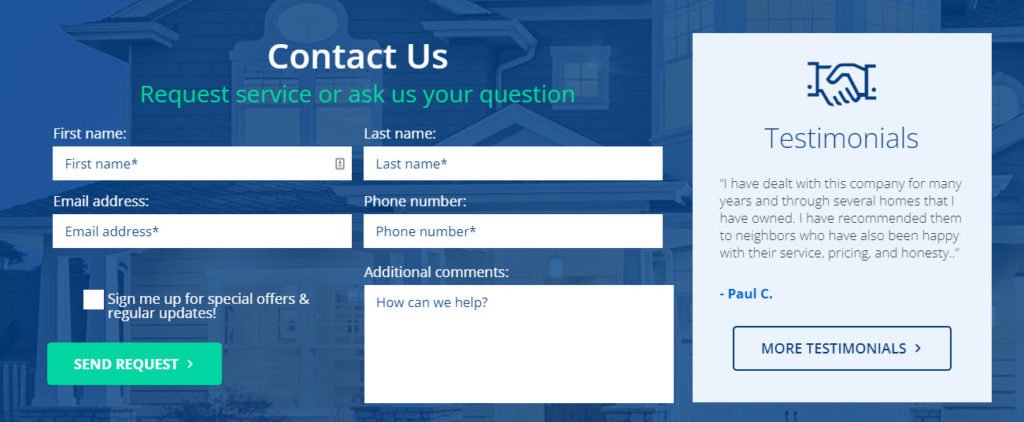
Plumbing Website Design Tip #3: An Easy Way to Request Service
Like in the Len The Plumber screenshot above, you need to make it as easy as possible for customers to contact you after reading your call to action. Using the same example above, Len The Plumber provides two ways for potential customers to contact them: phone and online.
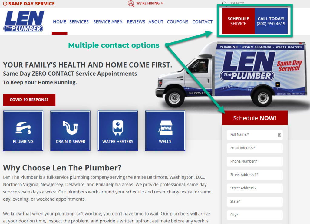
Plumbing Website Design Tip #4: Include a Services List
Google and other search engines want to provide users with the best answers to their search queries—so why shouldn’t you? Give users a clear list of services offerings (as detailed or high level as you want) as soon as they land on your plumbing website, like the icons and boxes in the example below:
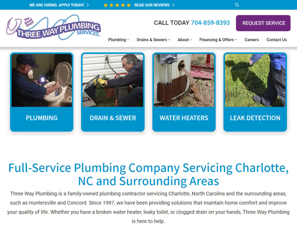
Pop quiz: Where else can you give website visitors a list of services?
Answer: In your website’s navigation!
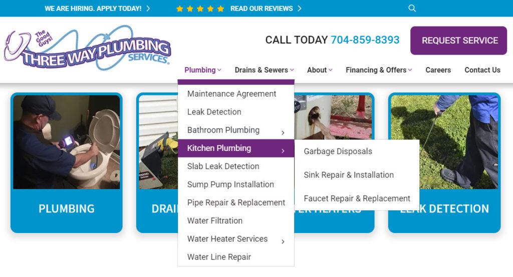
Plumbing Website Design Tip #5: Add a Sticky Header
Sticky headers are one plumbing website design tip that is best practice today. So what is it, you might ask? A sticky header is a functionality that makes the header section of your website static, keeping it in plain sight at all times and encouraging users to convert into a lead.
Notice below how the header section remains visible to website visitors as you scroll down the page:
Sticky headers help you get more leads because they keep your call to actions and contact information easily accessible and within view 100% of the time someone browses your website.
Plumbing Website Design Tip #6: A Responsive Framework
According to Adobe, nearly 8 in 10 consumers would stop engaging with content that doesn’t display well on their device.
Why is this important? Because if your website doesn’t display well on smartphones and tablets, 8 of every 10 people will leave your site and go to a competitor’s instead. To prevent this from happening, build your website on a responsive framework.
Responsive websites automatically resize according to device, giving users a beautiful display across desktop and laptop computers, iPads, iPhones, Android phones, and any device.
Building your plumbing website on a responsive framework also means you have a mobile-friendly website, which has been an absolute necessity since 2015.
Plumbing Website Design Tip #7: Clear Imagery
Nothing is worse than a picture that looks pixelated and blurry. Not only is it a sign of laziness, it simply isn’t user friendly. Instead, use professionally shot, hi-resolution images on your website for the highest clarity and professionalism.
With today’s smartphone technology, you may even be able to take great-looking shots of your team using your iPhone or Android device.
Plumbing Website Design Tip #8: Real People
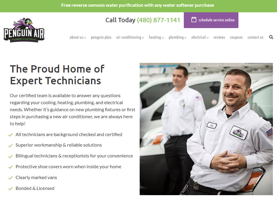
Homeowners like to know they are safe in their own homes while a plumber is performing service. One way to convey your legitimacy and establish rapport with homeowners in your service area is to have pictures of your technicians, trucks, and team members across your website.
Whether it’s your home page, a meet the team page, or another page of your site, a smile and friendly face goes a long way to generating more leads from your plumbing website.
A second and more fun way to do this is to create short introductory videos for each of your plumbers, like the company below:
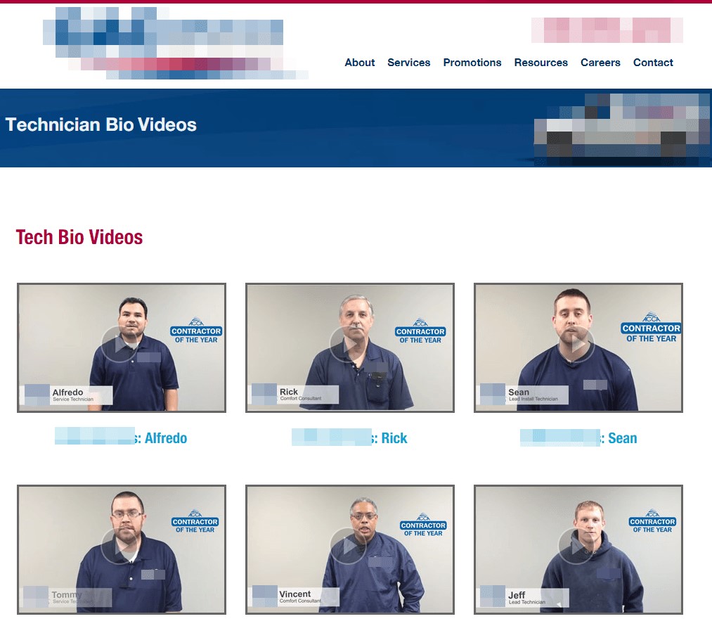
Plumbing Website Design Tip #9: Awards & Accreditations
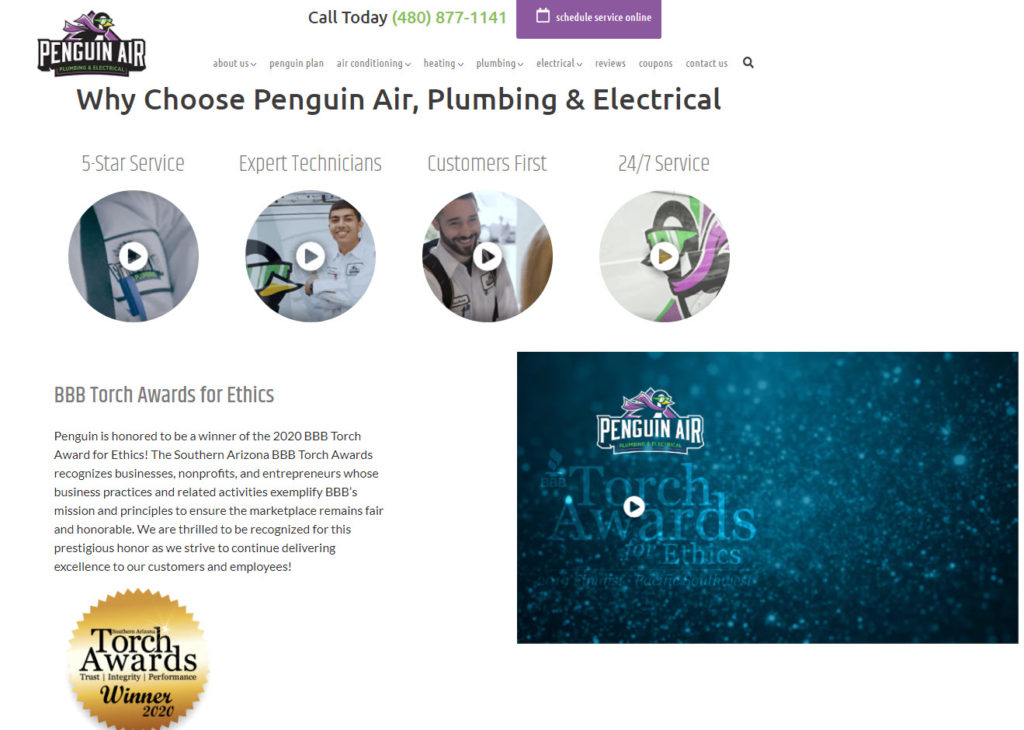
Every homeowner wants a plumber that is well-respected in the community and the plumbing industry. Industry awards, recognition, and accreditations are a fantastic (and encouraged) way to generate more leads from your plumbing website.
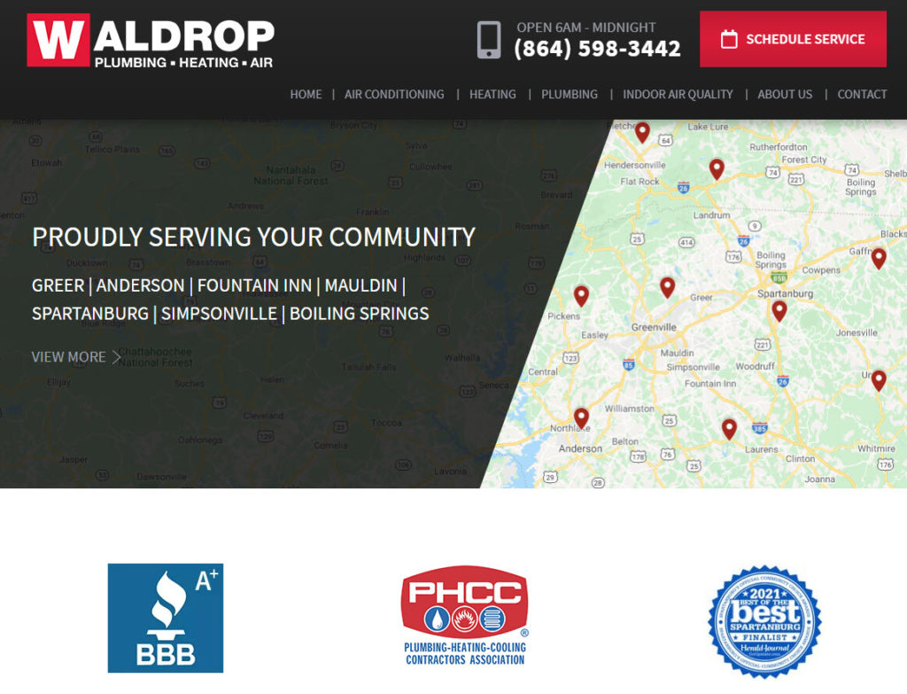
Here are a few badges, logos, and items we recommend every plumber include on their website, if possible. Remember to only use logos of organizations you are truly a member of and to check with each organization if they have specific guidelines and logos to use online!
- State plumbing licenses
- PHCC
- Nexstar Network
- Better Business Bureau
- Angi Super Service Award
- Best of Houzz
- Best of HomeAdvisor
- Other award badges and logos
Plumbing Website Design Tip #10: A Modern Website Design
Any plumber’s website should be a digital salesperson that works 24/7 to generate new leads and sales. Don’t have a salesperson like Bad Website 1, 2, or 3. Instead, invest in professional website design, SEO for plumbers, and other forms of plumber digital marketing to generate consistent (and grow) lead volumes.
Plumbing Website Design Tip #11: Competitive Differentiators
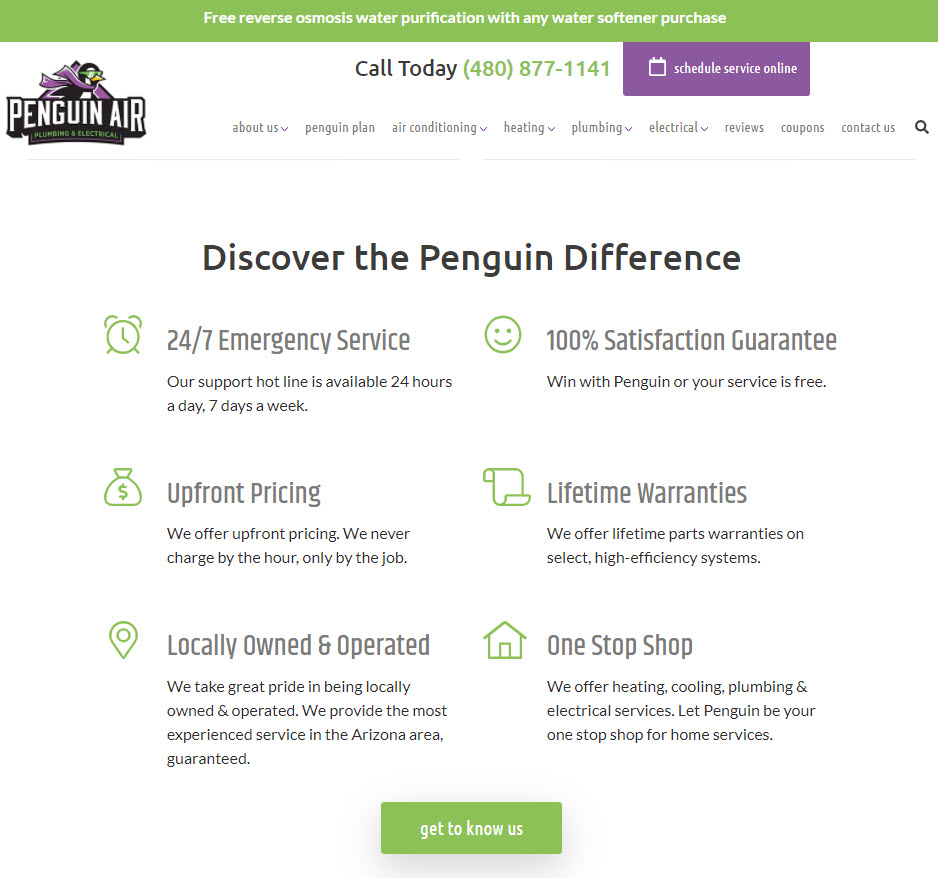
While you know your plumbing company is better than your competitors, homeowners who have never heard of your company don’t. To differentiate yourself from the competition and stand out among the rest, tell customers exactly why you’re the best plumber in town.
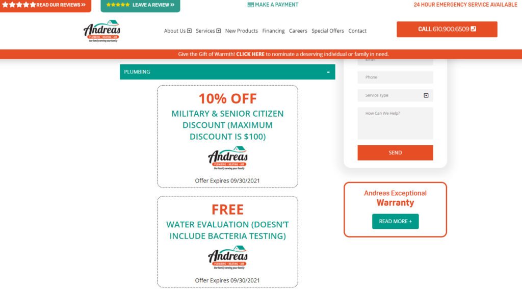
Plumbing Website Design Tip #12: Coupons & Special Offers
If you got it, flaunt it. Or something like that, right?
If you have special deals and coupons to offer customers, then advertise them on your website! Every little bit of money saved on a new fixture installation, service call, or maintenance plan goes a long way with customers and builds customer loyalty.
You can even include a well-positioned call-to-action for your special offers in places like your website chat widget:
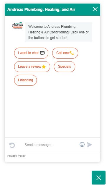
Although coupons mean less money in your pocket, what you make up for it in customer loyalty and retention far outweighs the $9.90 you lost giving a customer 10% off their $99 service call.
Plumbing Website Design Tip #13: Create Social Proof with Customer Reviews
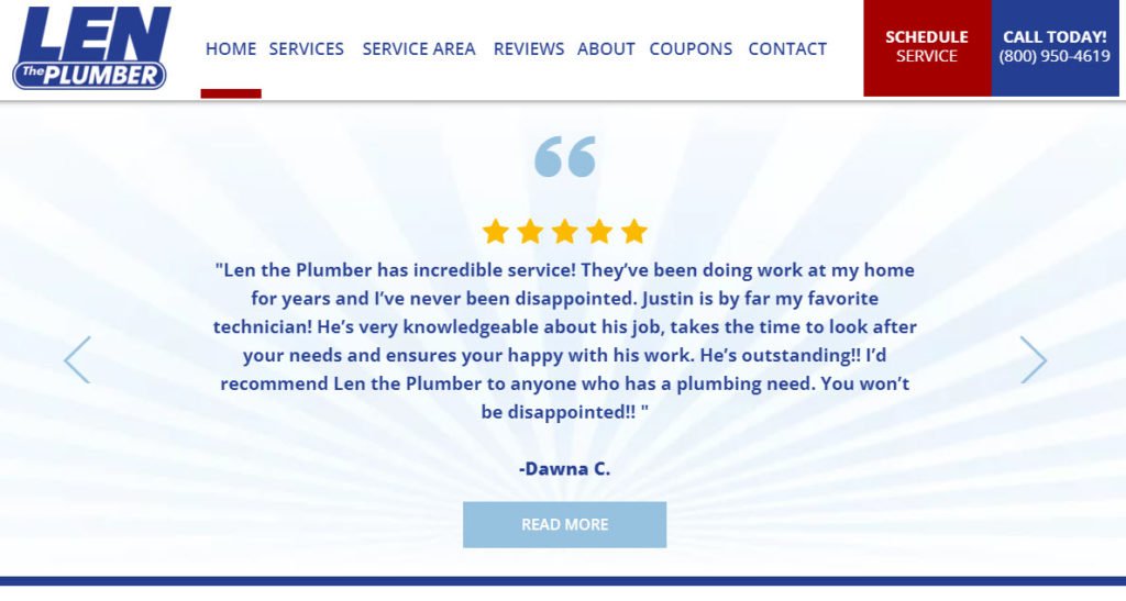
Data shows that nine out of every 10 consumers read online reviews before making a purchase. Not only that, 79% of shoppers say they trust online reviews as much as personal recommendations.
So, show off those awesome Google My Business reviews on your website!
Customer reviews and testimonial videos create social proof with other consumers. If 1,500 homeowners in their community had a great experience with your plumbing company, why shouldn’t they expect the same?
Plumbing Website Design Tip #14: Add a Click to Call Button on Mobile Devices
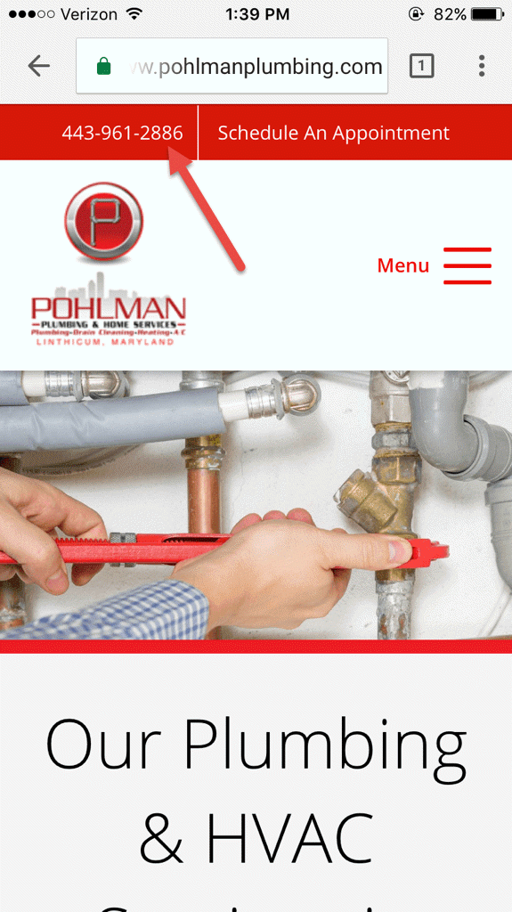
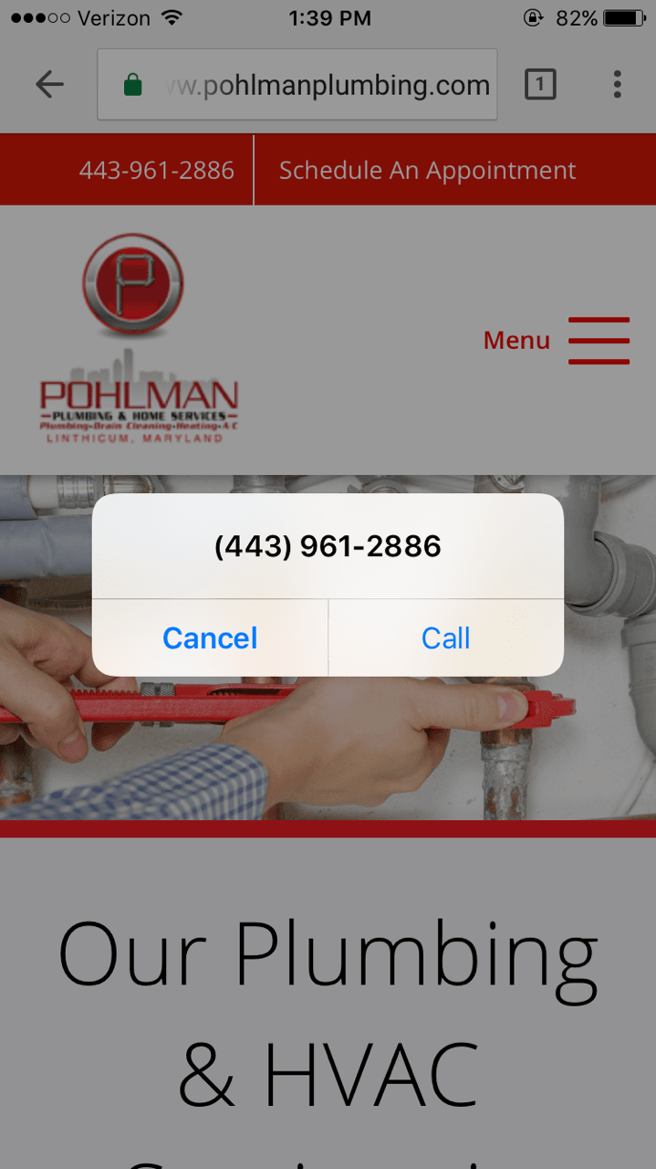
Keeping a call to action present across mobile devices is equally (if not more) important than on desktop. Click to call buttons, an option that allows mobile visitors to click a button and immediately call, presents a unique opportunity to convert mobile users on your plumbing website into a lead with the click of a button (literally).
Need a New Plumbing Website? Here’s What You Need to Do Next
Does your plumbing website need some help? Here at Blue Corona, we make your phone ring and any of our digital marketing experts can help you generate more leads, sales, and revenue from the web.
Let’s talk about how it can be improved: drop us a line to learn more.
Plumber Marketing Services You Might Be Interested In
- Plumber Digital Marketing
- Plumber SEO Marketing (search engine optimization)
- Plumber PPC Marketing (pay per click)
- Plumber Social Media Marketing
- Plumber Facebook Advertising
- Plumber Email Marketing


Recent Comments