
How to Increase Your Landing Page Conversions
There is little more satisfying as a digital marketer when it comes to website optimization and marketing than making tweaks to landing pages that directly impact conversions.
While it can be almost impossible to say what a standardized “good conversion rate” is, it is fundamental to your website success to continuously refine, experiment, and strive for improvements.
When it comes to securing and retaining potential leads, no metric is more important to track and monitor than the conv ersion rate for landing pages …
When you do make changes to your site, make sure you test one major thing at a time, i.e. redesign, layout, headline etc. (If you change too many things at once, some of the changes might have improved conversion rate while others didn’t, and you won’t know what worked and what didn’t.) You want to reach statistical significance with at least a 95% confidence level. (To be on the safe side, make sure your increase in conversions is actually from the change you made, not some external reason you can’t control, like seasonal variance.) You can use this easy calculator to test if your results are significant. No testing is foolproof. Making your button bigger or having more testimonials does not guarantee an increase in conversion rate; it could actually make it worse! Be smart and don’t make assumptions. Never. Stop. Testing. Sometimes it can take weeks, even months before you reach a significant result. Use this calculator to determine how long you should run your A/B tests for. Remember that getting the sale doesn’t end on the landing page. Look at your approach in terms of how you talk and communicate, and mystery shop your competition and your own employees. Even if you have a 42% lead gen conversion rate on your landing page, your real conversion rate could be much lower when it comes to actually sealing the deal.
1. Write killer headlines.
On average, 8 out of 10 people will read headline copy, but only 2 out of 10 will read the rest. You need a main headline that grabs the reader’s attention and sums up your proposition. It should be as concise as possible.
Then, craft a subhead to expand on the headline’s promise. Remember: People scan and skim. You must ensure they’ll get the gist of your pitch within a matter of seconds. These great examples of headlines and subheads do just that.
2. Include images and videos.
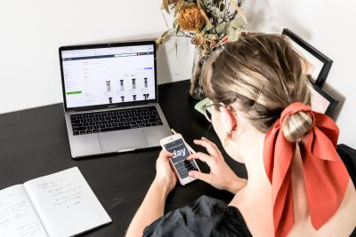
You usually want a good “hero image” or video above the fold. That’s old-school newspaper lingo, but it applies to virtual pages, too. Images help draw in readers, and compelling images will entice them to scroll down through your content.
Your hero image should connect directly to what you’re selling. If you’re pitching a product, it should be in the photo or graphic. If you’re selling something less tangible, such as a service, select a visual that shows someone enjoying the benefits of what you provide. Tie your headline to your image, and you’ll have a winning combo.
3. List the benefits.
People love benefits, and they also love bulleted lists. Cater to both of those by listing your benefits with bullets. Or check out how Dropbox.com uses clean visuals to sum up the pros of storing your files on its cloud.
4. Keep the most important elements above the fold.
People spend 80 percent of their time above the fold. You’ll need to strike a balance: You want as much content as possible above that imaginary screen border, but you don’t want to clutter up the visual field.
There is an infinite number of ways to accomplish this. Check out this article from Hubspot (and this one) to get some inspiration.
5. Issue an unmistakable call to action.
Your buttons should be your landing page’s most prominent element. You don’t want visitors to wonder where or how they should take action. Try backing away from your screen and squinting at the page until it’s blurry. Does your call to action still stand out? If it merges with the rest of the page, you need to make adjustments.
6. Add social proof.
Studies show that 70 percent of consumers say they look at product reviews before making a purchase, and consumer-generated product reviews are 12 times more trusted than product descriptions from manufacturers. If you want to sell anything at all, you need credibility. Consider adding customer testimonials, client logos or both to your landing page.
7. Minimize distractions.
Removing links (such as your site’s navigation) increases conversion rates. Obviously, you’ll still include your logo to build your brand’s recognition and link that element to your home page. But make no mistake: The goal is to strip your landing pages down to the bare minimum. That means giving up the sidebar, too. The more options you give viewers, the more competition you give your call-to-action button.
8. Address pain points.
No matter your industry or market space, there’s always a pain. It’s just a matter of degree. Without pain (or at least annoyance), consumers wouldn’t have searched online to find you or clicked the link in the e-mail you sent. Visitors are looking for something when they come to your landing page. Make sure nearly everything they see there serves one of the two purposes listed above.
If your target market detests dull light bulbs or chafes at having to replace bulbs so often, your solution might be a brighter and longer-lasting bulb. If you’re in the luxury-car business, you could be dealing with a lack of pleasure and not an actual pain point. Drivers might want to achieve a certain level of social status, or maybe they want a reliable and comfortable car that looks great.
9. Learn from others.
There’s no shame in basing your landing page on a style you’ve seen somewhere else. If you’re drawing inspiration from a company that’s significantly larger than yours, its marketing department almost certainly has invested time and money to develop and test the strategies you see.
Leverage their knowledge to your advantage, but don’t simply copy their designs. Note which components and tactics are at work. Then, refer to the points above to analyze what makes their pages so inviting. Once you know why a landing page works, you can replicate that success without lifting someone else’s design or identity.
How to Increase Your Landing Page Coversions – Tips

Here are some other tips to on How to Increase Your Landing Page Coversions:
- CTA and landing page copy need to convey the same message and value.
- Don’t ask for information you don’t need. That extra information just might scare them away.
- Eliminate any distractions by removing the navigation bar from your landing pages.
- People love testimonials. Showcase what others are saying about your offer.
- Guide your audience’s eye with formatting. Make sure your information is organized and easy to see.
- Convey value quickly when developing your landing page copy. Don’t include fluff after fluff. Dive right into the benefits and need your offer fulfills.
- If they love your offer let them share it by adding social share buttons to your landing page. They most likely know that some of their followers will find the info useful.
- Direct all CTA’s to the appropriate landing page. Unfortunately, 44% of B2B clicks are sent to a company’s homepage.
- Is your headline-turning people away? Ensure that the headline is related to the content and offer you’re providing. At a glance does your visitor know what your landing page offers? If not, they should.
- Optimize your Meta description. The higher you rank, the more chances you’ll have of attracting prospects and getting them to convert.
- Your call-to-action should direct visitors. Telling them what to do and what they will get. Remember to use action words like download, request and click here.
- Write your landing page copy in the second person. Visitors want to know how you will help them. For example: learn how you can drive more relevant traffic to your blog.
- Keep your copy above the fold. If your copy is too long, visitors will leave before you have the chance to convey value.
- Does that image relate to your copy? If not, don’t use it. It will distract your visitors and send them mixed signals. They won’t fill out your form if they are confused about what need it will fulfill.
- Not sure what headline, copy or call-to-action will attract visitors and produce more conversions? Don’t be afraid to conduct an A/B test.
- Include as little outbound links as possible. They will be your biggest threat, especially if you’re sending visitors away from your website.
- Use color and contrast to make your call-to-action pop off the page. Don’t let it get lost. Color can also be used to create an emotional response.


Recent Comments