On Instagram, photo editing trends move pretty dang fast. Just cast your mind back to those days when your feed was flooded with heavily filtered, square-cropped photos. Though it was only a couple of years ago, in 2022, that style looks so dated that you might as well be posting a daguerreotype.
Your average Instagram user spends almost half an hour each day on the app, and they’re smart enough to spot content that hasn’t managed to keep up with the times. That means last year’s interesting and original photo composition is this year’s tired cliche.
To hold your audience’s attention, you’ve gotta keep it fresh and stay up to date with the latest Instagram photo editing trends. So consider this required reading: We’ve got the top 7 Instagram photo styles for 2022.
Save time editing photos and download your free pack of 10 customizable Instagram presets now.
7 top Instagram photo editing trends
Want to put your best foot forward on Instagram’s explore page so you can rack up those likes and new followers?
Taking a good Instagram photo is just the first step — how you present it matters, too. So brush up on your Instagram editing essentials, download the best Instagram editing apps, and take some inspiration from these Instagram editing trends.
1. Authentic, unedited photos
Okay, yes, it feels slightly bananas to put “unedited” as the top trend of 2022 photo editing for Instagram. But we’re not deciding what the trends are. We’re just calling it like we see it.
And we’re seeing a huge embrace of “authenticity” on the app, as exemplified by fewer filters and edits. Long live the new era of raw, real, and messy!
Is the shot blurry? Is your hair out of place? Is a pigeon up to no good in the background? All the better.
We’re striving for anti-perfection here. Think of it as the inevitable backlash to the polished, posed 2018 Instagram aesthetic.
We’re seeing this trend show up as a messy mirror…
Or blurry, low lighting…
Or leaving a rack full of unstyled clothes in the background of a fashion line launch.
Just look at the soaring popularity of BeReal, the photo-sharing app that encourages users to snap and post their unfiltered lives.
(Of course, choosing what to post on Instagram at all is an act of filtering in and of itself. So, is striving to share a shot that looks real actually any more authentic than curating a picture-perfect moment? These are the things that keep us up at night.)
This Crown Affair pic looks pixelated and unposed — not exactly what you might expect from a beauty brand with over 57K followers. But the enthusiastic comments and likes are rolling in all the same.
For brands, this emphasis on authenticity can certainly save you time and money on photo styling. But just because these photos look like no effort doesn’t mean you should phone it in. Everything you post should still bring value to your followers — does it inform, inspire, or entertain?
2. Desaturated, moody palettes
With the current state of the world, it’s safe to say we’re all a little more emo than we were a few years back. And the vibe of your feed probably reflects that.
Save time editing photos and download your free pack of 10 customizable Instagram presets now.
Colorful, vivid hues are less common on Instagram today than in years past. Instead, you’re more likely to spot posts with desaturated hues and lowered contrasts. Glow levels and highlights have been muted in favor of moody, low-light shots.
Home scent company Vitruvi will show you how it’s done:
This effect can be achieved through photography, of course — shoot a gloomy scene, get a gloomy pic — but a few tweaks of the color and lighting levels in an Instagram photo editing app can help tone things down in a pinch.
Download our free Instagram preset pack to easily tweak the colors and levels of your Instagram photos with a few clicks.
3. Text overlays
It’s no secret that Instagram Stories and Reels are where the most action is on Instagram these days. And while these formats often incorporate audio, text is an equally common tool here. And now, text is showing up in posts on the main feed.
You can quickly add text to a photo or video in Create mode for Stories or Reels, using Instagram’s distinctive in-house fonts. (TikTok offers similar capabilities.)
It’s such a handy tool for adding context, jokes, labels, or explanations, that we’re starting to see this style used for memes or reposted screenshots in the Main Feed, too.
View this post on Instagram
Some big brands, like the New York Times, use text overlays to extend their reach and strengthen their brand. Their main feed posts are almost like mini infographics that feature text in their signature typeface.
These posts are designed for followers to reshare to their stories — a clever way to boost engagement.
But while some brands may have their own preferred fonts, using Instagram’s built-in fonts gives posts an authentic, just-part-of-the-gang vibe.
Don’t you want your followers to look at your delightfully scrappy post and think, “Stars! They’re just like us!”?
4. Extreme lighting
While soft, natural lighting was on-trend just a few years back, we’re in the thick of a more dramatic illumination phase.
Extreme, high-contrast lighting, in particular, is en vogue with editorial and advertising shots. Welcome to stark shadow season, baby.
A high-contrast steak spotted on chef Molly Baz’s page:
And on wine pop-up Vin Van’s account, too:
If you aren’t working with a professional photographer or don’t have access to some sort of fully stocked photo studio, don’t worry. There are plenty of editing tools out there to help you mimic this high-contrast look.
5. ‘70s (via the ‘00s) nostalgia
We’re in the thick of a turn-of-the-millennium nostalgia moment in fashion, music, and pop culture. But the late ’90s and early ’00s were heavy on the ’70s nostalgia, so we’re also seeing a lot of throwbacks to that groovy decade.
Graphic design and photography are romanticizing these low-tech times with grainy, high-flash photography (pretend you’re shooting with a disposable camera), retro color palettes (orange! is! back!), and grungy thrift-store vibes.
This Nike campaign taps into that very retro-cool vibe with unpolished, low-quality shots of a star athlete:
Our Place delivers the no-filter, bucket-hat vibes with zero apologies.
6. Photo dumps
Not really an editing trend per se, but get this one on your radar: users are maxing out Instagram’s carousel feature to casually, irreverently showcase their favorite snaps from an event, vacation, or time period, via “photo dumps.”
Carousels are actually prioritized by the Instagram algorithm, so this isn’t a bad one for brands to hop on at all. And hey, maybe you’re already using this feature to share up to 10 photos in one post.
But to capitalize on the photo dump trend specifically, the caption should be slightly dismissive and vague, and photos should be random, unfiltered, and authentic. Think “Spring 2022 photo dump,” “Springsteen collection launch BTS,” et cetera.
It’s almost the opposite of the standard recommendation to provide detail and context in your caption. Instead, the photo dump trend intrigues and titillates with real ‘inside joke’ energy. If that feels like a fit for your brand, then go for it.
If you’re ready to start dumping, check out our tips on mastering the art of the photo dump here.
7. Consistent color schemes
Photo dumps not really your style? Though some users still happily employ the main feed as a dumping ground for any and all snapshots, many brands still use their main feeds as a more curated showcase, cultivating an overarching theme or vibe for one’s account.
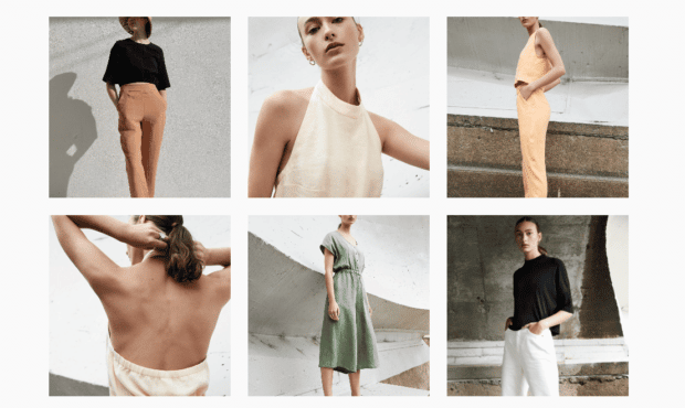
A consistent palette dominates fashion brand Eve Gavel’s Instagram page…

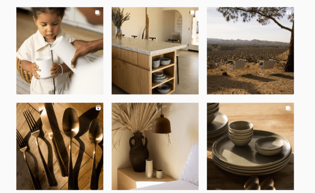
… Fable tableware, meanwhile, goes all-in on warm tone neutrals.

Most commonly, you’ll see brands or creators posting photos that fit a particular color scheme. Pink is particularly popular, as it has been since Millennials first crawled out of the primordial ooze and evolved to use the smartphone, but you’ll see this compelling monochrome trend in a variety of hues.
Want some more inspo for crafting a stop-them-in-their-tracks Instagram grid? We gotchu.
Editing Instagram photos with Hootsuite
Time-saving tip: You can edit your Instagram photos to achieve all these effects directly in the Hootsuite dashboard.
No more editing photos on your phone, emailing them to yourself, and then uploading them to your social media management platform separately! The video below shows you how to crop, align, apply filters and more before you schedule your posts.
If any of these Instagram photo editing trends tickle your fancy, we wholeheartedly encourage you to give ‘em a whirl!
If you enjoy the content you’re creating, chances are your audience will too, but no pressure here. Ultimately, trends on Instagram will come and go. But quality, engaging content that speaks to your unique audience and their needs? That’s forever.
Save time managing your Instagram presence by using Hootsuite to edit, schedule, and publish posts, grow your audience, and track success with easy-to-use analytics. Try it free today.
With files from Michelle Cyca.
Easily create, analyze, and schedule Instagram posts, Stories, and Reels with Hootsuite. Save time and get results.
The post The Top Instagram Photo Editing Trends in 2022 appeared first on Social Media Marketing & Management Dashboard.

 (@hesitantfailien)


Recent Comments