Whether or not you realize it, you judge every website by its visual appeal. And it only takes about 0.05 seconds to form an opinion. That means the hero image (the first photo, graphic, or video people see) has to be eye-catching enough to keep people scrolling the site.
High-quality hero images are the key to a great first impression. If done well, they represent the essence of your brand identity and the overall theme of your web page.
Yes, it's a lot of weight for one piece of visual content. That's why it's the most heroic of all.
This guide will explain how to level up your website with the perfect hero image, from choosing a graphic inspired by the latest design trends to ensuring your image is the optimal size. We'll also walk through hero image examples to spark ideas for your own website. Get ready for some design eye candy.
Hero Image In Web Design
If engaging visuals are the sprinkles on top of every great design system, a hero image is the shiny, red cherry. It draws your eye in and makes you want more.
In web design, a hero image is the first photo, graphic, illustration, or video people see on a web page. It typically incorporates both an image and text in order to convey a company's core message. Hero images sit above the fold and often feature a call to action (CTA) that encourages people to dive deeper into the website. The goal of this image is to add energy and excitement to a page. You want it to show off your brand's style, share the purpose of your site, and make people excited to explore.
A good hero image can elevate your traffic and conversions by making people want to interact with your site. Animation, carousels, and scroll-triggered effects are ways to flex your creativity beyond typical stock photography. But a bad image can bring down an otherwise great design. Off-brand visuals, large files that slow loading speed, and meaningless copy can ruin the user experience.
One common mistake when designing a hero image is getting the right file size. Too large, your loading speed plummets. Too small, everything looks pixelated. Let's walk through the different hero image sizes so you can create a stunning image every time.
Hero Image Dimensions
Finding the right aspect ratio and cropping can get confusing when sizing a hero image. Banner hero images aren't the same as full-screen images, and every image has to scale to fit the space. You also have to consider that no one browses in exactly the same way. Personally, my screen is usually zoomed in to 120%, but others may have dozens of tabs open that are all different sizes.
Some image cropping is bound to occur as your hero image scales to fit a variety of screens, so it's best to think of the following dimensions as guidelines, not rigid rules.
1. Full-Screen and Banner Image Dimensions
The ideal size for a full-screen hero image is 1,200 pixels wide with a 16:9 aspect ratio. For a banner hero image, the ideal size is 1600 x 500 pixels.
If you need crystal-clear images, or your target audience browses on large screens, you may have to size up to 1,800 pixels. Keep in mind this can result in a large file size that slows down your site.
You can check your loading speed for desktop and mobile with Google's PageSpeed Insights. It gives a comprehensive look at which site content loads first and where there's room for improvement. Aim for a page load time of one to two seconds because you'll likely lose people if it's over five seconds.
2. Mobile Hero Image Dimensions
The ideal size for a mobile hero image is 800 x 1,200 pixels.
While it's important to consider how your hero image looks on a desktop, you can't ignore the mobile experience. Nearly 55% of global website traffic in 2021 is generated on a mobile phone.
Your hero image design must be responsive and fit a vertical (phone) and horizontal (tablet) orientation. Dynamic hero images, like videos, do well on a desktop, but they often have to be swapped out for a static image for mobile. Videos take more time to load, and no one wants to take a massive hit to their data plan just to see your site.
3. Hero Image Compression
You want to compress your hero image if you have a large file size (anything over 1MB is too big). You can use sites like TinyJPG, Compress JPG, or Adobe's Photoshop Compressor to decrease the size without reducing quality. Just make sure to get the dimensions right beforehand or the image may appear blurred or stretched.
When sizing a hero image, check your Google analytics to see the typical screen resolution of your website visitors. Then, design with that target audience in mind. Just remember to test out your hero image on multiple browsers, screens, and phones to see how it scales. Once you have the dimensions right, it's time to work it into your web page using HTML and CSS.
Hero Image HTML
HTML is a coding language made up of elements used to give structure to a web page. It creates order and lets you embed content (like hero images) into a site.
Creating a hero image with HTML ensures your visual appears on a web page, while CSS makes it look good on a screen. Both require coding skills, so you may need to brush up on your HTML and CSS knowledge or enlist the help of a developer.
The main things to keep in mind are:
- The hero image needs to be centered.
- The text needs to be easy to read.
- It has to look great on all screen sizes.
- The image should cover the entire viewport.
Follow these steps to set up an eye-catching hero image. Note: The examples below include HTML elements and CSS rules, but I'll explain the difference between the two later on.
1. Create the structure.
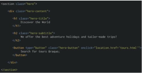
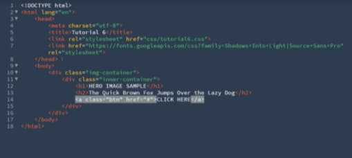
Set up two containers for your hero image using the coding conventions of your website. For instance, the first example below uses .hero for the structure and .hero-content for the image, text, and button, while the second uses .image-container and .inner-container.
2. Add your content.
Once the structure is in place, it's time to personalize your image. Add an image, choose a custom font, craft a header and subheader, and create a button with an enticing CTA. If you want to add a filter to your background image (without applying it to the text), DeveloperDrive recommends including the filter before your .hero-content code.
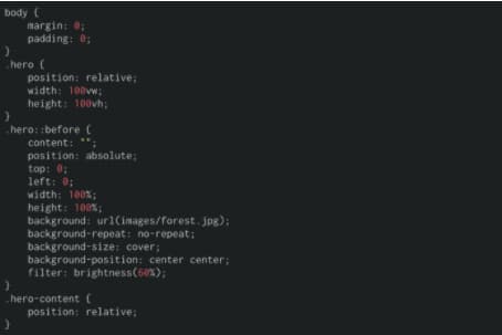
Notice how the width and height under the .hero section are set to 100vw and 100vh. This ensures the image fits the entire viewport, both vertically and horizontally, so it spans the whole screen.
No hero image is complete without a button that drives people to take action. Incorporate one into your image with the <button> element. Just make sure to include the font-family since the text doesn't automatically translate from the .hero-content element.
3. Center the content.
Not all hero images have centered text, but most have a centered image. To align your background image, you can make a flex container by incorporating display, justify-content and align-items under your .hero element.

For centered text, include a .text-align: center rule under your core content element. In the following example, the text is nested under the .hero-content code.
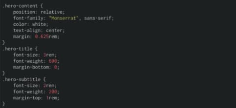
4. Make it responsive.
You want your hero image to look good no matter the screen size. Setting media queries allows you to create parameters so your image is responsive at a particular screen width.

5. Test the view.
Congratulations, your HTML structure is set! Test out how the image, text, button, margins, padding, and centering look on different screen sizes. If something seems off, comb through your code to see if you can find issues. For detailed instructions on creating and troubleshooting with HTML, check out this article from DeveloperDrive. All look good? It's time to add style with CSS.
Hero Image CSS
While HTML creates order, CSS (Cascading Style Sheets) adds flair. It's a rule-based language that complements the HTML elements by applying stylistic effects. For example, CSS lets you turn the text in a hero image header bright yellow so it pops against the purple background.
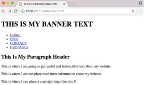
If you don't include CSS within your hero image, the HTML elements default to the basic browser properties like the example below.
That's not the most attractive web page, right?
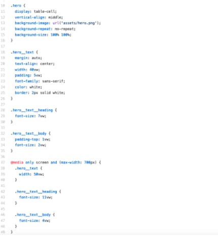
By including CSS rules, you can develop an image that draws in visitors instead of scaring them away. The above HTML examples include CSS rules, but let's walk through a basic design so you can work it into your own image.
The following template outlines the basic HTML and CSS needed to create a full-screen hero image. You can adjust the style by changing the rules under the .hero or .hero-text elements, like font-family, color, border, or padding-top.
For more information and inspiration on ways to use CSS for images, look to the hero-image forum on GitHub. Now, it's time to check out what good hero image coding can do for a company's web page.
Hero Image Examples
Like all creative mediums, hero images are influenced by trends. Remember when clipart was cool? How about when every news site hit you with a splash page?
To create a relevant hero image today, look to these design trends.
1. Parallax and Scrolling Animation
We experience parallax every day when watching cars pass by or walking down the street. It's the optical illusion that makes objects close to us appear to move faster than objects farther away. In web design, parallax uses foreground and background to recreate this effect. The result seems like magic. Just make sure not to overwhelm visitors by incorporating too many moving elements. Simplicity is key here.
Scrolling animation makes participation the goal. A good scrolling animation encourages people to keep scrolling before offering up a unique, engaging experience. Scrolling animations come in a variety of packages and work well across a number of industries, like retail, creative services, news publications, education, and more.
2. Abstract Compositions
Circles, triangles, stripes, and color blocks are back in vogue. Instead of restricting space and making sure everything is in its place, abstract hero images evoke a sense of freedom and creativity. You can find this trend taking over tech companies and startups, like this example from Zendesk that incorporates video within an abstract semi-circle to keep the design playful.
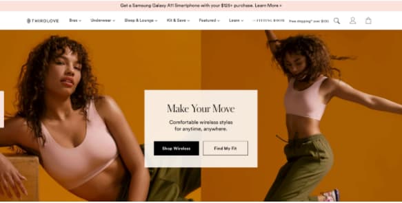
3. Soft Color Schemes
The average adult spends nearly eight hours per day with digital media — and that can lead to a lot of eye strain. Web designers have taken note and are starting to lean toward hero images with neutral, pleasing color palettes. This trend is popping up on retail, wellness, and medical websites to offer a more comfortable experience that's easy on the eyes.
4. Products as Design Elements
Products are the star of the show when it comes to hero images. Companies want to show their offerings and entice visitors to learn more about the features. For hero images, it's common to see products being used as graphic elements or deconstructed so visitors can dig into the details. Tech and retail companies often use this type of hero image, but it can work for any brand looking to put its product at the forefront.
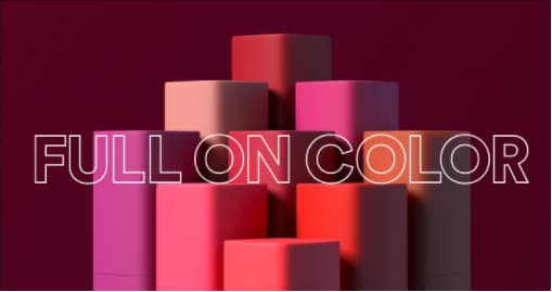
5. Lifelike Color
So long flat colors, hello fine 3-D shading. This trend in hero image web design is all about making people feel like they're inside the screen. Designers create these realistic experiences using gradients, shadows, and blended colors. While this trend will likely stay in tech and apps, it's great for pulling people into the world of your website.
6. Videos
Research by Wyzowl found that 84% of people have been convinced to buy a product or service by watching a brand’s video. This makes video the perfect visual content for an attention-grabbing hero image. If you decide to use a video, it's best to keep it under 30 seconds long and on a loop. As mentioned above, you'll want to switch out the video for a static hero image for your mobile site so it doesn't eat up data or take long to load.
Hero Image Best Practices
Trends are only one part of creating a great hero image. The rest of the magic relies on tried-and-true design standards. Even if you're not a trained designer, you can follow these best practices for a hero image that hits home with your audience.
1. Size
We already talked about the best dimensions for hero images above (1,200 pixels and a 16:9 aspect ratio), so consider this a reminder of how important it is to have the right size. You don't want the browsers to resize an image for you or you might wind up with a funky, stretched visual that puts off visitors.
Pro tip: Experiment with PNG and JPG files to figure out which results in a faster page loading speed.
2. Harmony
People are instantly distracted by bad design and will click off your site if your hero image doesn't harmonize with the rest of your layout. Keep your aesthetic in sync by carefully selecting the fonts, sizes, colors, navigation, visuals, and copy.
It's helpful to reference your brand identity and guidelines when coming up with a hero image concept. You don't want people to lose interest before getting to the good stuff.
3. Organization
Part of creating a harmonious design is having excellent organization. Your hero image content should have a logical hierarchy and flow, so every piece builds on what came before. This is incredibly important for pairing images with copy.
When a relevant image is paired with information, people can remember 65% of the information three days later. But only 10% is remembered from information alone. Make sure your message is clear and connects with your visuals. It's helpful to set up a simple wireframe for how your hero image will be organized on the page.
4. Originality
Stock photos are a core part of content marketing, but they may be hurting more than helping when it comes to hero images. While 40% of content marketers said original graphics helped them reach their marketing goals, only 13% of content marketers said the same thing about stock photos.
You can flex your creativity by creating original hero images with Canva or get inspiration from Behance. Lacking quality photos? Browse Unsplash or Pexels for a variety of high-quality photos that can be used for commercial and non-commercial purposes.
5. Consistency
The biggest struggle to create engaging visuals? 43% of marketers say it's producing them consistently. To get on a set schedule, set aside the time and resources you need to create visuals — even add it to your marketing budget.
If you're crunched for time, consider revamping your old graphics. It's a smart way to save time, and 51% of companies have found it's efficient and effective.
There's nothing worse than landing on a web page that looks like it was made in the dotcom bubble. It looks sketchy, and you're afraid to click on anything in case it redirects you to some kind of virus. On the other hand, being greeted by a beautiful hero image makes you want to stay and explore the page.
As the first touchpoint people have with your brand, hero images have a major impact on your brand perception, website traffic, and conversion. So it's time to put your newfound knowledge into practice and design one that draws people in from the first look.
![Ultimate Guide to Hero Images [Best Practices + Examples]](https://localseoresources.com/wp-content/uploads/https://no-cache.hubspot.com/cta/default/53/6b90aadb-dd8c-4687-89a3-c245110c6a91.png)





Recent Comments