I have moved way more times, way more recently than I’d care to relive—but each time, having a knowledgeable, trusted real estate agent made each process less stressful and overwhelming. Even when I received word-of-mouth referrals, I went online to double-check. I read profiles, sifted through reviews, and, of course, browsed websites.
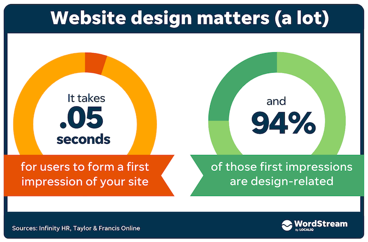
And not only did I make some quick judgments based on the design, but I also know I’m not alone: It takes 0.05 seconds to form a first impression about a website, and 94% of those first impressions are design-related.
Your real estate website is an essential element of your brand and its design is crucial to your business’s success. In this article, we’re walking through 11 real estate website examples and discussing what works, why it’s effective, and how you can use similar tactics to improve your own website.
Before we get into the examples, let’s talk about why your website is so important
Why is your real estate website essential to marketing?
Your real estate website is an important marketing channel for attracting inbound leads for clients, persuading word-of-mouth referrals to commit, and distributing your listings. Not convinced? Here are some stats to consider, courtesy of the National Association of Realtors:
- As of 2021, 81% of National Association of Realtors members have their own listings on their website.
- 70% of broker/broker associates and 69% of sales agents have a website.
- 69% of members include information about both buying and selling on their websites.
- Last year, 51% of buyers found the home they purchased online first.
These statistics are compelling—especially when you consider younger generations are more likely to find homes and agents online. Your real estate website is only going to get more important.
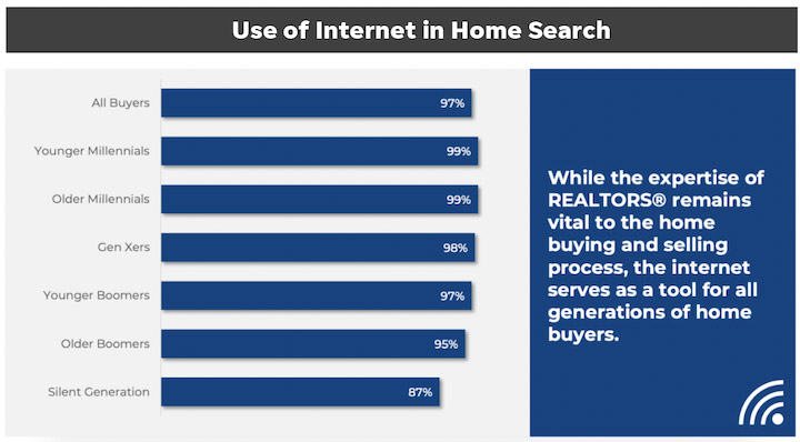
That takeaway is clear: People find homes online. If that’s where they’re looking, you should make sure they find your website. Now that we’re clear on why your site is important, let’s jump into the real estate website examples.
11 unbeatable real estate website designs
Here are real estate website examples to find inspiration, website design tips and trends, and more to improve your own marketing.
1. The New England Real Estate Company: Make navigation easy
If you’ve moved before, you know how stressful it is. Whether you’re looking for a bigger place, moving to a new city for a job, or ready to buy your first home, the process is overwhelming.
Your website should work to mitigate this stress by making navigation as straightforward as possible. The New England Real Estate Company does this exceptionally well.
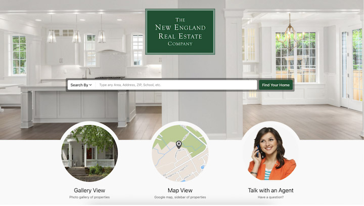
The search bar is centered in the hero section and the drop-down allows for searching by zip code, city, school district, neighborhood, and so many more location specifics. The three CTAs make finding extra help simple. And that bright, light, and airy aspirational background picture? The cherry on top.
You can find more navigation tips in our website header examples roundup.
2. Beach & Bartolo: Demonstrate local knowledge
Location, location, location. It’s paramount in real estate—and real estate marketing. Remember, when people are looking to partner with an agent, they’re looking for someone who is knowledgeable in real estate broadly but also in the specific area. Making this clear on your website could help you land some clients. It can also help with your local SEO.
Take Beach & Bartolo, an agency located in Columbia County, New York.
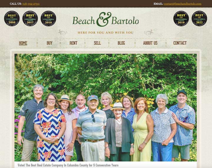
The nav bar is flanked by the best of Columbia County badges that Beach & Bartolo earned the last five years. The team photo puts friendly faces to the same achievements. Even more, the agent bio featured in the hero gallery leads with long-standing ties to the community. The website makes it super clear: Beach & Bartolo know their community.
3. NEREN: Prioritize accessibility
Website accessibility is a must for any design—not just as a best practice but as a way to implement inclusivity in your marketing. In addition to following best practices, many businesses are using accessibility widgets which allow users to customize their experience to their particular needs.
NEREN, or the New England Real Estate Network, is one such website. On the bottom right of the website you see an “Accessibility” button:
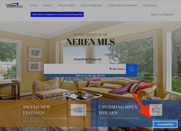
Click on it and you can adjust the contrast, text size, and text spacing, as well as highlight links, pause animations, and make the content dyslexia friendly. This particular one is powered by UserWay.
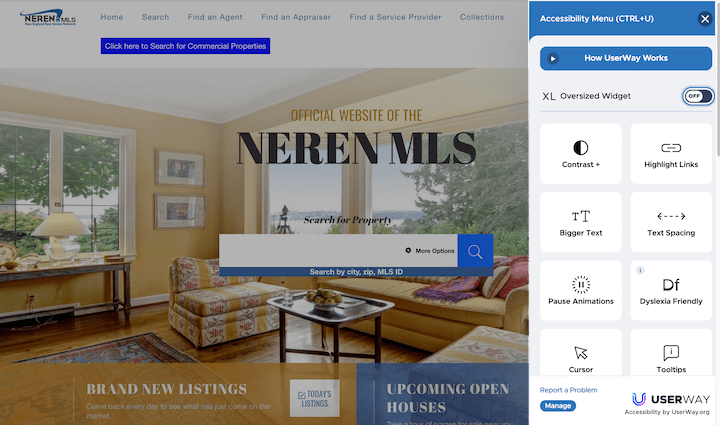
In addition, NEREN’s website keeps its information organized well. Because it serves different regions, the homepage includes top cities to find homes in a median price range, top waterfront listings, and most popular searches in states.
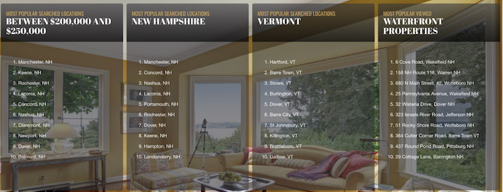
This gives people looking broadly in New England plenty of places to start searching. And that background photo with the classic New England lake scene outside the bay windows? Lovely touch.
For more great imagery, browse our business website examples roundup.
4. Long and Foster: Convey emotion with video
Looking for a place to live isn’t just a stressful process because of logistics—it’s also emotional. In some cases, this search means an exciting step in a relationship; it could also involve leaving a home, with memories, comfort, and even family, behind. A real estate agent that understands the emotional stakes in the process is appealing. That’s why you want to make sure to convey this understanding on your website.
Video is a great way to do this genuinely. Long and Foster has a great video on its website that captures scenes of a family cooking together, a woman relaxing in her own living room, and more heartwarming moments at home.
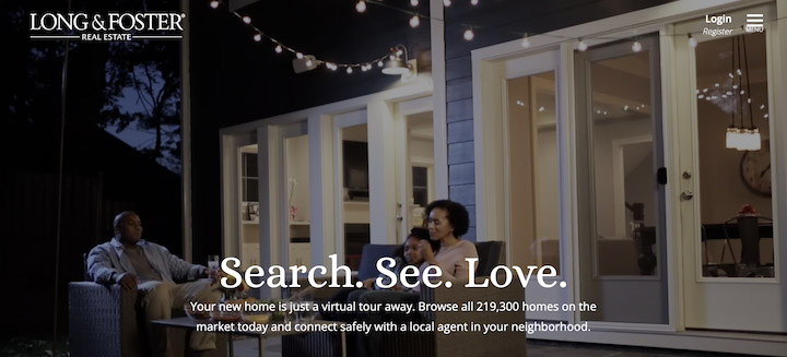
In case the video didn’t make it completely clear, the tagline spells it out: Search. See. Love.
5. Dawn McKenna: Cater to your target audience
Most of your potential customers will face a stressful experience, navigate the emotional impact of moving, and value insider knowledge about their prospective locations. But your website should also appeal to the specific experience of your target customers.
For instance, if you have a B2B website, you’ll want to cater your language to the decision-makers and executives. If your audience is families, you’d want to focus on school districts and suburbs. Or if your firm deals exclusively with waterfront houses, you’re likely working with a lot of people purchasing second homes. This should shape all of your marketing decisions.
Take Dawn McKenna. This real estate website is a great example of appealing to target customers.
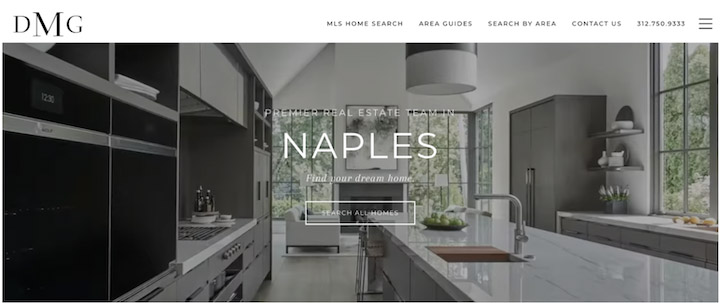
Take a look at the sleek Montserrat font, the dramatic visuals, the gray and white color scheme, the chef’s kitchen with the integrated refrigerator, and the double oven. The elements are high-end and the overall effect here is a luxury home. The target customer is clearly not a budget buyer.
6. Compass: Align your online and offline design
As a realtor, your marketing is happening in person at open houses or broker events or a brick-and-mortar office, as well as online. Your real estate website should coordinate with all of your IRL marketing strategies to offer a cohesive and memorable brand experience.
Compass does this well. Take a look at the Compass yard sign.

Now check out the Compass website.
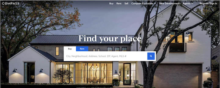
Same body font, same black and white color scheme, and same emphasis on geometric design. Take a similar approach with your own website and make sure anyone driving by your signs, visiting your open houses, or stopping by your office recognizes the same elements in your marketing collateral.
7. Sotheby’s: Make contact easy
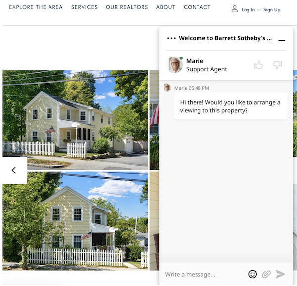
Making it as easy as possible for your potential clients to get in contact with you is key. This could be a simple contact form or a chatbot on your website.
Sotheby’s uses a chatbot when a visitor is viewing a property and interacting with the photos. That’s great—getting the chat too soon and it’s annoying, not helpful. Sotheby’s knows that they’re targeting a user who is more interested. The chatbot prompts you to schedule a viewing of the property you might be looking at.
8. Richard Blanco: Highlight your content and resume
When I’m not feeling well on a weekend morning, I turn on House Hunters International. The requirements and budget always seem ridiculous, the reasons for moving abroad are entertaining or mind-boggling, and a bonus: the repetition gets through any brain fog. And in the best episodes, there’s Richard Blanco, a London-based real estate agent.
Of course, when I checked out Richard Blanco’s website, his TV experience (and more) is featured prominently.

So if you have a solid content marketing strategy and have a blog, podcast, gallery, guide library, or guest content, highlight those links. If you’ve served on zoning boards or city councils, share that experience. If you’ve been on the news or a television show, feature these on your website. These all speak to your expertise—which is compelling for potential clients.
9. McEnearney Associates: Share impressive stats
Your website is the place to highlight your experience, explain your approach, and feature any property listings. Images, video, and website copy are key. But so are numbers. Don’t forget to include any stats you can.
Take this section from the about page of McEnearney Associates.
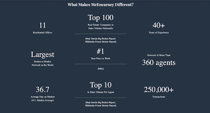
The numbers here are a great visual to break up the rest of your website elements. The stats here are also impressive—lower average days on market than the benchmark, an intimidatingly high number of transactions.
10. Sweet Living Realty: Show your testimonials
Client reviews are incredibly influential. That’s why testimonials belong on your website. Sweet Living Realty, a Seattle-based agency, knows this and sprinkles testimonials throughout its homepage.
Take a look at this testimonial:
Kristen And Her Team At Sweet Living Are So Amazing.
I cannot recommend them highly enough! Kristen helped us sell our first home and she was incredible. She was so supportive, informative, and responsive and she really helped us navigate the whole process with confidence. I trusted her to have our back and she exceeded our expectations. Kristen is a gem of a person, she’s funny, fun to work with, and helps bring levity to what can be a really stressful process. We moved out of the Seattle area and I really wish they covered the area we moved so we could work with them again. Sweet Living officially set the standard I will hold all realtors to.

This is a great review. It speaks to a specific, personal experience, comes with a picture, and has a button to the testimonials page.
Bottom line: If you’re not already, it’s time to start asking for reviews.
11. Zillow: Focus on ease of use
Now, Zillow isn’t a perfect real estate website example. It’s a listing tool, so it isn’t run by an agent or a firm. But it is the stickiest real estate website out there, and one that sees 36 million visitors each month. Worth getting some inspiration from.
Part of the reason why Zillow is so compelling is that it’s easy to use—searching by city, map view, price, and more. The copy on Zillow’s website emphasizes this appeal by presenting the process of buying or renting a home simply.
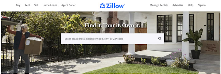
Find it. Tour it. Own it. In this market? Not quite that simple, but it could be easier if you’re starting on Zillow to find listings or figure out which area you want to be in.
Another thing Zillow does really well is branding. Zillow is consistent with colors and tone across its platforms. Take a look at its Twitter bio, for instance.
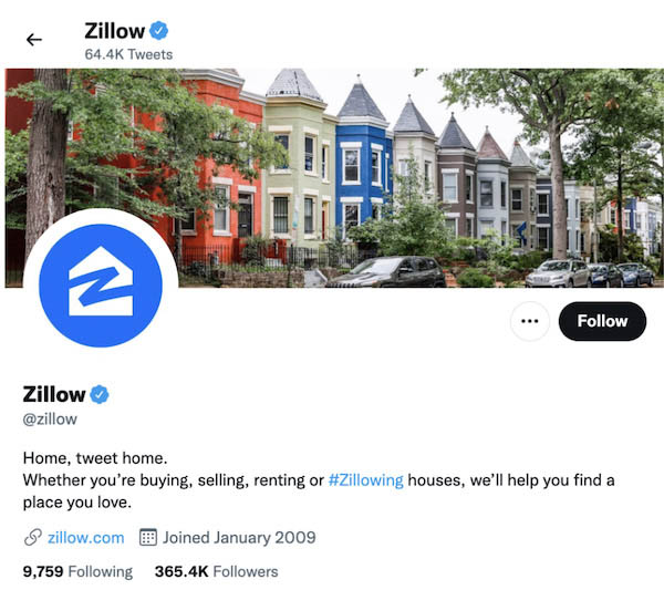
The row of houses with the on-brand blue. The “Home, tweet home.” line. It’s wonderful—and, even better, it’s memorable.
Real estate website design takeaway tips
We went through a lot of real estate websites, so here’s a quick overview of the key takeaways as they relate to real estate marketing:
- Make it easy. Moving is stressful. Navigating your website shouldn’t be.
- Highlight your local knowledge. Whether it’s a region, a city, or a type of area like waterfront or mountain homes.
- Zero in on your target client. Appeal to them throughout your website.
- Include trust signals. Awards, memberships, partnerships, and more.
- Use numbers. Tally up anything meaningful you can to show your prospects.
- Feature customer reviews. These recommendations are priceless.
- Keep consistent. Your brand should be recognizable throughout your online profiles and IRL.
Now, use these real estate website examples to revamp your site, add some compelling elements, and grow your business. For even more website tips, check out our free Small business Websites Marketing Lab Course. Good luck!
The post 11 Unbeatable Real Estate Website Designs & What Makes Them Great appeared first on WordStream.



Recent Comments