We’ve all had it happen to us: we try to choose an option on a website, and right before we click, the page jumps away and we end up clicking something we didn’t mean to. Doh!
Like a game of “down low, too slow”, this website behavior makes us feel slow and frustrated. Fortunately, website developers are now incentivized to improve their site experience with the release of Google’s Core Web Vitals; a set of metrics that help site owners measure and improve the user experience of their web pages.
Cumulative Layout Shift is one of these key metrics that measures the “jumpiness” of a website and how it unexpectedly moves as elements load. Let’s take a closer look at how this metric works, and how you can make sure your own website is following best practices so you rank higher on search engines and provide your users with a better experience.
What is Cumulative Layout Shift?
Cumulative Layout Shift (or CLS) is a measure of how much a webpage unexpectedly shifts during its life. For example, if a website visitor loaded a page and, while they were reading it, a banner loads and the page jumps down, that would constitute a large CLS score.
Along with Largest Contentful Paint (the amount of time it takes to load the largest piece of content) and First Input Delay (how long it takes for a page to be interactive or “clickable”), CLS is part of Google’s Core Web Vitals. Google’s web crawlers measure CLS on each page they index.
What causes Cumulative Layout Shift?
Page shifts happen when content loads at different speeds and causes the layout to change and alters what the viewer is looking at. Advertisements loading slowly, videos of unknown size suddenly appearing, or DOM elements being dynamically added are all potential causes of CLS.
The example below shows what happens when an ad banner is loaded after the rest of the webpage loads. The content is pushed down, and the user experience is negatively impacted.
It can be difficult to know if your users are experiencing CLS, because not every device or environment operates in the same way. If you’re loading your website in a development environment you may have elements cached or they may be loading locally. Personalized web content based on cookies will behave differently for every visitor, especially depending on their location. Plus, mobile users can have a very different experience – a small shift on a web browser may be monumental to someone viewing the site on a small screen. Really the only way to understand your users’ experience is to measure CLS, which we’ll go over below.
Why is CLS important?
Understanding CLS is critical for two reasons: your visitors’ experience and your search engine ranking.
Your visitors have high expectations when it comes to your site’s performance. In 2020, 93% of people reported leaving a website because it didn’t load properly.
Jumpy websites that load in pieces or with unexpected behavior will cause your visitors to find another website to browse. And if they do stick around, a high CLS score is likely to cause usability problems like choosing the wrong option, checking out too early, or missing parts of your website altogether.
This problem is only exacerbated by the large number of internet users who are browsing on their smartphones. When viewing your site on a small screen, any jumps and layout shifts on the website are certain to have a big impact on mobile user experience.
Optimizing your site and reducing your cumulative layout shift is essential to providing customers with a good experience.
Secondly, Google ranks sites based on their page performance. A better user experience results in a higher search ranking. If your page doesn’t meet the standards that Google lays out in their Core Web Vitals guidelines, your site will be penalized.
Google doesn’t want to direct people to sites that don’t perform well. Aligning with CLS best practices can help your website move up the rankings. And since 68% of online experiences start with a search, making sure your site shows up on the search results page is important to generating inbound traffic.
How do you measure Cumulative Layout Shift?
The good news is that you don’t have to measure CLS yourself because Google makes it really easy to analyze your page performance with their PageSpeed Insights tool, or in the Chrome browser using Lighthouse Tools.
To analyze performance in PageSpeed Insights:
- Enter a website URL into Google's PageSpeed Insights tool.
- Click ‘Analyze.'
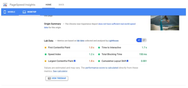
- Check your performance. You can review both mobile and desktop performance, which you can switch between using the top left corner navigation.
The page analyzed below shows a good cumulative layout shift score of 0.001.
 To analyze performance using Lighthouse tools:
- Open up the website you want to analyze in Chrome.
- Navigate to Developer Tools by clicking the three dots in the top right corner of the browser window, choosing “More Tools” and then “Developer Tools.”
- When the console opens, choose “Lighthouse” from the options along the top.
- Click “Generate Report.”
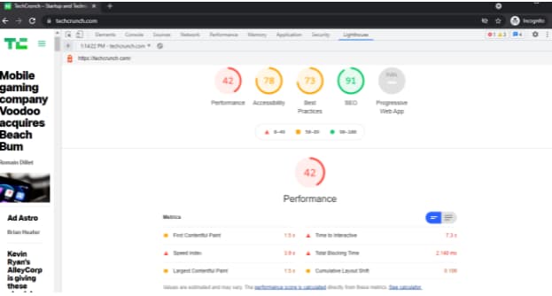
The page below shows a CLS of 0.109, or “needs improvement.”
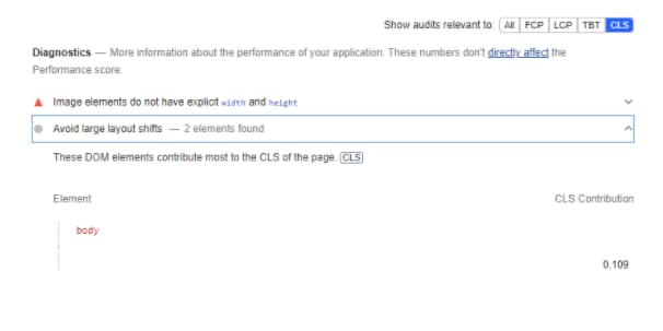
 Lighthouse provides a detailed audit of what contributed to that score. To review the audit, scroll down and choose “Show audits relevant to CLS.”

More About Impact Fraction and Distance Fraction
Two terms you might see when researching CLS are “impact fraction” and “distance fraction.” These are the two variables that Google uses to calculate CLS.
layout shift score = impact fraction x distance fraction
Impact fraction relates to the size of the unstable element in comparison to the viewport. Distance fraction is the amount the unstable element moves as a ratio of the viewport.
So a high CLS would consist of a large element moving a long distance. A small CLS would be the result of a small element moving only a small distance.
CLS is the largest “burst” or group of layout shift scores that occur during a session window. Essentially, if a bunch of shifts happen within a five-second window, this would be considered disruptive and result in a large CLS score.
What is a good CLS score?
A good cumulative layout score is anything less than 0.1. The reports from PageInsights or Lighthouse tools will automatically flag any poor scores, as well as provide advice on how to optimize the page for better performance.
How To Improve Cumulative Layout Shift
There are a few best practices that website owners can follow to improve their CLS score:
1. Use a CMS (content management system).
Especially one that integrates with Google Lighthouse or other diagnostic tools. This will make sure that you’re designing with best practices in mind, and flag any issues before you launch your site.
2. Specify size attributes for images and videos.
Rather than letting them set their own height and width, dictate size attributes for your media. By setting these attributes, you’re telling the browser how much space to set aside, even if the image isn’t loaded yet.
3. Understand how ads can influence your layout.
Google Publisher Tag offers extensive guidance about how to reserve space for ads.
Load new content below the viewport. Loading content above what the user is viewing will often cause a page to shift.
4. Use transitions and animation to provide context around page changes.
For example, a “Read more” link that scrolls the user down the page would not impact CLS because it’s an expected layout shift.
A Note On Expected Vs Unexpected Layout Shift
CLS only takes into account unexpected changes. If the layout changes because of a user-initiated action, there is no impact on CLS. This is a helpful tool to use when you don’t need to load everything all at once. Instead, offer users the opportunity to choose which elements they want to view through “read more” links or “expand topic” accordions within your page.
Offer A Better User Experience With CLS Optimization
Paying attention to CLS not only provides a better user experience, but it also boosts your search result rankings. It’s a win-win.
To meet Google’s standards for CLS, start by using a diagnostic tool to measure your website’s current performance. Take into account the basic guidelines outlined above, and keep layout shifts top of mind when designing your website, especially around transitions and content additions. With these few simple considerations, you’ll see better results across the board.

![→ Download Now: SEO Starter Pack [Free Kit]](https://localseoresources.com/wp-content/uploads/2021/11/1d7211ac-7b1b-4405-b940-54b8acedb26e.png)


Recent Comments