As someone who’s spent the past few years building websites and helping businesses fine-tune their digital presence, I’ve seen firsthand how overlooked the homepage can be. Yet, it’s the most visited page on your entire website. The virtual front door that welcomes (or turns away) the majority of your traffic.
A lot of businesses struggle here because they treat the homepage like a one-size-fits-all landing page. But your homepage has a much bigger job to do. It needs to guide visitors from all different backgrounds, interests, and traffic sources to the next best step.
That means it has to be designed with intention, not guesswork.
When I work on websites, and what to put on the homepage specifically, I always look at three non-negotiables:
- Does it attract and hook visitors quickly?
- Does it educate them on who you are and what you offer?
- Does it guide them toward taking action (without being pushy)?
That’s the formula for a homepage that performs. If you’re serious about making your homepage work harder for you, make sure the following must-have elements are in place.
What You Should Include in Your Website Homepage Design
1. Headline
On average, users usually scan websites within 15 seconds. That’s such a small window to tell visitors what your business has to offer. That’s why I always opt to place the headline, sub-headline, and a clear CTA right in the hero section — it’s prime real estate to get your message across fast. Your headline may only be a few words, but it’s one of the most important pieces of copy on your website.
When I’m working on website projects, I’ve learned that trying to please everyone with a single headline is a losing game. Your homepage will attract a wide range of visitors with different backgrounds, needs, and levels of awareness. But the truth is, your headline only needs to resonate with the third of your audience that’s most likely to love what you offer. Those are the people you want to connect with right away.
That’s why I always aim for clarity over cleverness.
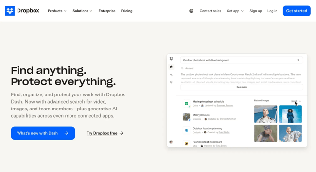
A headline should be simple, direct, and instantly tell visitors what’s in it for them. One of my favorite examples is Dropbox’s homepage headline: “Find anything. Protect everything.” There’s no fluff, no jargon. You don’t have to think twice about what Dropbox does. That kind of clarity is what keeps people on your site.
Over the years, I’ve seen too many businesses overthink their headlines — trying to sound innovative or bold — when what really works is being clear and human. A well-written headline can do more heavy lifting than an entire paragraph of marketing copy if you keep it focused on the visitor’s needs.
Pro tip: One way I simplify this process for myself and my clients is by using HubSpot’s free drag-and-drop website builder. It’s a user-friendly tool that allows you to build a homepage that adapts to your audience’s needs, no code required. I like it because it gives me control over layout and flow, while still leaving room to optimize as traffic behaviors change.
2. Sub-headline
Your sub-headline is where you get to add a little context to your headline. Think of it as the quick follow-up that explains what you actually do. It’s not the place to be vague or overthink it.
The best way to make it land is by calling out a problem your audience is dealing with and showing how you solve it.
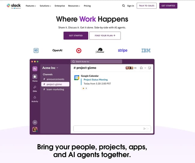
One brand that does this well is Slack. Their headline says, “Where Work Happens,” which is broad, but their sub-headline gets specific: “Bring your people, projects, apps, and AI agents together.” In just a few words, they’ve described exactly what they offer and why it matters to busy teams. The video of the Slack app being used also adds to the clarity of what their product actually offers and how it works.
When I’m working on websites, I always recommend using this space to address a real pain point. Don’t just list a feature, explain how it makes life easier for your users. That’s how you turn a headline and sub-headline into a powerful combo.
3. Primary Calls-to-Action
The first thing I think about before I dive into website building is what I want the users to do. What action do I need them to take? That’s where straightforward, easy-to-find calls-to-action (CTAs) come in.
I recommend having at least two to three CTAs above the fold, leading visitors to different parts of the buying journey. Personally, I like to at least place one in the header and another in the hero section. Some folks might be ready to sign up today, while others are just browsing. Your CTAs should meet them where they are — and they need to stand out.
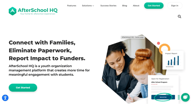
A good example of this in action is Afterschool HQ’s website. Right in the header, they have a CTA geared toward program directors looking to promote their after-school activities that says “Get Started.” If they miss the button in the header, they have the same one in the hero section underneath their sub-headline.
Pro tips:
- I always advise clients to use a contrasting color for CTAs. That simply means picking a color that pops against your homepage background but still feels like it belongs in your brand palette. For example, if your website has a soft, neutral color scheme — think whites and light grays — a bold navy blue or vibrant coral button will naturally draw the eye. The key is balance: It should grab attention without clashing.
- Keep the CTA text simple. I’m talking five words or less. Short, action-oriented phrases like “Get Started,” “Book a Demo,” or “Try It Free” do the trick. Don’t make people think too hard about what happens next.
4. Supporting Image
Most people are visual. Make sure to use an image (or even a short video) that clearly indicates what you offer. Use images or videos that capture emotion, drive action, and visually tell the story you’re writing about.
To optimize your images for mobile users, use high-quality images that have a reduced file size. (HubSpot customers don‘t need to worry about this, as images uploaded to HubSpot’s software are automatically compressed. Otherwise, tools like Tinify will do the trick.)
Also, always add alt text to your images to make them more accessible to visitors who use screen readers and to take your SEO efforts up a notch.
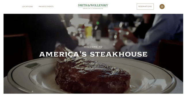
The Smith & Wollensky homepage is a great example of emotional imagery: It features a series of short, high-definition, and mouthwatering videos that play on a loop behind a simple headline.
5. Benefits
Stating what you do is not enough. I am a huge advocate for showing what you do as well. Your audience cares about how your product helps them, and that’s what keeps them interested.
Keep your message light, clear, and in their language. Evernote is one of my favorite examples of this. On their homepage, they show their benefits in a way that’s easy to read and nice to look at.
![]()
6. Social Proof
Social proof is a powerful indicator of trust. Your product or service could be the best in the world, and it‘s okay to lay that claim — it’s just that people may not believe you unless they hear it from other people, too. And that's exactly what social proof does.
Include just a few of your best (short) quotes on the homepage, and link to case studies if applicable. Adding a name and photo gives these testimonials more credibility.
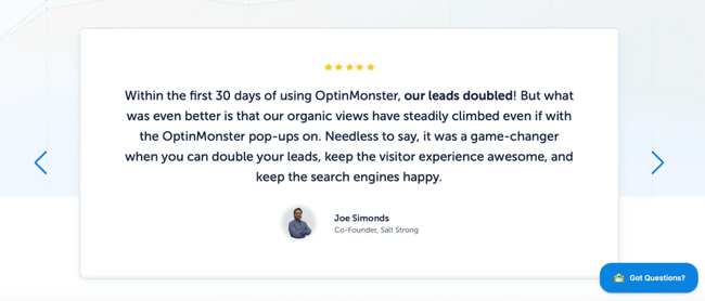
OptinMonster nails this on their homepage with glowing testimonials from actual clients. Most local services and goods thrive on social proof. So, whether you're working on an orthodontics website design or a local bakery, make sure to include testimonials and reviews if available.
7. Navigation
The design and content in your homepage navigation could mean the difference between a website conversion and a bounce. If you want to keep your bounce rate low, you’ve got to give visitors an obvious, easy-to-follow path to wherever they need to go — starting right from your homepage.
So, keep your navigation menu visible at the top, and lay out your links in a way that naturally guides people through your content, from the most important pages on down.
You and your team know your website inside and out, but your visitors don’t. That’s why it’s important to run user tests to see if navigating your site feels as smooth and intuitive to them as it does to you. If you can, add a search bar to make it even easier for folks to find exactly what they’re looking for.
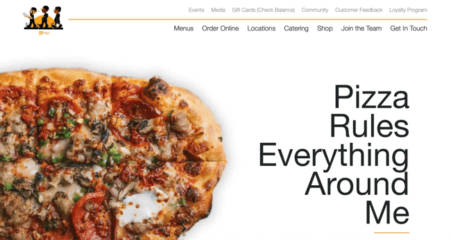
One of my favorite examples of easy navigation is Slim & Husky’s Pizza Beeria. Their homepage navigation is clearly structured, keeping visitors moving in the right direction.
8. Content Offer
To generate even more leads from your homepage, feature a really great content offer, such as a whitepaper, ebook, or guide. Folks who may not be ready to buy might rather download an offer that gives them more information about a topic they're interested in.
If you need inspiration, here are several different content types to pick from.
9. Secondary Calls-to-Action
Here’s the thing: Not everyone who lands on your homepage is going to be ready to commit straight into your main offer. That’s why having secondary CTAs is so important. They’re like your safety net, giving visitors who need a little more time (or a lower-commitment option) another way to connect with you.
While your primary calls-to-action should be front and center above the fold, those secondary CTAs belong further down the page.
As people scroll, you want to keep giving them reasons to stay engaged. A great example of this is Spanx’s homepage. Once you scroll past the top section, you’ll spot three clear CTAs waiting for you. Whether it’s grabbing $20 off or hitting “Shop Now” to browse the catalog, these secondary actions give visitors more paths to convert when they’re ready.
![]()
10. Features
In addition to benefits, list some of your key features. This gives people more of an understanding of what's provided by your products and services. Again, keep the copy light and easy to read.
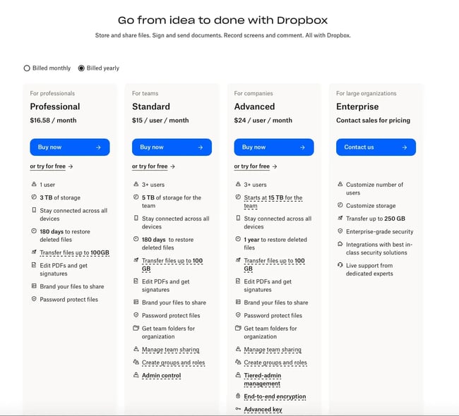
Dropbox for Business, for example, doesn't shy away from showing off a features matrix right on their homepage below the fold.
11. Resources
One of my signature website elements is having a resourceful footer. This is because most people aren’t going to be ready to buy on the spot. They’re still in research mode, trying to figure out if what you offer is the right fit.
That’s why it’s smart to give them a space where they can explore and learn more, like a resource center or knowledge hub. It not only keeps them engaged and on your site longer, but it also positions you as the go-to expert in your space.
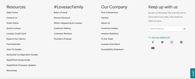
Take Lovesac, for example. They’ve added a resource link in the footer, below the fold, that reiterates all of their wonderful offerings.
Their secondary CTAs are thoughtfully designed to catch visitors at different stages of their buying journey. There’s a credit card link for folks ready to make a purchase, a fabric swatch guide for those still deciding on colors, and an online catalog for shoppers who are browsing but not quite ready to commit. Each one gives visitors a reason to stay connected and move closer to a purchase when they are ready.
12. Success Indicators
Along with customer success stories, awards and recognitions are great for making a strong first impression. Is your restaurant critically acclaimed? Did your app win best new product this year? Highlight those wins on your homepage. Just like social proof, showcasing achievements builds trust and adds credibility for visitors who are new to your brand.
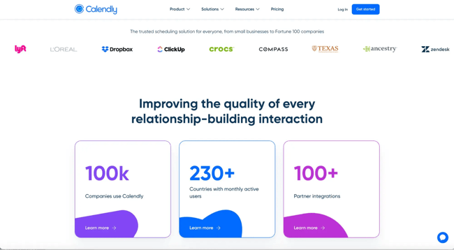
On Calendly’s homepage, for example, you'll find the names of famous organizations that have recognized them, like Gartner and Dropbox.
13. Search Bar
If your website is content-heavy, adding a search bar may be extremely helpful for your users, especially if you’re an online store with hundreds of products, a blog library, or a resource hub.
Visitors who already know what they’re looking for don’t want to go through layers of navigation menus. A simple, visible search bar gives them a direct shortcut to find exactly what they need, fast.
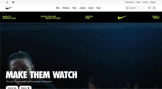
Remember this: The more content you have, the harder it becomes for people to browse through categories and filters. A search bar solves that by letting users type in exactly what they’re looking for. It’s an underrated tool that keeps visitors engaged and prevents them from bouncing out of frustration. Sites like Amazon and Nike wouldn’t be functional without it — and if your site has a large inventory or content library, you’ll want to follow their lead.
Even on smaller websites, a search bar can add value if you have multiple service pages, case studies, or blog articles. It’s all about reducing friction and making sure people don’t have to work hard to find what they came for.
14. Contact Us
Your “Contact Us” options shouldn’t be hidden away in some forgotten corner of your website. It deserves a spot right on your homepage. Why? Because when a visitor is ready to reach out, you want to make that next step as frictionless as possible. Whether they have a question, need a quote, or simply want to connect, giving them a direct line to you upfront builds trust and shows you’re approachable. Plus, it’s a key touchpoint that can turn casual browsers into real leads — so why make them dig for it?
Now, if you’re working with a minimalist design or don’t want to dedicate a full page or section to contact info, no problem. You can keep your layout clean by using a strategically placed “Contact” button that triggers a hidden modal. When clicked, this modal can pop up with a simple contact form or contact details, giving visitors a distraction-free way to reach out without cluttering the main page.
It’s a sleek way to keep your design tight while ensuring people know exactly how to get in touch with you. Check out this blog full of great “Contact Us” examples.
A Homepage Worth Visiting
Your homepage is your brand’s first impression — it sets the tone before you even get a chance to make a pitch. Visitors judge what you do, why it should matter to them, and how your product or service can make their life easier. That first impression happens fast, and your homepage needs to pop to keep them interested.
By weaving in the elements we’ve talked about — clear CTAs, strong headlines, user-friendly navigation, and a design that guides visitors down the funnel, you’re building a path to conversion.
Editor's Note: This post was originally published in January 2012 and has been updated for freshness, accuracy, and comprehensiveness.


Recent Comments