In business, we all love to have insightful reporting dashboards at our fingertips. When done well, they show us where the business is thriving, which areas are struggling, and if we're on track to reach our goals.
That said, creating reporting dashboards can be incredibly time-consuming. It takes time and effort to compile up-to-date, accurate, and meaningful data, not to mention the learning curve required to understand what data to collect and how to do so.
This is why reporting is one of the most effective areas of your business to automate.
What's more, it doesn't have to be complicated to implement automated reporting workflows.
Here's how to automate your business's reporting workflow for dashboards that are continuously updated, without you needing to lift a finger beyond set-up.
The Good, the Bad, and the Ugly of Reporting Workflows
So you know that you want to have good data reporting in your business. But what does this actually look like?
Take a look at the characteristics below and identify how your business's data workflows are currently performing.
The Good
You can identify the most effective reporting workflows by looking for:
- Clear tracking of the most important KPIs, without clutter and vanity metrics
- An automated dashboard that your team can view on any device
- Frequently updated data that doesn't require manual, time-consuming, and error-prone imports and exports
The Bad
By contrast, reporting workflows in need of optimization and automation look like this:
- Reports that depends on you (or anyone else) to trigger updates
- A lack of certainty if the data in your business reports is accurate
- Siloed reports that only certain people can easily access
The Ugly
And, here's what to really avoid if you want to save time, improve data accuracy, and fix efficiency leaks:
- Manually importing and exporting data between apps, or copying and pasting data between sheets and presentation slides
- Out-of-date or overly complex dashboards that don't provide any real value, or lacking any clear data
- Knowing that the data on your dashboards is inaccurate
Our Pick of the Best Options for Automated Reports
How can you achieve more of the good and less of the ugly in your reporting? Here are some of the best ways to automate your reporting and create insightful dashboards with the most relevant and up-to-date KPIs, ordered from basic to highly customizable:
- Built-in reporting for your CRM and key apps
- Google Analytics
- Google Sheets
- Google Data Studio
- Supermetrics
1. Built-in reporting for your CRM and key business apps
Many comprehensive CRM options on the market have excellent reporting capabilities. Some also have native integrations to pull data from other key apps.
For instance, HubSpot connects to Google Analytics to enrich the data you already have inside the CRM. This makes it simple to display website engagement analytics alongside lead and customer data.
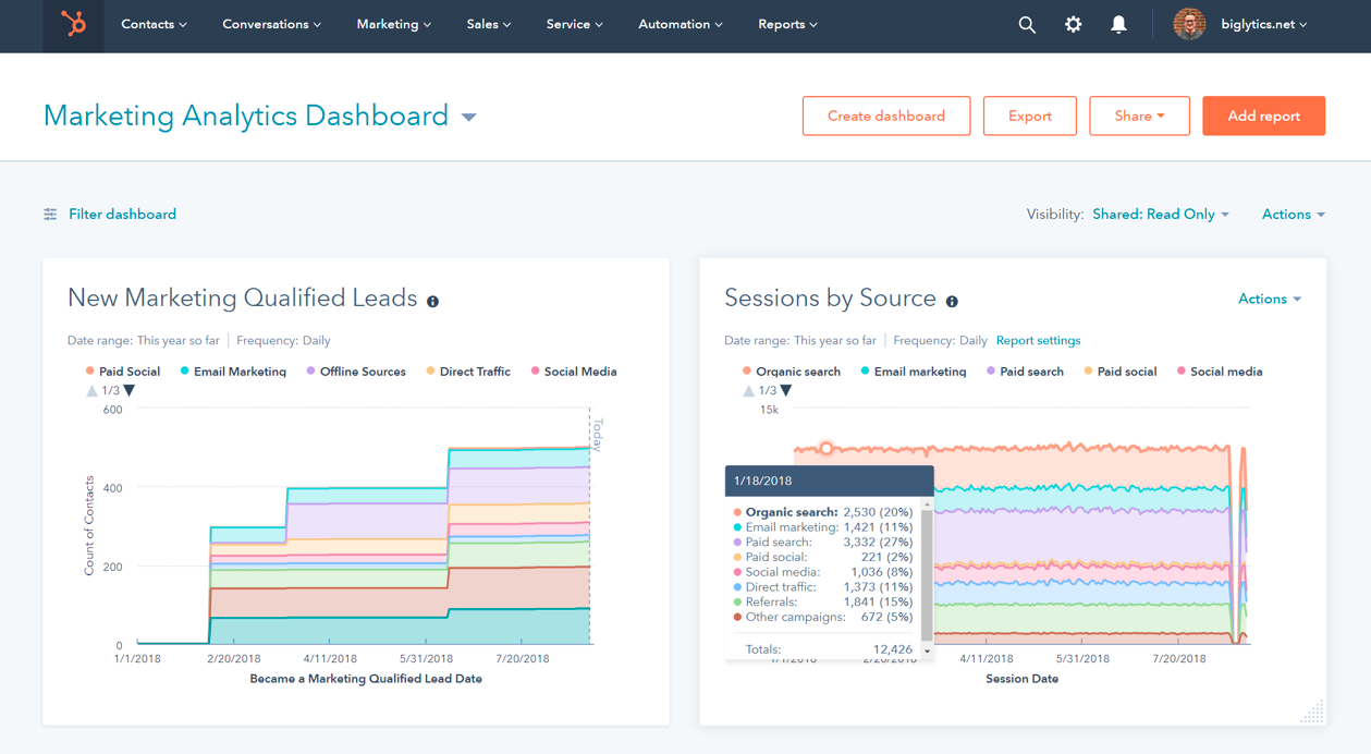
As a simple solution for automated reporting, check your CRM's scope for creating up-to-date dashboards that share your business's key data.
Tip: For the most accurate and enriched data insights in your CRM, sync it two ways with your other business apps that collect data.
2. Google Analytics – for an up-to-date view of your website data
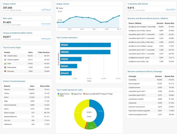
If you want to automate reporting on website engagement and conversion goals, Google Analytics provides a simple, yet robust, framework.
To begin, optimize the data you're collecting. Make sure the tracking code is properly added to your website, and look into setting up Events to track the conversions that matter to your business, such as ecommerce transactions or a visitor landing on your sign-up confirmation page.
You can then add these key metrics to your dashboard as custom widgets and choose how they are visualized. With custom dashboards, you can customize your reporting for the best overview, taking into account the most important KPIs for your team.
It's also worth creating a simple process to share or export your dashboard, such as with a link that anyone in your team can use without logging into Google Analytics. Or, you could take your automation even further by automating Slack notifications that share the GA dashboard every week.
3. Google Sheets – for a simple spreadsheet powered by Google Analytics
Google Sheets is a very simple but effective solution for automating your data reporting.
The main scope for automated reporting with Google Sheets is by enabling the Google Analytics add-on and automatically pulling data in.
Here's an example of a report that's straightforward to create in Google Sheets using Google Analytics data:
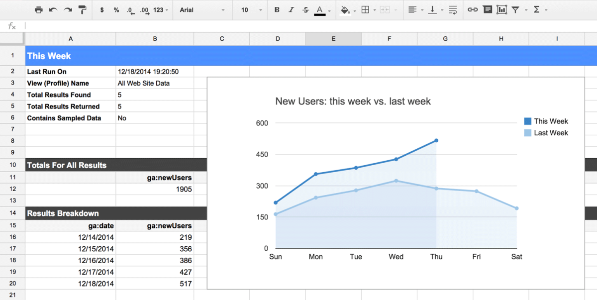
You can enable your reports to update automatically (and avoid having to click “refresh” to bring in the new data from Google Analytics) by selecting Add-ons > Google Analytics > Schedule Reports from the menu bar.
Another great option for automated reports in Google Sheets is the Supermetrics integration with Google Sheets that also enables you to connect data from your non-Google business apps.
Tip: If you use Google Slides to present business meetings and reports, you can automatically sync charts and data views in Google Sheets with Slides (and Docs) to avoid manual copy and pasting before every meeting.
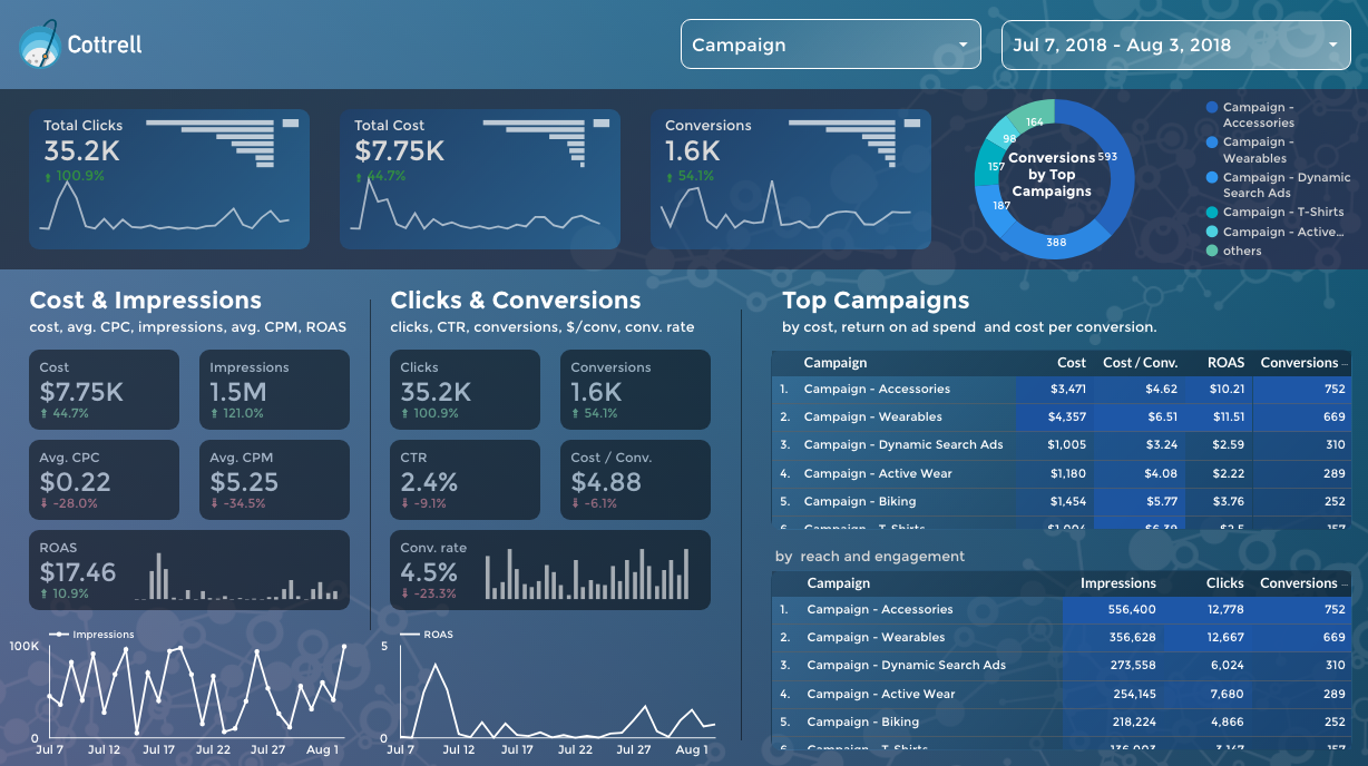
4. Google Data Studio – for highly customizable visualizations using data from multiple apps
Google Data Studio enables you to connect, visualize and share your business data on one platform. It's fairly straightforward to set up, but there's huge scope for customization and complexity if that's what you're looking for. With the tool, you can:
-
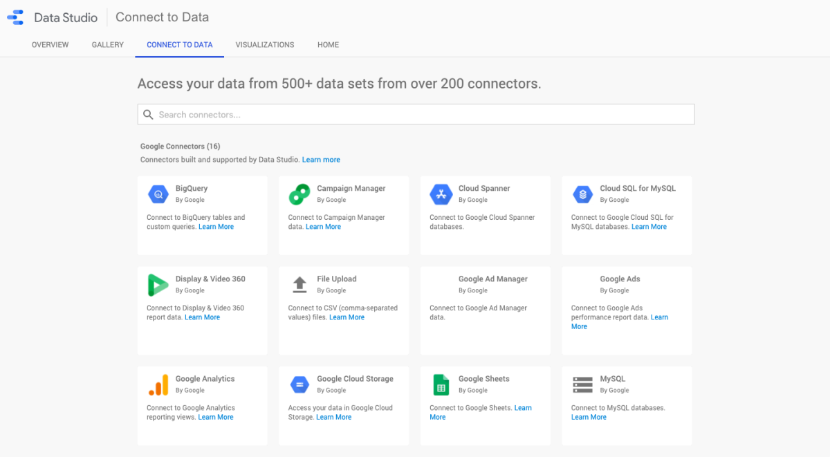
Connect data from the apps you use every day via built-in and partner connectors. The 500+ data sets include built-in connections with Google products like Google Analytics, Sheets, and Ads, plus partner connections with apps such as Copper, Mailchimp, or Facebook Ads.
-
Visualize your data in compelling ways with interactive reports, charts, and dashboards.
-
Share your reports and dashboards and collaborate with individuals, teams, or the world with public visibility. You can also embed your Data Studio reports on any web page.
To get started with Google Data Studio, first choose which data sources you want to connect:
Next, decide how you want to visualize and share your reports.
5. Supermetrics – for a scalable solution that takes Google Sheets, Excel, or Google Data Studio further
Supermetrics is a scalable solution designed to bring all of your marketing metrics together in one place, including PPC, SEO, social, and web analytics.
You can use Supermetrics alongside these tools to bring all of your marketing data insights directly onto each platform:
- Google Data Studio
- Google Sheets
- Excel
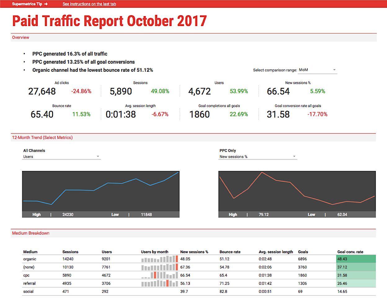
Here's an example of a report using Supermetrics data in Google Sheets:
Best Practices for Automated Reporting
Regardless of the tools and processes you choose to automate your business reporting workflows, there are a few best practices to keep in mind to achieve the best results.
When creating your reporting automation, focus on these three goals:
-
Simplicity: The most effective reporting workflows and dashboards are often the simplest. What's the most valuable data for your business to track? Keep the focus on a few KPIs and make sure the data is automatically updated, accurate, and accessible.
-
Accessibility: Avoid keeping your reporting in silos. Ensure your team members can easily access the data they need to track performance and do their best work, such as with a public dashboard that is pinned in a Slack channel.
-
Data accuracy: Even the best automated reporting workflow will fail if the data in your source apps is inaccurate. Take the time to clean up your databases and use an iPaaS to instantly sync data between your apps using conditional rules.


Recent Comments