You know how they say a closed mouth doesn’t get fed? If you want someone to do something, you gotta ask for it. Writing a killer call to action (CTA) is one strategy to get what you want.
Whether you’re trying to get people to buy your products, sign up for your emails, or join your cult, crafting the perfect call to action is essential for success.
But how do you write a call to action that stands out from the crowd and actually drives results? In this blog post, we’ll show you how to motivate with some powerful examples of moving calls to action and tips on writing them yourself.
Bonus: Download a free guide to social advertising and learn the 5 steps to building effective campaigns. No tricks or boring tips—just simple, easy-to-follow instructions that really work.
What is a call to action?
A call to action is a word or phrase that prompts action. It is a marketing term to describe urging your audience to act in a certain way.
A call to action can appear as a clickable button or simply as a piece of text. Call-to-action buttons and phrases can appear at any place in the user journey that you want to direct your audience.
Let’s say you’re trying to sell a pair of shoes on Instagram, and you’re crafting clear social media CTAs. You might have a call to action at the end of your social post caption that says, “Click the link in our bio.” The link in your bio could lead to a product page with information about the shoes on it. The call to action on this page would be an “Add to shopping cart” button.
CTAs aren’t just for social media. They can also appear in emails for an email marketing campaign, on paid ads, at the end of a blog post, and on landing pages.
CTAs are common in print marketing, too — think billboards or flyers that scream “Call Now!”
Examples of common CTAs
You’ll see plenty of CTAs around, but there are a few tried and tested phrases on repeat.
These common CTAs are uncomplicated phrases that tell your user exactly what to do and what they can expect once they follow through. There’s power in simplicity, which is why you’ll see these words used over and over again.
Some of the most common CTAs are:
- Buy now
- Subscribe
- Contact us
- Try for free
- Try now
- Add to cart
- Learn more
- Get started
- Join us
- Read more
Why is a good CTA important?
A well-crafted call to action serves as a bridge or a well-lit path. It guides your user where you want them to go. Which, if your business plan is in the right place, will be toward your goals.
A strong CTA will grab customers’ attention and incentivize them to take the decisive step necessary to achieve their goals. Effective CTAs give customers confidence in your business. They can communicate security, trustworthiness, and convenience, all of which can increase conversions or drive traffic where you want it to go.
Calls to action can also combat decision fatigue. When someone has too many options, they can become overwhelmed by choice. CTAs can help cut through decision confusion by giving your reader a direct command. Now, go read the best practices for creating effective CTAs.
Best practices for creating effective CTAs
Much like cutting your bangs, there’s a right way and a wrong way to go about creating CTAs. You’ll need to consider things like copywriting, design, visuals, and placement on a webpage.
It might seem like a lot, but we’ve got you covered with the handy best practice list below!
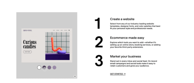
Make it concise and clear
The CTA should be concise and lay out a clear request for the customer, whether that be for them to join a mailing list or purchase a product or service. Don’t write your reader a paragraph with the CTA buried within it; you want them to be able to immediately know where they should go.
Source: Squarespace
Make it visible
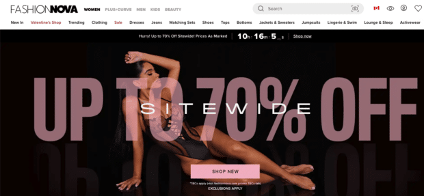
People don’t scour your web page. They don’t read every word, and they certainly don’t like searching for something. If your CTA isn’t immediately obvious, you will lose your viewer’s interest in seconds. Remember, a competitor is likely doing the same thing you are, and your customers are spoilt for choice.
Make your call-to-action buttons or phrases clearly visible on your page. You can tailor your imagery or site design to point to the CTA for added visibility. Take Fashion Nova, for example. Here, the banner model’s body points toward the Shop Now CTA.
Source: Fashion Nova
Use white space
A great way to make sure people can see your CTA is to surround it with white space.
Don’t be scared of white space on your website! It allows your viewers to breathe in between content and can highlight important information.
Surrounding your button CTA with white space makes it pop.
Source: West Elm
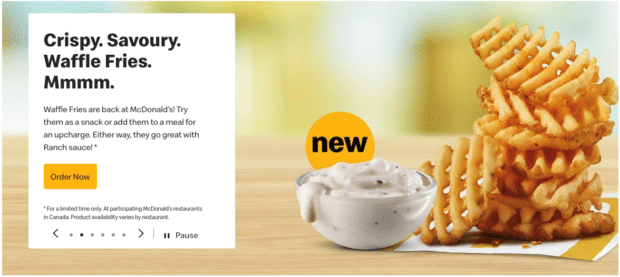
Use contrasting or bold colors
Stop signs are red for a reason. They pop out among cityscapes or the countryside because that bright, arresting red isn’t at risk of blending in. Do the same for your CTA button colors.
Keep in mind that you shouldn’t veer away from your brand colors. A secondary brand color can do the job well. (And if you want to know more about brand colors and a consistent style guide, we’ve got you covered.)
Source: McDonald’s
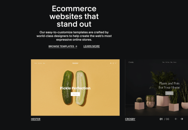
Have well-considered page placement
Where you place your call-to-action buttons matters a great deal. You want to consider the natural flow of your user’s journey. You’ll have some users who immediately want to get shopping or head to the next page, and you’ll have users who want to scroll through your landing page before moving on.
A call to action should be placed under your header and at the bottom of your page. You want to capture people immediately (if they’re willing) and give those who need a bit more time another opportunity to hit that CTA at the bottom.
Source: Squarespace
Write benefit-forward supporting text
Supporting text is the content that comes before or in between your CTAs. It can be blog content, email body copy, the text on your website, or any copy that supports your CTA.
This extra information is your opportunity to show your audience the benefit that befalls them when they click your CTA.
Source: Squarespace
For example, maybe you’re trying to get an audience to sign up for your email newsletter. If you want to convince people to hand over their email addresses, you’ll have to tell them what that newsletter will do for them.
A copywriting newsletter might say something like, “We sift through thousands of copywriting samples and pull only the best for you to repurpose for your own use. Plus, we tell you exactly why they work, so you don’t have to spend time puzzling through strategy. Impress your clients, save time, and look like an expert. Sign up today.”
The supporting copy highlights benefits so the call to action feels extra compelling. The reader knows exactly what to expect when they sign up for the email newsletter and how it will benefit them.
Create thoughtful copywriting
Aside from benefit-forward supporting text, the rest of your copywriting needs to be on point. Everything, from your site headers to your social posts, needs to be in your brand voice and speak directly to your audience.
Don’t forget to pay attention to the language you’re using both in and around your calls to action. Powerful words strike a chord with your audience’s emotions. White-hot CTA copy is an explosive way to skyrocket your ROI. (See what I did there?)
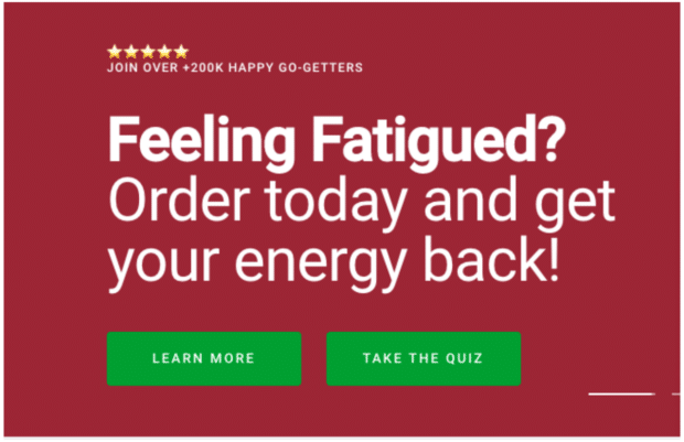
That being said, don’t confuse your audience. While your surrounding text can be full of powerful language, your CTAs need to be clear so your audience knows where they are headed. “Take the Quiz” or “Shop Now” gives your audience everything they need to know about where the button leads.
Source: Qunol
Test, test, and test again
The only way to really know if you’re using the best version of your CTA is to test it. Running A/B tests on your calls to action will show you which strategy performs the best.
It’s a simple method: You change one element (like your copy, placement, or colors) and let it run for a set amount of time. Then, see how it compares to the previous version.
6 great call-to-action examples
Now that you know what to do, it’s time to check out what others are doing! Get inspiration for your next CTA from the examples below.
Glossier
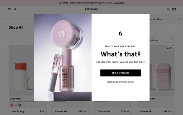
Oh, how we love a good mystery! Whether it’s a cheesy crime drama or a surprise gift from a company, there’s something about not knowing what you might get that is just so enticing.
Glossier’s “It’s a mystery!” CTA makes us itchy to click that button just to see what’s on the other side.
Source: Glossier
Article
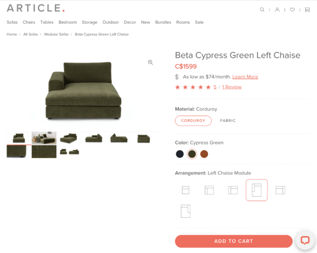
Article uses color to its advantage with the website’s call-to-action buttons. Their secondary brand color is a bright coral, which you can see is used for the “Add to cart” CTA button.
It’s clear, eye-catching, and concise, everything a great CTA button should be.
Source: Article
Coco & Eve
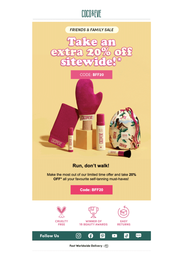
Coco & Eve’s email marketing campaign uses a discount code as a CTA. Who doesn’t love saving money? Incorporating your discount code into your CTA is a clever way to get people to click.
Source: Coco & Eve’s email campaign
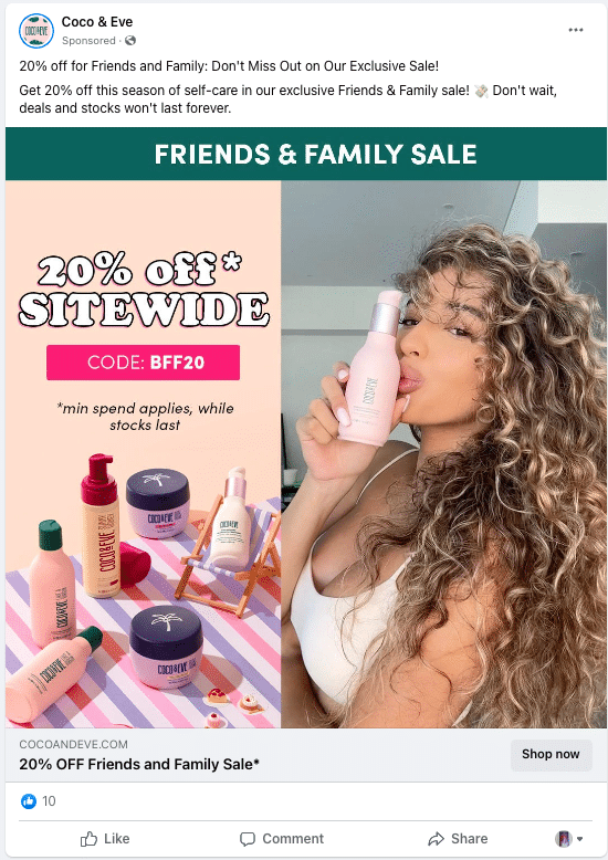
While this strategy worked well in Coco & Eve’s email campaign, they ran into CTA limitations on other platforms, like Facebook. If you’re advertising on LinkedIn or Facebook, you’ll know that the apps force you to use a set of standard CTA copy on the buttons.
While this poses some limitations, you can still add supporting text that motivates your audience to click. Below, Coco & Eve included the discount code on the imagery instead, which is just one of many clever ways to go about Facebook advertising.
Source: Coco & Eve on Facebook
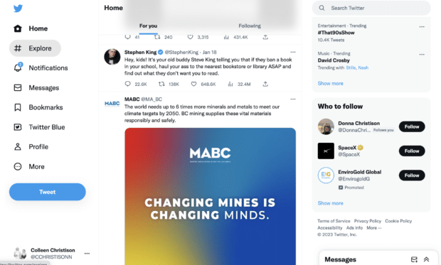
Twitter’s “Tweet” CTA uses its own brand-specific language. Before the rise of social media, if you had told someone to tweet something, you’d be met with a blank stare. (We’ve come since 2006, truly.)
To do this yourself, just create a globally-used platform that makes birdsong synonymous with snippets of thought. Easy.
Source: Twitter
Tushy
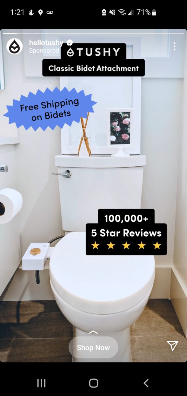
Tushy uses social proof as supporting text in its Instagram story ad. The “100,000+ 5 Star reviews” statement below serves to motivate others to grab a Tushy. Social proof is one of those marketing tactics that just works. People look to other people to determine what’s hot and what’s not.
Social proof works a lot like the bandwagon effect, a kind of cognitive bias. The bandwagon effect is pretty much exactly like it sounds; when a majority of people like or endorse something, it’s often picked up by others. And, with 100,000 5-star reviews called out, Tushy is using the bandwagon effect to its full advantage below.
Source: Tushy on Instagram
NatGeo
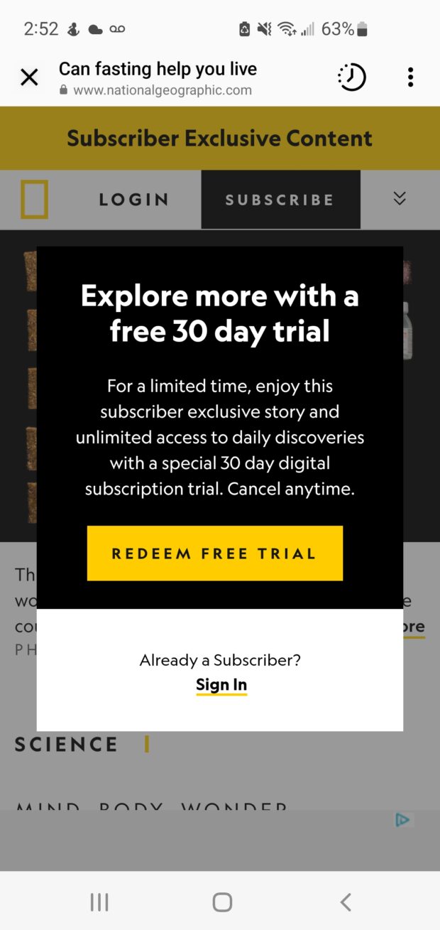
NatGeo dangles a free trial in its Instagram ad, one of many effective call-to-action ideas you can shamelessly steal. Although, when so many people are doing it and finding success, is it really stealing?
Source: NatGeo on Instagram
Do it better with Hootsuite, the all-in-one social media tool. Stay on top of things, grow, and beat the competition.
The post How To Write a Call to Action That Works [Tips + 6 Examples] appeared first on Social Media Marketing & Management Dashboard.
![How To Write a Call to Action That Works [Tips + 6 Examples]](https://localseoresources.com/wp-content/uploads/2023/03/Screen-Shot-2023-03-03-at-4.07.46-PM-620x266.png)




Recent Comments