Social media image sizes seem to change constantly.
One moment you have the perfect cover page for your account. The next, it’s been resized and looks all pixelated and wrong.
It doesn’t help that information about official dimensions and image sizes is harder to find than a civil discussion on politics on Facebook.
But, it’s not difficult if you consult this guide to social media image sizes on all important social media platforms!
Below are the most recent social media image dimensions, as of September 2024.
Quick social media image sizes
We go into more detail for every single network below, but this image includes the social media image sizes you probably look up most often.
Basic Instagram image sizes
- Profile photo: 320 x 320 px
- Landscape: 1080 x 566 px
- Portrait: 1080 x 1350 px
- Square: 1080 x 1080
- Stories and Reels: 1080 x 1920
Basic Facebook image sizes
- Profile photo: 170 x 170 px
- Landscape: 1200 x 630 px
- Portrait: 630 x 1200 px
- Square: 1200 x 1200 px
- Stories and Reels: 1080 x 1920 px
- Cover photo: 851 x 315 px
Basic X (formerly Twitter) image sizes
- Profile photo: 400 x 400 px
- Landscape: 1600 x 900 px
- Portrait: 1080 x 1350 px
- Square: 1080 x 1080 px
- Cover photo: 1500 x 500 px
Basic LinkedIn image sizes
- Profile photo: 400 x 400 px
- Landscape: 1200 x 627 px
- Portrait: 627 x 1200 px
- Square: 1080 x 1080 px
- Cover photo: 1128 x 191 px
Basic TikTok image sizes
- Profile photo: 200 x 200 px
- Landscape: 1920 x 1080 px
- Portrait: 1080 x 1920 px
- Square: 1080 x 1080 px
- Stories: 1080 x 1920 px
Bonus: Get the always-up-to-date social media image size cheat sheet. The free resource includes recommended photo dimensions for every type of image on every major network.
Instagram image sizes
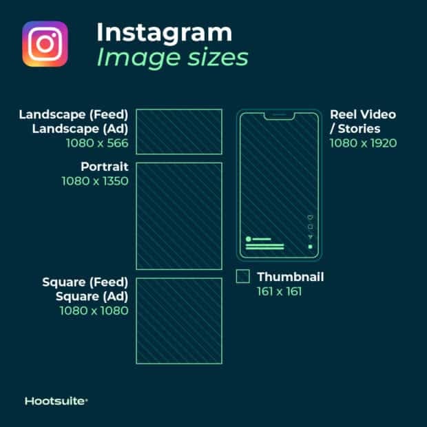
Instagram supports horizontally and vertically oriented images. It also still supports square images, which was what the platform was known for when it first launched.
This increases your brand’s options. But it also makes image dimensions a little trickier to get right. Follow these guidelines to make sure your images end up looking their best.
Instagram profile picture size: 320 x 320 pixels
Instagram profile photos are displayed at 110 x 100 pixels, but the image files are stored at 320 x 320 pixels, so make sure to upload an image that’s least that big.
Even though the dimensions are in a square format, Instagram profile photos are displayed as a circle. Make sure any elements you want to focus on in the photo are centered so they don’t get cropped out.
Instagram post sizes (feed photos):
- Landscape: 1080 x 566 pixels
- Portrait: 1080 x 1350 pixels
- Square: 1080 x 1080 pixels
- Supported aspect ratios: Anywhere between 1.91:1 and 4:5
- Recommended image size: Width of 1080 pixels, height between 566 and 1350 pixels (depending on whether the image is landscape or portrait)
Tips:
- If you want your images to look their best on Instagram, aim to upload an image that is 1080 pixels wide.
- When you share an Instagram image that’s sized over 1080 pixels, Instagram will size it down to 1080 pixels.
- If you share a photo that has a resolution lower than 320 pixels, Instagram will size it up to 320 pixels.
- If your image is between 320 and 1080 pixels wide, Instagram will keep that photo at its original resolution, “as long as the photo’s aspect ratio is between 1.91:1 and 4:5 (a height between 566 and 1350 pixels with a width of 1080 pixels).”
- If your uploaded Instagram image is a different ratio, the platform will automatically crop your photo to fit a supported ratio.
Resource: Learn how to edit Instagram photos like a pro.
Instagram photo thumbnail sizes:
- Display size: 161 x 161 pixels
- Recommended upload size: 1080 pixels wide
Tips:
- Remember that Instagram stores versions of these thumbnails that are as large as 1080 x 1080.
- To future-proof your Instagram feed and avoid pixelation, upload images that are as large as possible.
Instagram Stories image size: 1080 x 1920 pixels
Tips:
- This is an aspect ratio of 9:16.
- Uploading an image with a smaller pixel size (but the same aspect ratio) means the Story will buffer quickly.
- If you don’t use this ratio, the Story might show with strange cropping, zooming, or leave large sections of the screen blank.
- Instagram Reels use this same sizing.
Resource: Take your Instagram Stories to the next level with these free templates.
Instagram carousel image sizes:
- Landscape: 1080 x 566 pixels
- Portrait: 1080 x 1350 pixels
- Square: 1080 x 1080 pixels
- Aspect ratio: landscape (1.91:1), square (1:1), vertical (4:5)
- Recommended image size: Width of 1080 pixels, height between 566 and 1350 pixels (depending on whether the image is landscape or portrait)
Instagram Reels sizes:
- 1080 x 1920 pixels
- This is an aspect ratio of 9:16.
- Cover photo: 1080 x 1920 pixels
- Keep in mind that Reels are cropped to a 1:1 image in your profile feed and a 4:5 image in the home feed.
Instagram ads image sizes:
- Landscape: 1080 x 566 pixels
- Square: 1080 x 1080 pixels
- Minimum width: 320 pixels
- Maximum width: 1080 pixels
- Supported aspect ratios: Anywhere between 1.91:1 and 4:5
Tips:
- Remember: Instagram ads appearing in users’ feeds cannot have more than 30 hashtags.
- There are also recommendations for the number of characters included in an ad’s primary text and headline.
Image sizes for Instagram Stories ads: 1080 x 1920 pixels
Tips:
- Instagram recommends leaving roughly “14% (250 pixels) of the top and bottom of the image free from text and logos” to prevent them from being covered.
- As of September 2020, Facebook and Instagram ads are no longer penalized if more than 20% of the ad space is text.
The formula for going viral
Everything you need to make engaging content. AI support for captions, an AI hashtag generator, and access to Canva in Hootsuite.
X (f.k.a. Twitter) image sizes
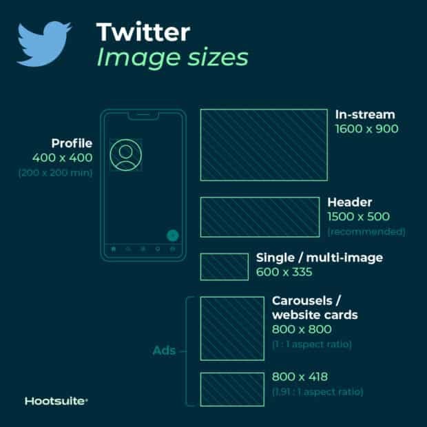
Tweets that include images consistently get more click-throughs, more likes, and more Retweets than non-image Tweets. In fact, Tweets with visual content are three times more likely to get engagement.
So, choosing the right images and creating great visual content for X (formerly Twitter) matters. And, of course, that includes getting the image sizes right.
X (Twitter) image sizes for profile photos: 400 x 400 (recommended)
- Minimum image size: 200 by 200 pixels
- Maximum file size: 2MB
X (Twitter) header photo size: 1500 x 500 pixels (recommended)
Tips:
- To future-proof the image, it’s best to use the maximum size.
- Header images are cropped to an aspect ratio of 3:1.
- Keep in mind that the way header images display changes depending on the monitor and browser being used.
X (Twitter) images sizes for in-stream photos: 1600 x 900 pixels (recommended)
- Minimum size: 600 by 335 pixels
- Recommended aspect ratio: any aspect between 2:1 and 1:1 on desktop; 2:1, 3:4 and 16:9 on mobile
- Supported formats: GIF, JPG and PNG
- Maximum file size: Up to 5MB for photos and GIFs on mobile. Up to 15MB on the web.
X (Twitter) card image size:
X (Twitter) recognizes when a post includes a URL. The platform then crawls that website, pulling in content, including an image for the summary card. (This is how it all works, by the way.)
- Minimum size: 120 x 120 pixels
- Supported formats: GIF, JPG, PNG
- Maximum file size: 1MB
Tips:
- You can test what your summary card will look like and see a preview using the card validator.
- There is a range of different X cards, so also a range of sizes. As well as the regular summary cards, there are summary cards with large images, app cards and player cards.
X (Twitter) image sizes for ads:
- Single and multi-image tweets: Minimum 600 x 335 pixels, but use larger images for the best results.
- Website card image: 800 x 418 pixels for 1.91:1 aspect ratio. 800 x 800 for 1:1 aspect ratio. Max file size of 20MB.
- App card image: 800 x 800 pixels for 1:1 aspect ratio. 800 x 418 pixels for 1.91:1 aspect ratio. Max file size of 3MB.
- Carousels: 800 x 800 pixels for 1:1 aspect ratio. 800 x 418 pixels for 1.91:1 aspect ratio. Max file size of 20MB for 2-6 image cards.
- Direct Message card: 800 x 418 pixels for 1.91:1 aspect ratio. Max file size of 3MB.
- Conversation card: 800 x 418 pixels for 1.91:1 aspect ratio. Max file size of 3MB.
Resource: Find more information here on how to advertise on X (Twitter).
Facebook image sizes
Facebook updates its design and image dimensions constantly. The best strategy to future-proof your brand’s content is to always upload the highest-quality image you can. Stick to Facebook’s recommended file formats for the best results.
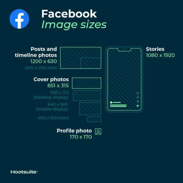
Facebook profile picture size: 170 x 170 pixels (on most computers)
Your Facebook profile picture will display at 170 x 170 pixels on desktop. But it will display as 128 x 128 pixels on smartphones.
Facebook image sizes for cover photos: 851 x 315 pixels (recommended)
- Display size desktop: 820 x 312 pixels
- Display size smartphone: 640 x 360 pixels
- Minimum size: 400 x 150 pixels
- Ideal file size: Less than 100KB
Tips
- To avoid any compression or distortion, upload a JPG or PNG file.
- Use the recommended pixel sizes for the fastest load times.
- Profile pictures and cover photos with logos or text work best when uploaded as a PNG file.
- Don’t drag to reposition once you’ve uploaded your cover photo.
Resource: Get more tips on creating great Facebook cover photos.
Facebook timeline photo and post sizes:
Facebook automatically resizes and formats your photos when they are uploaded for the timeline to be 500 pixels wide and to fit the 1.91:1 aspect ratio.
But avoid pixelation or slow load times by remembering these sizes:
- Recommended size: 1200 x 630 pixels
- Minimum size: 600 x 315 pixels
Tips:
- If you are sharing 2-10 images in your brand’s Facebook post using the carousel display, images should be 1200 x 1200.
- This is a 1:1 ratio.
Facebook event cover photo image sizes: 1200 x 628 pixels (recommended)
Tips
- This is about a 2:1 ratio.
- The size of your event cover photo can’t be edited after it’s been added to an event.
Facebook image sizes for panorama or 360 photos:
- Minimum image size: Facebook says that it should be “30,000 pixels in any dimension, and less than 135,000,000 pixels in total size.”
- Aspect ratio: 2:1
Tips
- Facebook automatically recognizes and processes these images based on “camera-specific metadata found in photos taken using 360-ready devices.”
- Files for these Facebook images can be up to 45 MB for JPEGs or 60 MB for PNGs.
- Facebook recommends using JPEGs for 360 photos and ensuring files aren’t bigger than 30 MB.
Facebook image sizes for Facebook Stories: 1080 x 1920 pixels (recommended)
Tips
- Facebook Stories take up the full screen of a phone. That’s an aspect ratio of 9:16.
- Don’t choose an image with a width smaller than 500 pixels.
- For Stories with text, consider leaving 14% of the top and bottom text-free. (That’s 250 pixels.) That way any call-to-action won’t be covered by your brand’s profile photo or buttons.
Facebook image sizes for ads:
- Sizes for Facebook Feed ads: At least 1080 x 1080 pixels. Minimum size 600 x 600 pixels. Ratio 1.91:1 to 1:1. Maximum file size of 30 MB.
- Sizes for Facebook Right Column ads: At least 1080 x 1080 pixels. Minimum size 254 x 133 pixels. Ratio 1:1. (Remember: These are a desktop-only ad format.)
- Facebook image sizes for Instant Articles: At least 1080 x 1080 pixels. Ratio 1.91:1 to 1:1. Maximum file size of 30 MB.
- Image sizes for Facebook Marketplace ads: At least 1080 x 1080 pixels. Ratio 1:1. Maximum file size of 30 MB.
- Image sizes for Facebook Search: At least 1080 x 1080 pixels. Minimum size 600 x 600 pixels. Ratio 1.91:1 to 1:1. Maximum file size of 30 MB.
- Facebook image sizes for Sponsored Messages: At least 1080 x 1080 pixels. Ratio 1.91:1 to 1:1. Maximum file size of 30 MB.
- Sizes for Messenger inbox ads: At least 1080 x 1080 pixels. Ratio 1:1. Minimum size 254 x 133 pixels. Maximum file size of 30 MB.
- Sizes for Messenger Stories ads: At least 1080 x 1080 pixels. Ratio 9:16. Minimum width of 500 pixels.
Resource: Here’s more info on how to advertise on Facebook.
LinkedIn image sizes
When you use LinkedIn for business — whether it’s via your personal profile or a company page — pairing your LinkedIn updates with images has consistently been shown to increase comments and sharing.
Stick to the recommended sizes below for best results. And always make sure to look at your profile and content on multiple devices before finalizing.
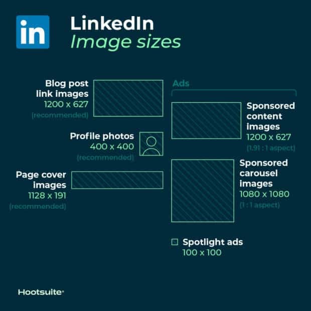
LinkedIn image sizes for profile photos: 400 x 400 pixels or larger (recommended)
Tips
- LinkedIn can accommodate photos up to 7680 x 4320 pixels.
- And it can handle files up to 8MB, so upload as large as you can to future-proof.
LinkedIn image sizes for personal profile cover photos: 1584 x 396 pixels (recommended)
- Aspect ratio: 4:1
Tips
- Make sure your file is smaller than 8MB.
- Cover photos are cropped differently on mobile and desktop. Make sure to view your profile on both kinds of display before finalizing.
LinkedIn image sizes for company pages:
- Company logo size: 300 x 300 pixels
- Page cover image size: 1128 x 191 pixels
- Life tab main image size: 1128 x 376 pixels
- Life tab custom modules image size: 502 x 282 pixels
- Life tab company photos image sizes: 900 x 600 pixels
- Square logo: At least 60 x 60 pixels
Tips
- When posting image updates to your company page, make sure to use PNG or JPG images.
- Use an aspect ratio of 1.91:1.
- The recommended LinkedIn post size is 1200 x 628 pixels.
- This LinkedIn image sizing also applies to LinkedIn Showcase pages.
LinkedIn image sizes for blog post link images: 1200 x 627 pixels (recommended)
LinkedIn custom image size for sharing a link in an update: 1200 x 627 pixels (recommended)
When pasting a URL into an update, an auto-generated thumbnail image may appear in the preview if one is available, along with the article or website title.
But, you can customize it by clicking the Image icon below the text box and selecting a photo from your computer.
Tips:
- The image should use a 1.91:1 ratio.
- More than the minimum of 200 pixels wide.
- If the image width is less than 200 pixels wide, it will appear as a thumbnail on the left side of the post.
LinkedIn image sizes for ads:
- Company logo size for ads: 100 x 100 pixels
- Spotlight ads logo size: 100 x 100 pixels
- Spotlight ads custom background image: 300 x 250 pixels
- Sponsored content images: 1200 x 627 pixels (1.91:1 aspect ratio)
- Sponsored content carousel images: 1080 x 1080 pixels (1:1 aspect ratio)
Pinterest image sizes
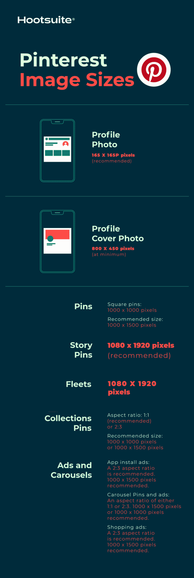
Pinterest profile image size: 165 x 165 pixels (recommended)
Tips
- Remember that your profile photo will be displayed as a circle.
Pinterest image size for profile cover photo: 800 x 450 pixels (at minimum)
Tips
- Try to avoid placing a portrait photo into the cover photo spot.
- Instead, use a landscape photo with a 16:9 aspect ratio.
Pinterest image sizes for Pins:
- Aspect ratio: 2:3 (recommended)
- Square pins: 1000 x 1000 pixels
- Recommended size: 1000 x 1500 pixels
- Max file size: 20MB
Tips
- Keeping the 2:3 aspect ratio ensures your brand’s audience sees all the image’s details on their feed.
- On the feed, Pins are displayed with a fixed width of 236 pixels.
- If you want to create Pins with a different aspect ratio, know that Pinterest crops images from the bottom.
- Both PNG and JPEG files are accepted.
Pinterest image sizes for collections Pins:
- Aspect ratio: 1:1 (recommended) or 2:3
- Recommended size: 1000 x 1000 pixels or 1000 x 1500 pixels
- Max file size: 10MB
Tips
- This format appears as one main image, above three smaller images.
- All images must have the same aspect ratio.
- Collections appear in feeds on mobile devices.
- Both PNG and JPEG files are accepted.
- Collections can also be an ad format on Pinterest.
Pinterest image size for Story Pins:
- Aspect ratio: 9:16
- Recommended size: 1080 x 1920 pixels
- Max file size: 20MB
Pinterest image sizes for ads and carousels:
- App install ads: Same specs as standard Pins. A 2:3 aspect ratio is recommended. 1000 x 1500 pixels recommended.
- Carousel Pins and ads: An aspect ratio of either 1:1 or 2:3. 1000 x 1500 pixels or 1000 x 1000 pixels recommended. Up to 5 images can be included in a carousel.
- Shopping ads: Same specs as standard Pins. A 2:3 aspect ratio is recommended. 1000 x 1500 pixels recommended.
Resource: Get some advice on how to use Pinterest for business.
Snapchat image sizes
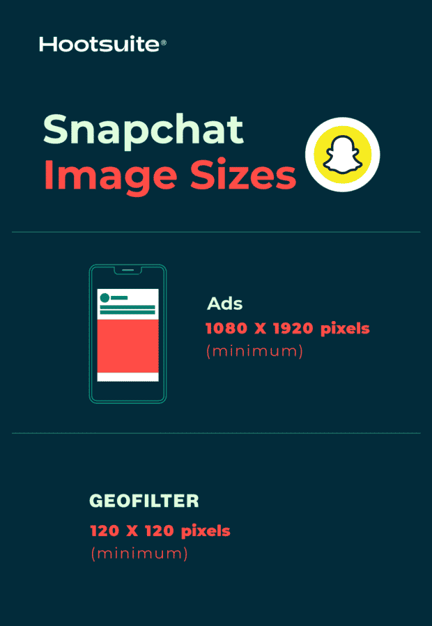
Snapchat ads image size: 1080 x 1920 pixels (at minimum)
- Aspect ratio: 9:16
- File type: JPEG or PNG
- Maximum file size: 5MB
Snapchat Geofilter image size: 1080 x 1920 (at minimum)
- Aspect ratio: 9:16
- File type: JPEG or PNG
- Maximum file size: 5MB
Resource: How to Create a Custom Snapchat Geofilter
YouTube image sizes
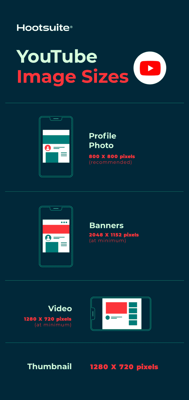
YouTube profile photo size: 800 x 800 pixels (recommended)
Tips
- Make sure the focus of your photo is centered for best results.
- Files should be JPEG, GIF, BMP or PNG. Animated GIFs won’t work.
- Photos will render at 98 x 98 pixels.
YouTube banner image size: 2048 x 1152 pixels (at minimum)
- Aspect ratio: 16:9
- Minimum area for text and logos without being cut off: 1235 x 338 pixels
- Maximum file size: 6MB
Resource: How to make the best YouTube channel art (plus 5 free templates).
YouTube video size: 1280 x 720 pixels (at minimum)
Tips
- YouTube recommends that videos intended for sale or rental have a higher pixel count: 1920 x 1080 pixels.
- YouTube requires videos to be 1280 x 720 pixels in order to meet HD standards.
- This is a 16:9 aspect ratio.
YouTube thumbnail size: 1280 x 720 pixels
TikTok image sizes
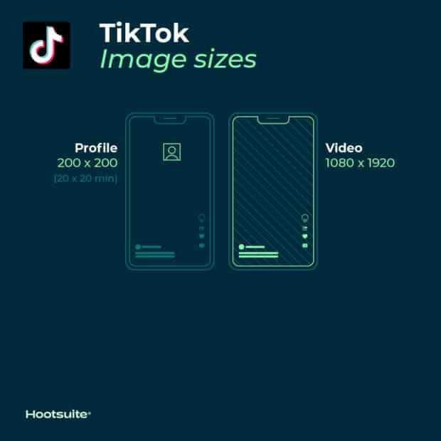
TikTok profile photo size: 20 x 20 pixels (minimum size to upload)
Tips
- While 20 x 20 is the minimum upload size, upload a higher quality photo for future-proofing.
TikTok video size: 1080 x 1920 (portrait) or 1920 x 1080 (landscape)
Tips
- The ideal aspect ratio for vertical TikTok videos is 9:16. You can post vertical videos with other dimensions, but the platform will add black bars to the top and bottom of the videos so they are full-screen.
- The ideal aspect ratio for horizontal TikTok videos is 16:9. When you upload a video with these dimensions, a Full Screen button will appear that allows users to view the full video by flipping their screens sideways.
TikTok carousel image size: 1080 x 1920 (for best results)
Tips
- The ideal aspect ratio for Tik Tok carousel images is 9:16 or 1:1, but you can also post images with a 4:5 ratio.
Why is it important to get social media image sizes right?
Social media marketers need to get many things right when creating visual content for social media.
You’ve got to make sure any images you use don’t defy copyright laws. If you don’t have original imagery, you’ve got to find high-quality stock photos. And you’ve got to figure out which tools out there can help elevate your social media images.
On top of that, you’ve got to get your social media image sizes right. And getting that right is really important because:
- It avoids pixelation and awkward image stretching. And avoiding that keeps your images looking professional.
- Your photos will be optimized for each social channel’s feed. This can help increase engagement.
- It ensures your audience sees the full photo. Incorrect sizing could cut off some of your brand’s messaging.
- It can future-proof your content. Being in-the-know with social media image sizes now could mean less work for your brand in the future, when network change up how images display again.
When building posts in Hootsuite, you never have to worry about getting the image size wrong. You can upload and refine your images using Canva’s editing tools right inside the Hootsuite dashboard. And the very first step of the process is selecting a network-optimized size for your image from a drop-down menu.
Here’s how it works:
- Log in to your Hootsuite account and head to Composer.
- Click on the purple Canva icon in the bottom right corner of the content editor.
- Select the type of visual you want to create. You can pick a network-optimized size from the drop-down list or start a new custom design.
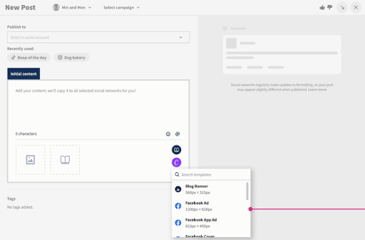
- When you make your selection, a login pop-up window will open. Sign in using your Canva credentials or follow the prompts to start a new Canva account. (In case you were wondering — yes, this feature does work with free Canva accounts!)
- Design your image in the Canva editor.
- When you’re done editing, click Add to post in the top right corner. The image will automatically be uploaded to the social post you’re building in Composer.
You can cancel anytime.
Don’t feel like memorizing all this info? Easily resize your social media images for publication through Hootsuite Compose, which includes up-to-date image dimensions for every social media network.
Better content in half the time
Boost engagement and save time with an AI writer, hashtag generator, and Canva in Hootsuite.
The post Social media image sizes for all networks [September 2024] appeared first on Social Media Marketing & Management Dashboard.
![Social media image sizes for all networks [September 2024]](https://localseoresources.com/wp-content/uploads/2023/01/Inpost-CTA-Planner.png)



I completely resonate with the frustration you’ve described regarding the ever-shifting landscape of social media image sizes! It feels like just when you’ve finally nailed down a perfect cover photo, it becomes an exercise in futility as the platforms tweak their specs yet again. As someone heavily involved in digital marketing, I’ve closely followed these changes, and it’s quite daunting keeping up.
I can relate to that feeling of chasing after social media specs—it really does seem like a never-ending cycle. It’s interesting how these updates can have a ripple effect on how we approach our content strategy, isn’t it? I remember when Instagram first introduced Stories; it completely shifted the way brands would communicate, and now, with the constant revisions to dimensions and formats, it feels like an ongoing game of catch-up.
You’re spot on about the ripple effect these updates create. The shift when Instagram launched Stories was a game-changer, forcing brands to rethink their entire approach to engagement. Now, with the constant back-and-forth over dimensions and formats, it can feel overwhelming. It’s interesting how these changes push us to be more innovative, yet they also create this ongoing pressure to adapt quickly. Finding that balance between staying relevant and maintaining authenticity in content is no easy task. Many brands are discovering that embracing a more flexible strategy, one that responds to these changes while staying true to their voice, can create more genuine connections with their audience. What strategies have you found helpful in navigating these shifts?
Absolutely! It really does feel like we’re always adapting, doesn’t it? If you’re looking for some strategies to stay ahead of the curve, check out this helpful resource!
https://localseoresources.com/ninja
You’ve hit on something really important about the evolving landscape of social media. The introduction of features like Stories really did force brands into a more dynamic engagement model, and it’s fascinating to see how that ripple effect continues with each update. It often feels like a balancing act—navigating the need for innovation while also staying true to a brand’s core identity.
I found some great insights that might help with navigating those constant shifts, particularly when it comes to timing your posts effectively.
‘The Best Time to Post on Facebook in 2024 Explained’
https://localseoresources.com/the-best-time-to-post-on-facebook-in-2024-explained/.
I get where you’re coming from—it really does feel like a never-ending cycle of adjustments. And for those in digital marketing, it must feel like you’re constantly running to catch up. I remember when I finally set my profile picture just right, only to discover a few weeks later that it looked pixelated because the platform had subtly changed the size again.
It’s true; the constant changes can feel like a relentless race. You invest time perfecting your profile only to find it’s outdated again. This reality can be frustrating, especially in an industry that thrives on being visually appealing.
I totally get what you mean. The pressure to keep up with the latest trends can indeed feel like a hamster wheel, especially when you’ve put so much effort into crafting a profile that reflects your style and skills. It’s disheartening to see all that work seem to fade into the background as new trends emerge.
I get what you mean about the constant changes feeling like a relentless race. It’s like you’re always playing catch-up, trying to make your profile look fresh and engaging. I’ve found myself spending hours on updates, only to see trends shift again before I can fully enjoy the fruits of my labor. It really puts a strain on creativity and can lead to burnout, especially in an industry that relies so heavily on visuals and innovation.
I can relate to that feeling of being on a constant treadmill, trying to keep up with what’s trending. It’s interesting how the pressure to create fresh and engaging content can sometimes overshadow the joy of the creative process itself. I’ve definitely found myself caught in that cycle before, spending hours perfecting something only for it to feel outdated almost overnight.
You’ve captured the struggle perfectly. It’s frustrating how the landscape keeps shifting beneath our feet, and I think it’s a shared experience for many of us in the creative realm. You pour your energy into crafting something that feels fresh and relevant, only to find it’s already lost its shine before you’ve had the chance to fully appreciate what you created.
I totally get where you’re coming from. It feels like the landscape shifts with every sunrise, doesn’t it? The pressure to keep things fresh can be overwhelming, especially when the last update hasn’t even had time to breathe. Sometimes, I think we forget to enjoy the process because we’re glued to our screens, chasing the next big thing.
I can really relate to that feeling of constantly playing catch-up. It’s almost as if the moment you put in all that effort to refresh your profile, something new emerges that shifts the entire landscape. I’ve found myself in a similar loop where I spend way too much time fretting over trends, only to feel like I’m on a hamster wheel. It’s frustrating because it can easily start to sap not just your creativity, but also your motivation.
I hear you—it can really feel like a never-ending sprint to keep up with everything changing so rapidly. Investing time into something like a profile, only to see it become obsolete, is disheartening. It’s interesting to think about how this pressure to maintain a visually appealing presence affects not just our professional lives but our mental well-being too.
I get that struggle—keeping your cover letter fresh can feel just as tough, but I found some examples that really nail what to do right in this ever-changing landscape.
‘The 23 Best Cover Letter Examples: What They Got Right’
https://localseoresources.com/the-23-best-cover-letter-examples-what-they-got-right/.
I can totally relate to that feeling. It seems like every time I finally get comfortable with a platform’s design or rules, they switch things up on us. I remember investing time into curating my online persona, only to have a minor update throw everything off. It’s almost like a digital version of trying to keep up with the latest fashion—it takes a lot of effort to look just right, and then suddenly a new trend emerges that you didn’t even know about.
I get what you mean about the constant changes in platform designs and rules. It can feel exhausting to keep reinventing your online presence just when you think you’ve found a rhythm. It’s really interesting to think about how digital spaces have become so integral to our identities, almost like a virtual wardrobe where we curate our best selves.
You’ve hit on something really crucial here. The constant shifts in platform designs and rules can make it feel like you’re on a never-ending treadmill, always running but never quite getting anywhere. It’s not just about aesthetics; it’s about the very foundation of how we interact with each other online and the ways we present ourselves. Each change can send ripples through our carefully constructed online personas.
Absolutely, it’s a fascinating evolution! Speaking of curating our online presence, I recently came across some great resources that can help navigate these changes more smoothly.
https://localseoresources.com/ninja
You’ve captured that feeling perfectly—it’s a real challenge to constantly adapt when platforms shift their design or functionality. It can feel like you’re navigating through a maze where the walls keep changing. I’ve had my share of moments where I thought I had things figured out, only to find that a small tweak altered my hard work.
I totally get where you’re coming from. It’s like a never-ending treadmill trying to keep up with these platform updates. Just when you finally settle on a size for your cover photo, it’s time to adjust again. I often wonder what drives these changes—is it really about improving user experience, or is it just a way to keep us all scrambling?
I can definitely relate to that feeling of being on a never-ending treadmill. It seems like every few months, platforms are tweaking something that sets off a cascade of adjustments for us. I often wonder if these updates are genuinely aimed at enhancing user experience or just keeping creators on their toes—perhaps a bit of both?
I totally hear you—navigating platform changes can feel relentless. Speaking of adjustments, I recently came across some insights on brand colors that really clarified how vital they are to maintaining a consistent identity amidst all the chaos.
‘Brand Colors — Everything You Need to Know’
https://localseoresources.com/brand-colors-everything-you-need-to-know/.
It’s interesting that you mention the feeling of being on a treadmill—sometimes it really does seem like we’re just going round and round with all these updates. Each platform tweak feels like it’s meant to shake things up just enough to keep us alert, right? I wonder if they realize how overwhelming that can be for creators who are just trying to keep their heads above water. It’s a balancing act where we have to adapt quickly while still trying to maintain our brand, voice, and vision.
“Discover a treasure trove of insights and inspiration waiting just for you—click here to embark on your next adventure!”
https://localseoresources.com/ninja
I get where you’re coming from. It really feels like we’re constantly adapting to the latest changes these platforms throw our way. You hit the nail on the head with that observation about whether updates are truly about enhancing user experience or just keeping creators on their toes. It sometimes feels like a mix of both, doesn’t it? In many cases, maintaining user engagement while also keeping content creators on a tight rope seems to be the goal.
“Unlock new insights and discover the possibilities—explore more here!”
https://localseoresources.com/ninja
I get that feeling too—it’s like we’re all on this digital rollercoaster where the track keeps changing. Sometimes it feels hard to keep up with the updates, and you can’t help but wonder about the motivation behind them. Part of me thinks it’s a mix of both: platforms want to enhance user experience, but the constant adjustments can definitely feel more like a strategy to keep creators engaged and challenged.
I totally resonate with that feeling. It’s interesting how the digital landscape has transformed into this unpredictable ride. One moment, you’re getting used to a new feature, and the next, it’s reshuffled again. I sometimes wonder if that’s part of the appeal for platforms—keeping us on our toes and constantly adapting to new tools and trends.
You hit on something really interesting with that analogy of the digital rollercoaster. It’s wild how fast things change. One day, a feature feels groundbreaking, and the next, it’s just one more layer on a very complicated cake that we’re all trying to bake.
“I totally get that—it’s a wild ride! If you’re looking for ways to navigate these changes more smoothly, check out this resource that dives into the latest trends and strategies for creators!”
https://localseoresources.com/ninja
You bring up a great point about how quickly things evolve in the digital landscape. It really does feel like every day brings a new update or feature that shifts the way we create or interact online. I often think about how this relentless pace can be both a challenge and an opportunity. On one hand, it can feel overwhelming trying to keep up. On the other, it offers us the chance to innovate and push boundaries in ways we couldn’t have imagined even a year ago.
I can totally relate to what you’re saying about being on this digital rollercoaster. It really does sometimes feel like the rules change just as you’re starting to get the hang of them. The constant updates can create this pressure to stay on top of everything, which can be exhausting. I often wonder if platforms truly prioritize user experience or if it’s more about keeping creators scrambling to produce content constantly.
It’s interesting, isn’t it? This dance we do with platforms feels like an ongoing balancing act. The updates can be frustrating, but it’s a reminder that we need to adapt and stay sharp. Your take on brand colors hits the mark. They can really anchor our identities, especially when everything else feels like it’s up in the air.
I get what you’re saying—the constant updates can feel overwhelming, almost like we’re caught in a game of whack-a-mole. It often leaves us questioning the intentions behind these changes. Are they really enhancing the experience, or just making sure we don’t get too comfortable? It seems like a mix of both, doesn’t it?
Navigating the ever-evolving landscape of social media image dimensions can certainly feel overwhelming at times. I find it fascinating how the seemingly minor details—like the size and clarity of an image—can have such a profound impact on our online identities and the ways we engage with our audiences.
It’s interesting how those details can shape our online presence in significant ways. The right image dimensions can make or break the impression we leave, and it’s almost like a visual language that speaks to our audiences before they even read our words. I’ve noticed how even slight changes in clarity or composition can alter engagement rates. It challenges us to think critically about our choices in this digital space.
I get what you mean about the details making a difference; I recently came across a guide that really helps streamline posting schedules, which could make managing image dimensions a bit easier.
‘How to Create a Social Media Posting Schedule (Free Template and Tools)’
https://localseoresources.com/how-to-create-a-social-media-posting-schedule-free-template-and-tools/.
You raise an important point about how much our visual choices impact our online presence. The landscape of social media demands that we pay attention to image dimensions, clarity, and composition, but we often overlook just how crucial these elements are in cultivating an authentic connection with our audience. It’s fascinating how a pixel-perfect image can resonate with viewers, while a blurred or poorly sized one can send them scrolling past in seconds. A striking image can evoke emotions, spark curiosity, or even convey the essence of a brand without a single word being spoken.
Absolutely! It’s fascinating how much thought goes into crafting our online presence. If you’re looking to streamline your posting schedule even further, I highly recommend checking out this helpful guide—it could really enhance your efficiency in managing those crucial image dimensions! Here’s the link: [How to Create a Social Media Posting Schedule (Free Template and Tools)](https://localseoresources.com/how-to-create-a-social-media-posting-schedule-free-template-and-tools/).
https://localseoresources.com/ninja
I completely agree with you about the visual language we project in the digital world. It’s fascinating how something as simple as image dimensions can influence people’s perceptions before they even give our captions a second glance. It reminds me of how important it is to be intentional with every detail, from the images we choose to the layout of our profiles. This kind of critical thinking can really set us apart and elevate our online presence.