Sometimes it’s nice to take a break from endlessly scrolling through your feed — and endlessly scroll through someone’s individual Instagram page instead.
Welcome to The Grid.
Lined up neat rows of three, each Instagram post suddenly is part of a bigger picture. A peek into a user’s soul… or at least their content strategy.
And Instagram power users know just how to work this viewpoint to their advantage, with artfully planned posts that, together, create a gorgeous Instagram grid layout.
If you haven’t thought about what your own rows of squares add up to, it’s about time. Here’s all you need to know about building an attention-grabbing Instagram grid to grow your following and engagement.
Bonus: Get 5 free, customizable Instagram carousel templates and start creating beautifully designed content for your feed now.
Why your Instagram grid layout matters
When someone follows you for the first time, or navigates to your profile to check out your content, your grid is an opportunity to showcase your vibe or brand.
The grid gives you a birds-eye view of a user’s posting history. This is your first impression of their, uh, body of work: an introduction at a glance to their personal or professional brand at a glance.
For individual users, creating a beautiful grid may not matter — sure, color coding your posts could be a fun personal challenge, but if you’re just on the ‘gram to connect with friends, not amass an audience, branding likely isn’t too important.
But for brands, creatives or influencers, consistency and style are critical… particularly if your account is focused on aesthetics or lifestyle.
After all, your grid is a quick and easy way to get your message across. Plus, anyone viewing your profile is thinking about following you. This is your chance to show exactly what you offer.
Are you avant-garde, or on trend? Will your content soothe, or bring the drama? Is your brand consistent, or chaotic? One look at a grid, and they’ll get the (sorry not sorry) picture.
7 creative ways to design an Instagram grid layout
Great grids start with a vision, so we’ve scoured the depths of Instagram to dig up some of the slickest styles to inspire your own look.
Commit to a color combo
This is probably the most common grid style going — not that I’m calling anyone lazy (don’t @ me!), but it really doesn’t get much easier.
Pick a color palette (pinks and greys?) or a certain tone (high contrast neons?) to feature in every photo. Viewed together, your gallery will look like a matching set, even if the content of your pics vary. Home and lifestyle influencer
@the.orange.home exclusively features photos with bright, white backgrounds with earth-tone accents. It’s a vibe.
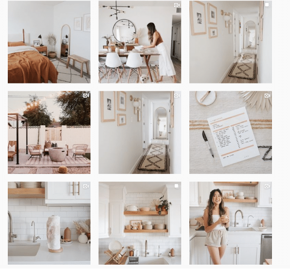
In case your home or office isn’t decorated like an Insta-ready backdrop, one easy way to make sure your photos all speak the same visual language is simply to use the same filter for every photo to help create a consistent tone.
A variation on this theme? Using a standard filter or color palette, but also working in an “accent” color or filter every few posts, too. Maybe your feed is mostly dreamy, sepia-toned boho fantasy, but every few rows, we see a vibrant pop of forest green. Woo! You’re playing with fire!
Create a checkerboard effect
By alternating the style of photo you post, you’ll easily create a checkerboard look on your grid. Try alternating text quotes with photography, or mixing close-up shots with landscape photos. Going back and forth with two distinct colors can work, too.
Some adorable inspo for you: here, parenting resource @solidstarts alternates between photos of snacking babies and how-to graphics.
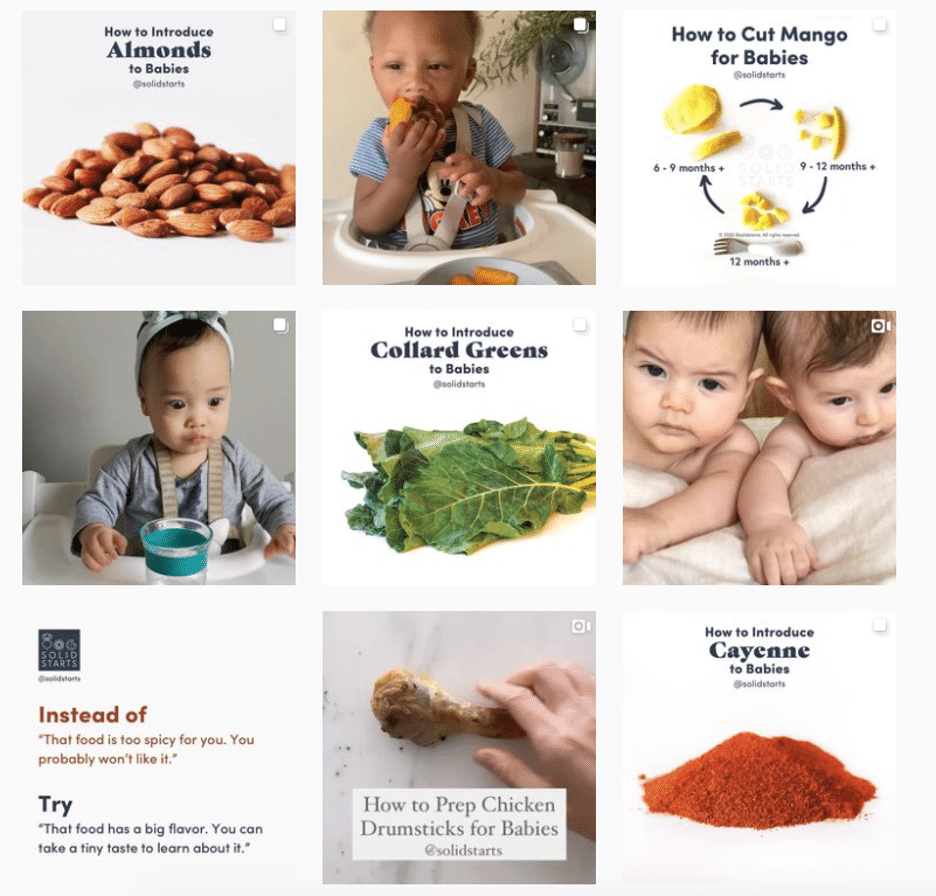
Hot tip: if you’re using text-based posts, keep the background color or fonts consistent to really make the pattern clear. Check and mate.
(Need a little help on the graphic design front? There are tons of great tools and templates out there to create visuals that pop.)
Design row by row
Think outside the box… and inside the, um, row. Uniting the images on each row by theme or color can create a powerful impact.
PR firm @ninepointagency, for example, goes with a different background color for each palette on their grid.
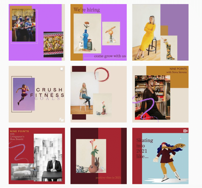
The trick for this one, of course, is that you have to post three images at a time, or the alignment will be off.
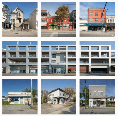
If you’re bold enough to experiment with panoramic images for one of your rows — a trio of photos that add up to one long, horizontal image, you daredevil, you, — many users post the same caption for each one to make it clear they’re three parts of a whole, like photographer @gregorygiepel did with his architectural shots.
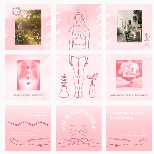
Create a vertical column
Breaking up the grid with squares that create a vertical, central image is a great way to mix graphic branding elements and photography together on your profile.
Vancouver’s @communitybreathwork uses both a vertical and a horizontal connected image in this part of their grid — but the images can technically all still stand alone. (Or… lay down alone?)
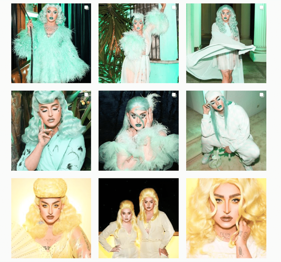
Turn your grid into the rainbow
You need both patience and a great color sense to pull this look off. The goal is to post regularly in one saturated color… and then slowly transition to the next shade in the rainbow with your next rows of posts.
To truly get the full effect of drag queen @ilonaverley’s rainbow ‘gram grid, you’ll need to scroll for yourself, but here’s a screenshot of her transition from green to yellow.
Embrace the border
Creating a consistent look can be as simple as applying a border to all of your images.
Stylist @her.styling uses white square borders on all of her images, but you could create a signature look with any range of colors. The free Whitagram app is one option to quickly apply this edit, with borders and backdrops in all sorts of different shades.
Turn your posts into a puzzle
This layout is a tricky one to pull off on a day-to-day basis, but for a big announcement or campaign, or to launch a new account, a puzzle grid certainly packs a punch.
A puzzle grid creates one big, interconnected image out of all the squares. Individually, these posts probably look like nonsense. But viewed together, it’s a work of art.
Give commercial photographer @nelsonmouellic a round of applause for this visual feat, will ya?
5 tips for planning a gorgeous Instagram grid layout
Of course, none of these sleek grids happen by accident. You gotta grind for that grid! Here are some things to keep in mind as you’re planning out the big picture.
1. Preview first
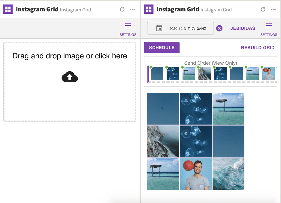
Before you post it: map it.
You could mock it up in photo-editing software, or use Hootsuite’s app integration that lets you preview your layout before it goes live. Right now, it’s for personal accounts only, but business account functionality is coming soon.
Bonus: Get 5 free, customizable Instagram carousel templates and start creating beautifully designed content for your feed now.
Create an Instagram grid layout of up to nine images, and then schedule them to go up in the exact right order via the Hootsuite dashboard.
2. Keep it consistent
Creating a great Instagram grid means sticking to a plan. One off-beat photo in the wrong color, the wrong filter, or in the wrong order can throw your whole look out of whack.
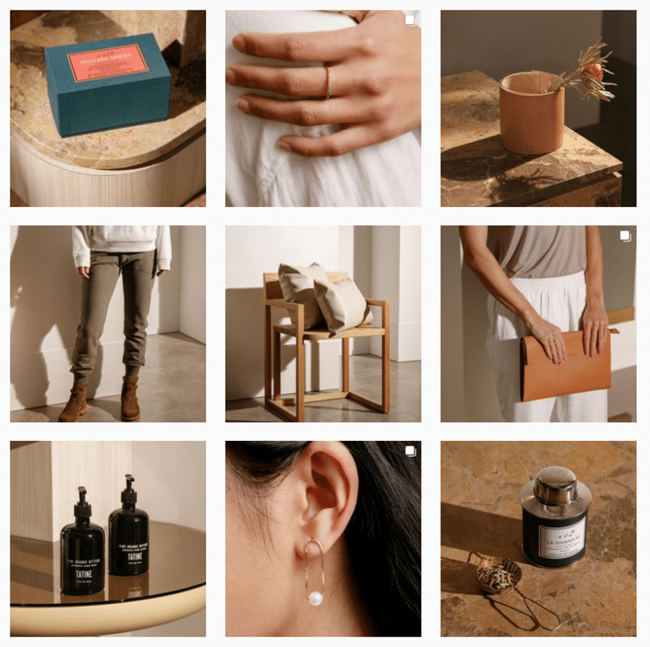
Just imagine if luxury goods company @shopcadine tossed in a picture of a #kitchenfail to their muted, earth-tone, carefully curated collection of photos. Instant chaos!
3. Make sure it matches your brand
Ultimately, the goal of a grid isn’t just to impress your friends with your dedication to using a particular Lightroom preset filter. It’s to build a unified look for your brand.
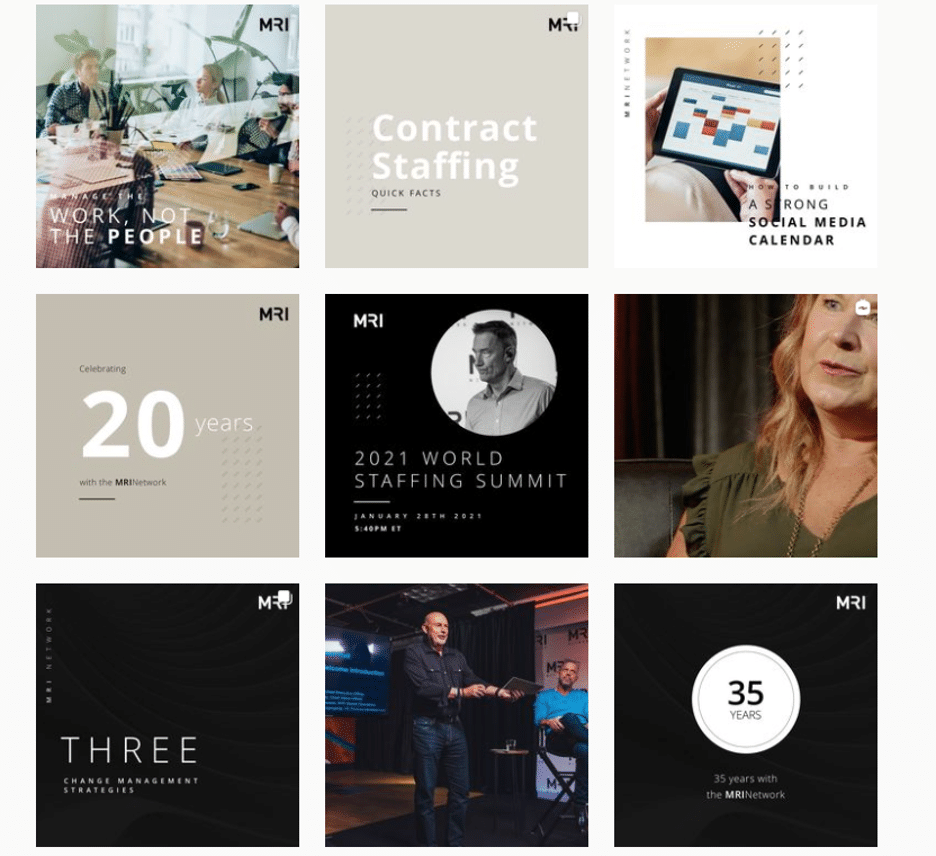
So, if you’re a recruiting firm for high-level executives, like @mrinetwork for instance, having a playful rainbow grid might not quite fit the professional and serious tone you’re going for. A monochromatic, text-based series of posts, on the other hand…
4. Take advantage of image editing tools
In case you haven’t figured it out yet: Instagram is a visual medium… and it’s hard to put together a great grid unless the individual pictures also are great.
Luckily, there are tons of great photo editing tools out there, as well as expert advice around every corner… for example, our guides to taking great Instagram photos and staying on top of the hottest Instagram trends.
5. Schedule your posts in advance
Keep your gorgeous grid active and updated with the help of a scheduling tool that allows you to drop just the right filtered pic (or three) at just the right time. Hootsuite’s dashboard, for example, makes it easy to prep your best photos at your convenience. Get that grid going!
Of course, creating a great grid is just one way to capture attention on the ‘gram. For more marketing tips and tricks to take your account to the next level, check out our ultimate guide to Instagram marketing here.
Grow your Instagram presence using Hootsuite. From a single dashboard you can schedule and publish posts and Stories directly to Instagram, engage your audience, measure performance, and run all your other social media profiles. Try it free today.
Easily create, analyze, and schedule Instagram posts with Hootsuite. Save time and get results.
The post 7 Ways to Design Your Instagram Grid Layout Like a Pro appeared first on Social Media Marketing & Management Dashboard.

Recent Comments