
Does homepage SEO exist? We asked ourselves that in our post on homepage SEO. However, a lot of the people still feel that a homepage should be optimized for a keyword. Perhaps optimizing your homepage for search engines works for some of you, but ranking in Google should definitely not be the only purpose of your homepage! In this post, we want to explore the main purpose of your homepage and give tips on how to optimize your homepage to make it totally awesome.
Table of contents
Rankings, showcase and/or branding?
You might be able to rank your homepage for all the different keyphrases, but you have to consider if that really is the best strategy. Targeted landing pages have a tendency to perform better for these types of things. It might be better to think of your homepage as a sort of showcase of who you are and what you have to offer. You could use your site as a launching pad for all those conversions. Plus, a good homepage helps build and solidify your brand!
What is your website about?
First, we want you to check what your website is about. This seems obvious, but your mission, the uniqueness of your website, should be reflected on your homepage.
Is your homepage just a large list of products and services, or did you actually take the time to write a decent welcome for your visitors? Now one of the most annoying things a website owner can do, is actually write ‘welcome to our website’. By welcoming your visitor, we mean telling him or her what they can find on your website. What is your main product or service? What can be found on your products and on your company itself on the website? And most important: what is the main benefit (USP; Unique Selling Point) for the visitor? What do you do to stand out from the crowd?
Make your USP specific
The second homepage optimization tip is to make your Unique Selling Point clear. If you do a quick search online, you’ll find that many sites struggle to make this clear. But, it’s not always easy to be absolutely clear about what your company brings the customer.
You often see business coaching websites that have a tagline like: “Helping you improve yourself!”. That isn’t a great intro or tagline, as it tells absolutely nothing about the purpose of the company. It might as well be selling great running shoes, helping you improve your running, right? Make sure your introductory content is about the key benefits for the visitor you offer. “Coaching consultants using self-reflection” would already tell a visitor a lot more.
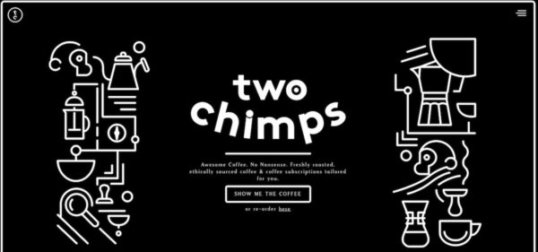
In the above homepage for Two Chimps Coffee, it is very clear what the purpose of the website is. Not only the tagline is impressive, but the design also makes this site stand out.
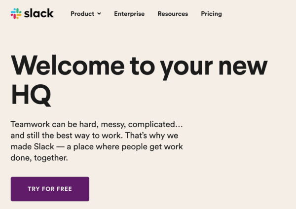
In most cases, that could indeed mean getting back to a boring business tagline. We’re not fan of the vague descriptions half of today’s companies seem to use. You don’t need buzzwords or hyperbole to have something be memorable and stand out — it needs to follow an easy to understand flow. If you can, try to describe the problem people have, how your product or services fixes that problem, while ending on a positive not. Something like Slack does on their homepage:
Elicit trust
We’ve seen the trust factor become ever-more important for todays websites. Make sure that your site comes across as trustworthy, not only in a technical sense, with up-to-date technology and SSL certificates, but also in a psychological sense. If you sell something, a service or a product, people need to know that you are legit. Why should people buy your product? Why are you the expert at the subject and is your solution the one everyone should use?
Whenever you can, give visitors proof of your success. Add testimonials, reviews, recommendations from other experts, publications you appeared — anything goes. Don’t forget to link to the these because nothing more frustrating than trying to verify your claims and coming up short. Of course, you can always pick a selection of reviews and make a specific page for the rest if needed. Just make sure you don’t overdo it on the homepage — your site needs to stay clear, without too many distractions.
Guide your visitor
Another purpose of your homepage is guidance for your visitor. You should make sure your homepage guides your visitor to your main pages. And, your homepage needs the introduction or tagline we described above. But that one would be useless if your homepage wouldn’t allow the visitor to click to your main or money pages. These would be the pages where you close the deal, sell the product or fill out the contact form.
This is by now means an exhaustive list, but these are the obvious ‘guides’ on most homepages:
Sliders, or better alternatives
It’s pretty obvious that we at Yoast don’t like sliders. Still, a slider is used very often to promote these pages. The lack of attention these pages get, is one of the reasons why we don’t like sliders. But that slider area is a great spot for guidance. If you would add a so-called hero image of your featured product, including a great call-to-action button, that would make sense. If you want to rotate that with every browser refresh, please do. It’s a great way to make your homepage appear different with every visit.
The menu
The most obvious one is the menu of your site. Have your thought about what is in your menu? Is it structured and focused? Let us give you an example: this is the menu of a financial consultant we found a while ago:

Start Here could be a call-to-action, of course. But Hard Choices is just too general. In the end, we’d replace both with names that describe the content after the click.
Your products
If you have an online shop, the possibilities are endless. But don’t add the entire category list in your sidebar. Focus on your most visited categories and add these in a prominent spot on your homepage. Add your best selling product to the homepage, perhaps in that larger image we mentioned at ‘sliders’ above. Be creative. Your homepage seems the best spot on your site to announce a new product, for instance. If your shop has a sale, make sure that people notice it on the homepage.
Search as a call-to-action
In many sites, the search bar is located in the header or footer. If you are selling thousands of products, or if you have written hundreds of articles on your site, chances are that a search bar will come in handy for your visitor. Why not make that one your main call-to-action and list it as the main element — instead of that slider — on your website? Doing this is actually step two. Step one is making sure your search result pages look decent.
Contact information
You also have to realize that a — returning — visitor could just be looking for your contact details. List a link to your contact page where one would expect it. That could be in the last spot in your menu, but could also be an address in your footer, or a (short) contact form in the sidebar. On mobile, your phone number should be activated to allow visitors call you with a simple tap on the number.
Do not clutter!
Do not go overboard in guidance on your website! Don’t clutter your homepage with all kind of actionable guides, but pick two or three that make sense on a site like yours. And focus on these. Keep the design of pages simple and easy to use.
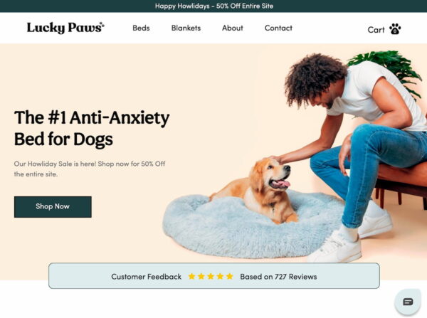
This is a great example of a focused homepage. Lucky Paws as even thought of making that call-to-action a distinctive color. The page is quick to scan, the pay-off is clear and the image shows the product in use. That doggo seems might happy with that bed! The extra focus on the holiday sale above the menu is subtle and doesn’t scream SALE — although you might argue that it’s a bit too subtle.
Homepage optimization: the conclusion
Your homepage should make clear what people can find on your website. It should focus on your unique selling point. And, it should guide your visitors to your most important pages. Perhaps you can focus on these things and still optimize your homepage for a certain keyword. What do you think about that?
Of course, your website is more than just your homepage.
Read more: Does homepage SEO exist at all? »
The post How to optimize your homepage appeared first on Yoast.

Recent Comments