When it comes to marketing, your company has plenty of options for making the right connections with the right people. Sometimes, it may seem like there are too many content options, and if you’re looking for a great place to start or optimize your return on investment (ROI), sending effective emails is the way to go. Email marketing can be a fruitful endeavor, yielding a massive ROI (we’re talking 3,800%). So to hit the bullseye every time, let’s walk through your blueprint for a rockstar newsletter.
Catch Their Attention
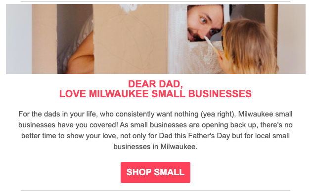
For your header, go for a medium-sized logo and/or hero image. For the overall email layout, leave plenty of white space (“spacers”) between elements and keep an equal margin distance from all directions. Ensure the color palette aligns your brand and always use a web-safe font.
Step one for building your best marketing newsletter is to tap into what inspires your audience to open your emails. Readership starts with the subject line. Plain and simple. Our 2021 Millennial Mom research found that the millennial audience is highly receptive to branded messaging distributed via email, which is great, as they tend to be suspicious of advertising otherwise. Email is your ideal content type to reach out more directly and do business-centric messaging. But you want to make sure you’re executing well so you can meet your goals.
Marketing evolves constantly, and it can be hard to keep up with such a rapidly-changing industry, but there are do’s and dont’s of subject line writing that stand the test of time. Here’s what to keep in mind:
- Do: yse language that resonates with your audience.
- Don’t: deceive your audience. Instead, tell them exactly what they’ll find inside.
- Do: avoid spammy buzzwords. You’re more creative than that.
- Don’t: write a novel. Instead, aim to use as few words as possible to get your message across.
- Do: rely on the power of numbers. If you’re counting down to a sale, let them know. If you have five tips inside the email, include five in your subject line.
Besides the subject line, the preview text or email preheader text is your opportunity to drum up interest and boost those open rates. Preheader text and preview text are technically different, but both are extra juice to get people reading. While you want to keep your subject line clear and concise, the preview text is a bit more forgiving with length, we’re talking 60 characters vs. about a sentence. The subject line and preview text need to reflect each other and point out the most exciting part of your newsletter. Make it so they have to read more.
Provide Value With Your Best First
To keep people reading, put your most interesting and compelling information front and center. Don’t make people wait or work for it; give them the goods! Think of your newsletter like a pyramid. Your most valuable information comes first—the sale information, the product release, the downloadable resource, the blog link, the event sign-up, and so on. Then, the body of the newsletter will continue to the footer in order of decreasing significance.
There is so much content out there. People send and receive over 319.6 billion emails worldwide every single day. You’re not going to stand out or keep people’s attention if you’re meandering through your content and taking your sweet time to get to the important stuff. When you’re writing your newsletter, think of the pyramid and arrange your content accordingly.
CTA Your Way Into People’s Minds

Action quickly follows information in the best marketing emails. There’s no hard and fast rule here, but generally speaking, the quicker you can get to your most valuable call to action (CTA), the better. Remember, email marketing bolsters relationships and encourages engagement. And if we’re operating on the premise that every marketing newsletter is meant to provide value in exchange for that engagement, you need a compelling CTA to get everybody to the final destination: conversions, monetary or otherwise.
Here’s what a CTA should be:
- Brief
- Actionable
- Legible
- Color-contrasted
- Time-sensitive (if applicable)
Consider using first person in your CTA’s, heck, do an A/B test and see if your results change depending on which perspective you use. When developing your CTA’s, read them out loud, read them in context, and discern whether they’re optimized to achieve your goals. Solid CTA’s leave no doubt in the reader’s mind what their next step has to be. Sign up today. Download your free eBook. Claim your discount. Claim my discount.
Keep It Brief

Email marketing requires strategy, but execution can be stunningly simple. First, let’s talk about length. Lots of studies find that shorter emails perform better. We’re talking anywhere from 25-200 words total. Emails that get to the point and get out tend to have higher click-through rates. The caveat here is the copy you do include needs to be impactful, and writing clear, concise copy involves technique.
Your goal is to provide all the pertinent details and write about them in a way that’s good to the last drop. Think of your newsletter like a modern iteration of Goldilocks and the Three Bears: you want just enough copy to intrigue, inspire, and engage, but not so much that it dilutes the meaning of your email. Now, for a frame of reference, this section topped off at about 180 words. Take a look at the amount of text here and think about it in the context of an email. One strategy you can employ is to start with an image, write a few sentences of copy, include a CTA, and rinse and repeat.
Let’s Get Visual
It’s not just an email; it’s an experience. From your branding to your color choices to your images, everything we’ve discussed up until this point is the ingredients, and your visual elements allow you to “plate” your newsletter in a way that everybody will want to take a pic for the ‘gram. Or forward to a friend, in this context.
When you build your emails, create a template that includes your logo in the header of the email. Get access to your hexadecimal brand colors and have them in the body of the email—from subheadings to background colors, you want your audience to know this email is from you.
And as we mentioned before, contrast your CTA colors with the rest of the email. For example, say your brand colors are primarily shades of blue, grey, and green. Use orange or red to make your CTA button pop.
People are incredibly visual when it comes to the content they consume. Include visuals in your rockstar newsletter to break up the text, make the content more interesting, and show your audience who you are by bringing your content to life. To make sure you’re executing effectively, do a round or two of QA before you launch your email, and specifically check if your images or video load correctly on desktop and mobile. About 46% of email opens come from mobile devices. Don’t skip mobile-friendly formatting!
End With Options

So you’ve landed in somebody’s inbox with your carefully crafted subject line and preview text. They opened the email! You took them on a journey, giving them the most valuable information first, directing them to the next steps with your brilliant CTA. On this journey, you surrounded them with high-quality images and a taste of your branding. They’re not going to forget you anytime soon. But before you sign off, end the newsletter with options.
People love options. Fast-casual dining rose in popularity because restaurants gave people the ability to customize for a reasonable price, making them feel special. Email marketing can parallel this human desire by ending with a footer that gives them the option to update their subscription and follow your company pages on social media.
Communication doesn’t have to end with the newsletter. A social follow opens up another avenue for connecting with your audience, and in an entirely different way. While millennials are happy to receive company information via email, they are less apt to keep following you if you get heavy-handed with the brand messaging on your social accounts. However, social media is prime real estate for building relationships over time, gathering user-generated content, and establishing your company as a respectable and maybe even inspiring member of the community.
Use your email marketing to encourage social media engagement.
You Hit Send, Now What?
Once you’ve designed your newsletter, you’re ready to track metrics to see if your email resonated. Check your open rates, click-through rates, and unsubscribes. And while you’re at it, start saving content—subject lines, CTAs, even body copy—for well-performing emails. The portions that resonate can be repurposed and tweaked, becoming a gift that keeps giving.
We’d love to be part of YOUR journey as you get your email marketing up and running or optimized. So if you want to be more hands-off, give us a call. We do flexible content retainers to take the pressure off of you so you can focus more on business strategy and internal growth and development. Let’s talk.
The post The Anatomy of a Newsletter That Converts appeared first on Brainchild Studios®.


Recent Comments