
When embedding a YouTube video on your website, you’ve probably discovered a minor but very annoying issue: YouTube embeds are not natively responsive. This means that when you’re viewing your web page on a mobile device for example, the video doesn’t properly resize with the rest of the page elements. This can negatively impact your website’s design and usability. So why does this happen, and what can you do about it?
Why YouTube videos aren’t responsive
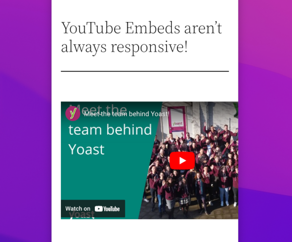
Standard YouTube Embeds, such as the one below, use iFrames to generate an embedded video player:
<iframe width=”560″ height=”315″ src=”https://www.youtube.com/embed/5kW0RtcJZC8″ title=”YouTube video player” frameborder=”0″ allow=”accelerometer; autoplay; clipboard-write; encrypted-media; gyroscope; picture-in-picture” allowfullscreen></iframe>
The advantage of using iFrames? It’s a straightforward piece of HTML. Plus, it allows YouTube embeds to be compatible with the broadest possible selection of use cases, applications and content management systems. YouTube can also update existing video embeds with, for example, new player styles or advertising scripts from the server side without requiring users to change the code on their websites. This works because an iFrame essentially acts as a window to a different page.
But there’s also a downside. Using iFrames can make YouTube videos slower to load on any given page. It could also mean that the videos aren’t always visible on first-paint, since a browser needs to find and load the iFrame before being able to load the video. Finally, and more frustratingly, without CSS or Javascript, there isn’t a native way to make YouTube videos adapt to a container. Which is why the embed specifies a size (560 x 315 by default).
As a consequence, to make a YouTube embed truly responsive and optimized for mobile display, you need to do a bit of extra work. Luckily, there are several simple mays to make it happen.
Method 1: With a bit of custom CSS
The simplest way of using CSS to create responsive embeds is to create a class that features the property “aspect-ratio”. This property allows you to stipulate the aspect ratio of the class you are creating, such that it’s always resized within a container along that aspect ratio. Given that embeddable YouTube videos are all presented with a 16×9 aspect ratio, this means you can use the property to ensure everything scales accordingly.
Let’s look at how method one works.
First, create a class such as “youtube-video”. Next, give it the property aspect-ratio set to 16/9 with the width at 100%.
.youtube-video {
  aspect-ratio: 16 / 9;
  width: 100%;
}
You’ll then need to apply this class to any YouTube embed in the code, while removing the default width and height stipulation.
<iframe class="youtube-video" src="https://www.youtube.com/embed/5kW0RtcJZC8" title="YouTube video player" frameborder="0" allow="accelerometer; autoplay; clipboard-write; encrypted-media; gyroscope; picture-in-picture" allowfullscreen></iframe>This method is very simple for anyone comfortable editing basic CSS and HTML. However, it does require some work for each individual YouTube embed. This is less than ideal, especially for websites with multiple authors and editors who likely all try to embed YouTube videos in pages and posts.
Method 2: With Gutenberg Blocks in responsive themes
Some WordPress themes, such as Inspiro and responsive, have features that automate responsiveness for video embeds. So if you’re open to changing your theme and templates, it’s a simple matter of installing one of these. These themes have a CSS rule similar to method one that is baked into the theme. This rule will then be applied to certain blocks, and featured within the theme.
In other words: If you use the “video” Gutenberg block, where you paste in the URL of the YouTube video you want to embed, your videos will remain responsive.
However, be sure to test out these themes with your website first. The specific implementation may not work perfectly with your videos.
Method 3: With the Yoast Video SEO Plugin
If you’re a WordPress user, the simplest and fastest way to solve this problem is with the Yoast Video SEO plugin. In addition to automating the inclusion of metadata, which gets your videos ranking in Google search results, JavaScript automatically resizes the video embed for any device and browser size. Beyond just the container size, the video will adjust its height and width as the page scales. So you don’t need to worry about implementing custom CSS or tiresome browser testing!
In addition, the Yoast Video SEO plugin uses asynchronous JavaScript to speed up loading times for YouTube videos as much as possible. This ensures that your videos are delivered in the best way possible to guarantee high play rates and engagement. The plugin is $79 a year, takes just a couple of minutes to install and set up, and ensures you never need to worry about responsive videos ever again.
Summary
Videos are a great tool to use on your website. People love them! But if they don’t scale with the rest of your site, they can look clunky. Luckily, there are multiple ways to ensure that your embedded videos are responsive. Either with a bit of custom CSS or by installing a useful plugin like Yoast Video SEO, you can make sure your YouTube videos resize properly. You can also opt for changing your theme to one that has automatic video responsiveness. If you have any further questions or suggestions, please leave them in the comments.
Read more: YouTube vs your own site: Which is better for video SEO? »
The post How to make YouTube videos responsive appeared first on Yoast.


Recent Comments