In 2021, Your Mobile Website Experience Is Critical to Marketing Success
Mobile website experience has mattered for quite some time now, but the importance of a strong mobile experience only continues to rise. What is mobile site experience, exactly? Your site needs to be:
- Mobile-friendly – Can the site be navigated without needing to pinch to zoom or scroll sideways?
- Fast to load – Will your site load before users are compelled to click back to their search?
- Easy to use – Can users find what they’re looking for?
Good mobile site experience is no longer a competitive advantage, it’s essential to your performance in search.
Mobile Is the New Desktop
It’s no surprise with as much as we’re all connected to our phones that a lot of searches occur from mobile devices. As early as 2015, desktop traffic was surpassed by mobile device traffic, and it hasn’t slowed down since. As of February 2021, mobile devices make up over 54% of traffic worldwide:
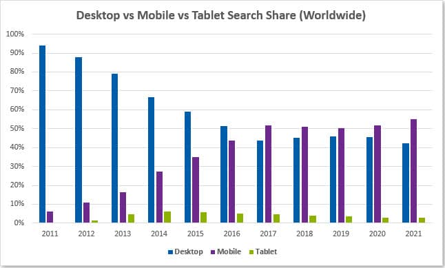
Source: StatCounter
In 2015, 61% of mobile device users were more likely to contact a local business if their site was mobile-friendly. Nowadays, if your site isn’t optimized for mobile, not only are you less likely to get leads, you’re less likely to appear in search to begin with.
From Mobile-Friendly to Mobile-First
Google first clearly indicated that mobile experience impacted search results with their mobile-friendly update that rolled out in April 2015. At this point in time, users began to see different search results on desktop and mobile devices to cater to users’ needs. Site content was still number one, so sites with poor mobile performance could still rank well, even number one, without a mobile-friendly site.
Taking it to the next level, Google began experimenting with mobile-first indexing in 2016. That essentially means Google looks at the mobile version of sites when evaluating content to rank and appear on Google. By December 2018, half of the pages shown in results globally used mobile-first indexing. Prior to this shift, Google was looking at the desktop version of sites when ranking content, but because the majority of Google users were now accessing Google search on a mobile device, the mobile experience became a priority.
The default for new sites switched to mobile-first indexing in July 2019, but the transition for existing sites was significantly less immediate. Switching the entirety of the web to mobile-first indexing has taken years. In mid-2020, Google announced they experienced setbacks from their original goal of mobile-first indexing for all sites across the web by September 2020. As of the end of March 2021, Google’s rollout should be complete, and desktop-only sites will be dropped from Google’s index.
Unsure if your site is mobile-friendly? Check out Google’s Mobile-Friendly Test tool.
So, What Makes a Good Mobile Site Experience?
Having a mobile site is not enough anymore. Instead, you have to have a site that is truly optimized for mobile devices. Many elements contribute to the overall experience on your mobile site:
Content is Key
When mobile sites first gained popularity, it wasn’t uncommon to provide users different (or less) content on mobile compared to desktop to keep mobile sites simple. But with the complete rollout of mobile-first indexing, your mobile site’s content now needs to take precedence.
Google’s John Mueller has made it clear that Google is indexing only the content that exists on the mobile version of a site, and desktop content will essentially be ignored. Want your site’s content to rank in Google search? Ensure the mobile version of your site reflects that content, or Google will gloss over it.
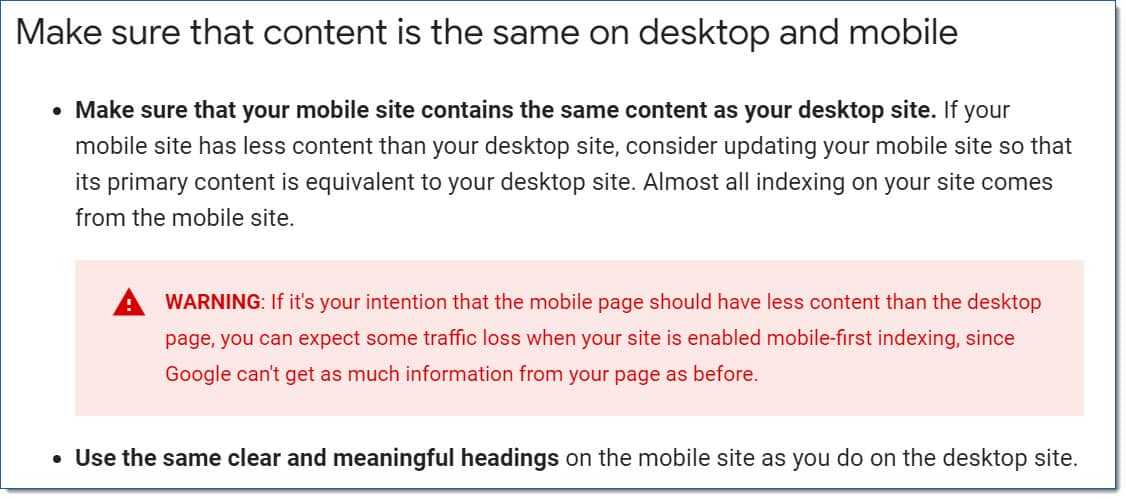
If you employ less content on your mobile site and your site has made the switch to mobile-first indexing, you may have seen a decline in rankings or overall site performance, as Google is no longer seeing the additional content on your desktop site. Essentially, your mobile site is now the primary version of your site, and you should treat it as such.
Mobile-First Design
Sites optimized for mobile come in different shapes and sizes. Both mobile-friendly and responsive site designs are characterized by the ease with which one can use them from a mobile device. A mobile-friendly site functions the exact same on desktop and mobile devices. While you may be able to click on elements easily, sites that are only mobile-friendly aren’t designed with the mobile user in mind. These sites meet Google’s standards and can be less time-consuming to build.
Responsive site design varies the appearance of a site based on the size of the browser or device it is viewed on. Responsive sites reformat the content on a desktop site to accommodate the needs of mobile device users because the behavior of mobile device users is different than that of desktop users. Responsive sites not only meet Google’s standards for mobile sites, but they utilize their layout to appeal to mobile users. With today’s shifting landscape, many design teams have started to employ a “mobile-first” approach to designing websites, focusing on elements like conversion rate.

Flash plugins, pop-ups, and elements that are too hard to reach on a mobile device can ruin your site’s mobile experience for a user. Not convinced your mobile experience matters? 75% of smartphone users expect to get immediate information while using their smartphone. If your site doesn’t measure up or is too difficult to navigate, users are likely to hit “back” and choose your competitor instead.
Core Web Vitals: Google’s Latest Ranking Factor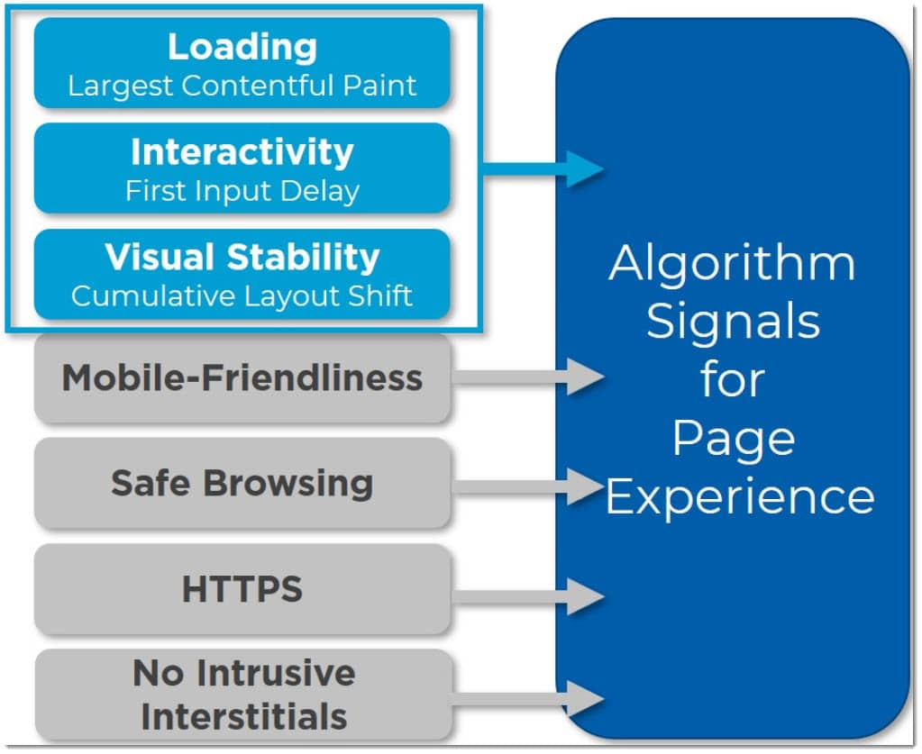
We’ve all done it – gotten frustrated by how long a site takes to load, and simply given up. Google’s newest update looks at just that. Google’s Page Experience Update, coming in May 2021, pairs existing user experience metrics (mobile-friendliness, safe browsing, HTTPS, and intrusive interstitials) with new metrics called “Core Web Vitals.”
Core Web Vitals metrics measure how long it takes to achieve three factors on your site: loading, interactivity, and visual stability. The measure of those factors are as follows:
1. Largest Contentful Paint (LCP)
Largest Contentful Paint measures how long it takes for the largest content element (e.g., a banner image, video, contact form, etc.) on your page to become visible in the users’ viewport. Put simply, LCP measures how quickly your web page loads.
2. First Input Delay (FID)
First Input Delay measures how quickly users can interact with your website in their browser. Keeping your website’s code lean by reducing third-party scripts will improve your site against FID.
3. Cumulative Layout Shift (CLS)
Cumulative Layout Shift measures the amount of visual change to your web page after a user starts interacting with it. The lower the score, the better the experience for your website visitors.
Core Web Vitals, combined with existing page experience metrics, will contribute to Google’s rankings to fulfill Google’s goal of helping users find the most relevant and quality sites for their queries.
Stand Out in SERPs
Mobile users often conduct localized searches from their devices, looking for “________ near me” and other similar queries. Google is constantly looking to serve the most relevant results, so those localized queries can help bring you business. If your site isn’t optimized for mobile, you can be missing out on valuable leads that are likely to convert.


When optimizing your site for search, think like a mobile user. SEO elements like title tags and meta descriptions should be optimized for what shows on mobile results, ensuring the most valuable information about your page isn’t cut off when viewing from the confined space on mobile. If you save a competitive differentiator, like offering 24/7 service, until the end, it’s likely mobile users won’t even get to see it.
Once your mobile site experience is up to par, it’s important to remember your mobile search strategy only begins with your site. Combining onsite optimization tactics like meta data optimization and structured data use with local SEO efforts can really help your brand appearance on mobile devices.
Marketing with Mobile in Mind
From mobile-first, responsive site design to search engine optimization services, the team at Blue Corona is equipped to help improve your mobile site experience and drive results.
Ready for a marketing partner committed to you and your mobile site experience? Contact us today.


Recent Comments